1. Broken line diagram
2. Scatter plot
3. Histogram
4. The pie chart
5. boxplot
6. Probability map
7. Radar map
8. Flow diagram
9. Table settings in the drawing
10. Polar diagram
11. Clouds of words
11.1 Install the relevant package
11.2 The process of word cloud generation
1. Broken line diagramBroken line diagram (Line Chart) It's a graph that connects data points in order , It can also be seen as a scatter diagram according to X Drawings linked by axis coordinate sequence . The main function of line chart is to view dependent variables y With the independent variable x Changing trends , Best for displaying over time ( Set... According to the common scale ) And changing continuous data . meanwhile , We can also see the difference in quantity
Draw line chart plot The format of :
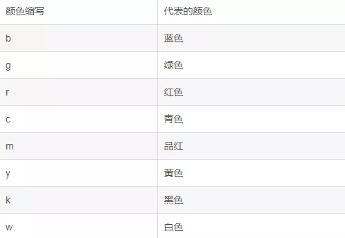
matplotlib.pyplot.plot(*args,**kwargs)color Parametric 8 See the table for the commonly used abbreviations
surface 2 color Common color abbreviations for parameters :
plt.plot Draw line chart code display :
import matplotlib.pyplot as pltimport numpy as np%matplotlib inlinex = np.arange(9)y = np.sin(x)z = np.cos(x)#marker Data point style ,linewidth Line width ,linestyle Line style ,color Color plt.plot(x,y,marker='*',linewidth=1,linestyle='--',color='orange')plt.plot(x,z)plt.title('matplotlib AK')plt.xlabel('height',fontsize=15)plt.ylabel('width',fontsize=15)# Set legend plt.legend(['Y','Z'],loc='upper right')plt.grid(True)plt.show()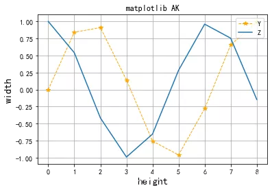
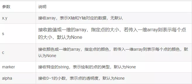
Scatter plot (Scatter Diagram) It's also called scatter plot , It takes a feature as the abscissa , Another feature is the ordinate , Use coordinate points ( Scatter ) A graph that reflects the statistical relationship between features . The value is represented by the position of the point in the graph , Categories are represented by different tags in the chart , Usually used to compare data across categories
scatter The format of the method :
matplotlib.pyplot.scatter(x,y,s=None,c=None,marker=None,alpha=None)scatter The main parameters of the function and their descriptions are shown in table 3scatter Main parameters and their descriptions
scatter Drawing examples 1:
fig.ax = plt.subplots()plt.rcParams['font.family'] = ['SimHei'] # Used to display Chinese tags plt.rcParams['axes.unicode_minus'] = False # Used to display symbols normally x1 = np.arange(1,30)y1 = np.sin(x1)ax1 = plt.subplot(1,1,1)plt.title(' Scatter plot AK')plt.xlabel('X')plt.ylabel('Y')lvalue = x1ax1.scatter(x1,y1,c='r',s=100,linewidths=lvalue,marker='o')plt.legend('x1')plt.show(),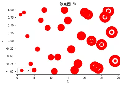
scatter Drawing examples 2:
fig,ax = plt.subplots()plt.rcParams['font.family'] = ['SimHei'] # Used to display Chinese tags plt.rcParams['axes.unicode_minus'] = False # Used to display symbols normally for color in ['red','green','blue']: n = 500 x,y = np.random.randn(2,n) ax.scatter(x,y,c=color,label=color,alpha=0.3,edgecolor='none')ax.legend()ax.grid(True)plt.show()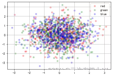
Histogram (Histogram) Also known as mass distribution diagram , It's a kind of statistical report chart , Data distribution is represented by a series of vertical stripes or line segments with different heights , Generally, the horizontal axis is used to represent the category of data , The vertical axis represents the quantity or proportion . The distribution of product quality characteristics can be seen more intuitively by histogram , It is convenient to judge the overall quality distribution . Histograms can discover data patterns that distribution tables cannot discover 、 The frequency distribution of the sample and the distribution of the population .
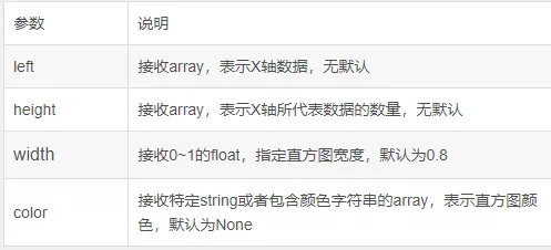
Draw histogram function bar Format :
matplotlib.pyplot.bar(left,height,width = 0.8,bottom = None,hold = None,data = None)function bar See the following table for common parameters and their descriptions 4
surface 4 bar Common parameters and their descriptions :
bar Drawing examples 1:
import pandas as pdimport matplotlib.pyplot as pltimport numpy as npfig,axes = plt.subplots(2,1)data = pd.Series(np.random.randn(16),index=list('abcdefghijklmnop'))data.plot.bar(ax = axes[0],color='k',alpha=0.7)data.plot.barh(ax = axes[1],color='k',alpha=0.7)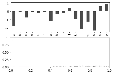
bar Drawing examples 2:
import pandas as pdimport matplotlib.pyplot as pltimport numpy as npplt.rcParams['font.family'] = ['SimHei'] # Used to display Chinese tags plt.rcParams['axes.unicode_minus'] = False # Used to display symbols normally fig,ax = plt.subplots()x = np.arange(1,6)y1 = np.random.uniform(1.5,1.0,5)y2 = np.random.uniform(1.5,1.0,5)plt.bar(x,y1,width = 0.35,facecolor='lightskyblue',edgecolor = 'white')plt.bar(x+0.35,y2,width = 0.35,facecolor='yellowgreen',edgecolor = 'white')plt.show()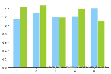
The pie chart (Pie Graph) Used to indicate the proportion of different classifications , Compare various classifications by radian size , The pie chart can clearly reflect the part and the part 、 The proportional relationship between the part and the whole , It is easy to display the size of each group of data relative to the total number , And the way of presentation is intuitive .
Draw the pie chart pie The format of the method :
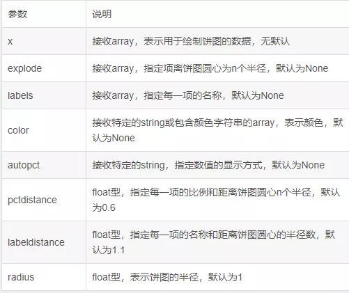
matplotlib.pyplot.pie(x,explode = None,labels = None,color = None,autopct = None,pctdistance = 0.6,shadow=false,labeldistance=1.1,startangle=None,radius=None,...)pie See table for common parameters of the function and their descriptions 5
surface 5 pie Function common parameters and their descriptions :
pie Drawing examples :
plt.figure(figsize=(6,6))# Establish the size of the axis labels = ['Springs','Summer','Autumn','Winter']x = [15,30,45,10]explode = (0.05,0.05,0.05,0.05)# This one controls the separation distance , Default pie chart does not separate plt.pie(x,labels = labels,explode = explode,startangle = 60,autopct='%1.1f%%')#autopct Show scale values in the diagram , Notice the format of the value plt.title('Rany days by season')plt.show()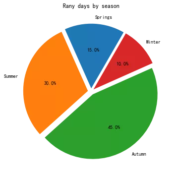
boxplot (Boxplot) Also known as box whisker diagram , By plotting statistics that reflect the characteristics of data distribution , Provide key information about data location and dispersion , Especially when comparing different features , It can also show the difference of dispersion degree . The box diagram uses... In the data 5 Statistics ( minimum value , Lower quartile , Median , The upper quartile and the maximum ) To describe the data , It can roughly see whether the data has symmetry , The degree of dispersion of the distribution , It can be used to compare several samples , You can also roughly detect outliers .
boxplot Format of function :
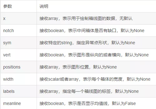
matplotlib.pyplot.boxplot(x,notch = None,sym = None,vert = None,whis = None,positions = None,width = None,patch_artist = None,meanline = None,labels = None,...)boxplot See table for common parameters of the function and their descriptions 6
surface 6 boxplot Function common parameters and their descriptions :
import numpy as npimport pandas as pdimport matplotlib.pyplot as pltnp.random.seed(2)# Set random seeds df = pd.DataFrame(np.random.rand(5,4),columns = ['A','B','C','D'])# Generate 0~1 Of 5*4 Dimension data and store it in 4 Column DataFrame in df.boxplot()plt.show()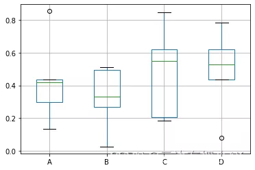
Probability graph models are Turing winners Pearl The theory proposed to represent the probability dependence between variables , Normal distribution is also known as Gaussian distribution . Positive probability density function normpdf(X,mu,sigma), among ,X Vector ,mu Is the mean ,sigma As the standard deviation .
Draw a probability map :
import numpy as npimport pandas as pdimport matplotlib.pyplot as pltfrom scipy.stats import normfig,ax = plt.subplots()plt.rcParams['font.family'] = ['SimHei'] # Used to display Chinese tags plt.rcParams['axes.unicode_minus'] = False # Used to display symbols normally np.random.seed(1587554)mu = 100sigma = 15x = mu+sigma*np.random.randn(437)num_bins = 50n,bins,patches = ax.hist(x,num_bins,density=1,stacked=True)y = norm.pdf(bins,mu,sigma)ax.plot(bins,y,'--')fig.tight_layout()plt.show()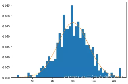
Radar chart is also called network chart 、 Star map 、 Spider web 、 Irregular polygon 、 Polar maps, etc . Radar chart is a graphic method for displaying multivariable data in the form of two-dimensional chart of three or more quantitative variables represented on the axis starting from the same point . The relative position and angle of the axis are usually uninformative . Radar map is equivalent to parallel coordinate map , The shaft is arranged radially .
Draw a radar chart of a student's performance information
import matplotlib.pyplot as pltimport numpy as np%matplotlib inline# A student's course and grades courses = [' data structure ',' Data visualization ',' Advanced Mathematics ',' English ',' Software Engineering ',' How it's made up ','C Language ',' sports ']scores = [82,95,78,85,45,88,76,88]dataLength = len(scores) # Data length #angles The array divides the circumference equally into dataLength Share angles = np.linspace(0,2*np.pi,dataLength,endpoint=False)scores.append(scores[0])angless = np.append(angles,angles[0]) # closed # Drawing radar maps plt.polar(angless, # Set the angle scores, # Set the data on each angle 'rv--', # Set the color 、 Linetype and endpoint symbols linewidth=2) # Set the line width # Set angle network label plt.thetagrids(angles*180/np.pi,courses,fontproperties='simhei',fontsize=12,color='k')# Fill the inside of the radar map plt.fill(angless,scores,facecolor='g',alpha=0.2)plt.show()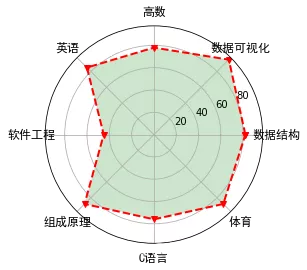
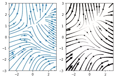
In transportation problems , It is often necessary to indicate the yield of the place of origin 、 Sales volume of land sold , And traffic maps of flow direction and flow , In this case, the flow chart can be used . The flow chart can visually show the data flow , Reveal some laws or phenomena in motion .
Flow chart drawing :
import numpy as npimport matplotlib.pyplot as pltY,X = np.mgrid[-3:3:100j,-3:3:100j]U = -1-X**2+YV = 1+X-Y**2speed = np.sqrt(U*U+V*V)plt.streamplot(X,Y,U,V,color=U,linewidth = 2,cmap = plt.cm.autumn)plt.colorbar()f,(ax1,ax2) = plt.subplots(ncols=2)ax1.streamplot(X,Y,U,V,density=[0.5,1])lw = 5*speed/speed.max()ax2.streamplot(X,Y,U,V,density=0.6,color='k',linewidth=lw)plt.show()
In the drawing , Sometimes it is necessary to display data tables at the same time .Matplotlib Provided in the drawing table Method can display data tables at the same time
Show data table in drawing ;
import numpy as npimport matplotlib.pyplot as pltplt.rcParams['font.family'] = ['SimHei']data = [[66386,174296,75131,577908,32015], [58230,381139,78045,99308,160454], [89135,80552,152558,497981,603535], [78415,81858,150656,193263,69638], [139361,331509,343164,781380,52269]]columns = ('Freeze','Wind','Flood','Quake','Hail')rows = ['%d year'% x for x in (100,50,20,10,5)]values = np.arange(0,2500,500)value_increment = 1000colors = plt.cm.BuPu(np.linspace(0,0.5,len(columns)))n_rows=len(data)index = np.arange(len(columns))+0.3bar_width=0.4y_offset = np.array([0.0]*len(columns))cell_text = []for row in range(n_rows): plt.bar(index,data[row],bar_width,bottom=y_offset) y_offset = y_offset+data[row] cell_text.append(['%1.1f'%(x/1000.0) for x in y_offset])colors = colors[::-1]cell_text.reverse()the_table = plt.table(cellText=cell_text, rowLabels=rows, rowColours = colors, colLabels = columns, loc = 'bottom')plt.subplots_adjust(left=0.2,bottom=0.2)plt.ylabel("Loss in ${0}'s".format(value_increment))plt.yticks(values*value_increment,['%d' % val for val in values])plt.xticks([])plt.title(' Meteorological disaster loss ')plt.show()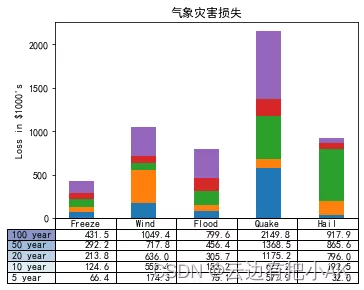
In plane projection , from X Axis and Y Axis positioning coordinates ; In polar projection , Coordinates need to be located in the form of radius and angle . The radius in the polar projection is displayed in the size of the circle radius , And at every angle 0° The angle of the circle is the projection angle of the starting point . To generate a polar projection , You need to define the projection type as polar .
Draw a polar graph :
import numpy as npimport matplotlib.pyplot as pltr = np.linspace(0,2,100)theta = 2*np.pi*rfig = plt.figure(figsize=(13,4))ax1 = plt.subplot(121,projection='polar')ax1.scatter(theta,r,label='Polar Projection',s=10)ax1.legend(bbox_to_anchor=(0.85,1.35))ax2 = plt.subplot(122)ax2.scatter(theta,r,label='Polar Projection',s=10)ax2.legend(bbox_to_anchor=(0.85,1.35))ax2.set_xlabel('R')ax2.set_ylabel(r'$\theta$')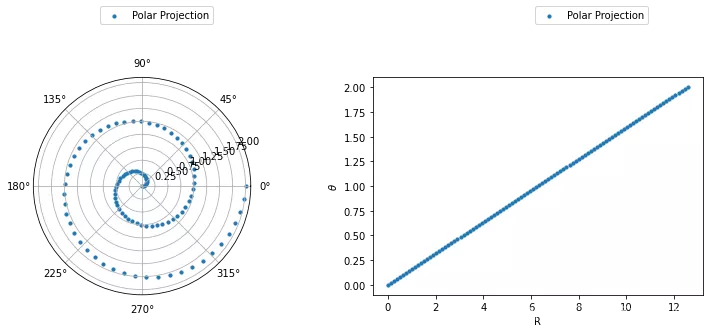
Word cloud is used to visually highlight the keywords that appear frequently in the network text , formation “ Key word cloud ” or “ Keyword rendering ”, To filter out a lot of text information , So that visitors can understand the main idea of the text at a glance .
11.1 Install the relevant packageDrawing words requires WordCloud and jieba package .jieba Used to separate words from sentences in text .
Installation statement of two packages :
pip install wordcloudpip install jieba11.2 The process of word cloud generation Generally, the process of generating word cloud is :
1) Use Pandas Read the data and convert the data to be analyzed into a list
2) Use the word segmentation tool for the obtained list data jieba Traversal segmentation
3) Use WordCloud Set the properties of the word cloud image 、 Masks and stop words , And generate word cloud images .
This is about python matplotlib This is the end of the article on drawing eleven common data analysis charts , More about python matplotlib Please search the previous articles of SDN or continue to browse the related articles below. I hope you will support SDN more in the future !