This article is Python visualization seaborn The second article in the series , This article will explain in detail seaborn How to explore the distribution of data .
import numpy as np
import pandas as pd
import matplotlib.pyplot as plt
import seaborn as sns
% matplotlib inline
sns.set(context='notebook',font='simhei',style='whitegrid')
# Set style scale and display Chinese
import warnings
warnings.filterwarnings('ignore') # No warning
seaborn.distplot(a, bins=None, hist=True, kde=True, rug=False, fit=None, hist_kws=None, kde_kws=None, rug_kws=None, fit_kws=None, color=None, vertical=False, norm_hist=False, axlabel=None, label=None, ax=None)
# Histogram
from scipy.stats import norm # Histogram and maximum likelihood Gaussian distribution fitting are used to plot the distribution
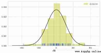
rs = np.random.RandomState(50) # Set random number seed
s = pd.Series(rs.randn(100)*100)
plt.figure(figsize=(8,4))
sns.distplot(s, bins=10, hist=True, kde=False, norm_hist=False,
rug=True, vertical=False,label='distplot',
axlabel='x Axis ',hist_kws={
'color':'y','edgecolor':'k'},
fit=norm)
# Fit with standard normal distribution
plt.legend()
plt.grid(linestyle='--')
plt.show()
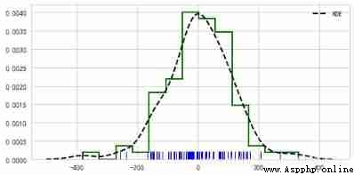
plt.figure(figsize=(8,4))
sns.distplot(s,rug = True,
rug_kws = {
'color':'b'} ,
# Set the data frequency distribution color
kde_kws={
"color": "k", "lw": 2, "label": "KDE",'linestyle':'--'},
# Set density curve color , Line width , mark 、 Linear
hist_kws={
"histtype": "step", "linewidth": 2,"alpha": 1, "color": "g"})
# Set the style of the box 、 Line width 、 transparency 、 Color
# Styles include :'bar', 'barstacked', 'step', 'stepfilled'
plt.show()
Steps of kernel density estimation :
seaborn.kdeplot(data,data2 = None,shade = False,vertical = False,kernel =‘gau’,bw =‘scott’,gridsize = 100,cut = 3,clip = None,legend = True,cumulative = False,shade_lowest = True,cbar = False,cbar_ax = nothing ,cbar_kws = nothing ,ax = nothing ,* kwargs )*
# Single sample data density distribution diagram
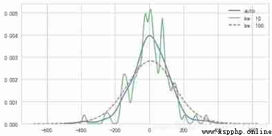
plt.figure(figsize=(8,4))
sns.kdeplot(s,label='auto')
sns.kdeplot(s,bw=10, label="bw: 10",linewidth = 1.5)
sns.kdeplot(s,bw=100, label="bw: 100",linestyle = '--',linewidth = 1.5)
# bw → It can also be regarded as the number of boxes in the histogram , The bigger the number , The more boxes , The more accurate the depiction .
plt.show()
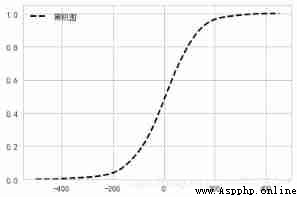
sns.kdeplot(s, label=" Cumulative graph ",color='k',cumulative=True,
linestyle = '--',linewidth = 2)
plt.show()
** The nuclear density level graph can not only plot the , You can also plot two variables !!!**
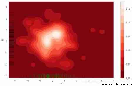
# 2、 Density map - kdeplot()
# Data density distribution of two samples
rs = np.random.RandomState(2) # Set random number seed
df = pd.DataFrame(rs.randn(100,2),
columns = ['A','B'])
fig = plt.figure(figsize=(10,6))
sns.kdeplot(df['A'],df['B'],
cbar = True, # Whether to display color legend
shade = True, # Whether to fill
cmap = 'Reds_r', # Set the color palette
shade_lowest=True, # Whether the outermost color is displayed
n_levels = 10, # Number of curves ( The bigger it is , The more dense )
bw = .3
)
# Two dimensional data generates a curve density graph , Display as density falloff in color
sns.rugplot(df['A'], color="g", axis='x',alpha = 0.5)
sns.rugplot(df['B'], color="k", axis='y',alpha = 0.5)
# Pay attention to the settings x,y Axis
seaborn.jointplot(x,y,data = None,kind =‘scatter’,color = None,size = 6,ratio = 5,space = 0.2,dropna = True,xlim = None,ylim = None,joint_kws = None,marginal_kws =None,annot_kws =None,* kwargs )*
The function is JoinGrid class A lightweight interface for , If you want to draw more flexibly , have access to JoinGrid function
# Scatter plot + Edge histogram
tips = sns.load_dataset("tips")
sns.jointplot(x='total_bill', y='tip', # Set up xy Axis , Show columns name
data=tips, # Set up the data
color = 'k', # Set the color
s = 50, edgecolor="w",linewidth=1,
# Set the scatter size 、 Edge line color and width ( Only aim at scatter)
kind = 'scatter',
space = 0.2, # Set spacing between scatter and layout
size = 7, ratio = 5, # Height ratio of scatter plot to layout , integer
marginal_kws=dict(bins=20, rug=True) # Set the number of histogram boxes , Whether to set up rug
)
plt.show()
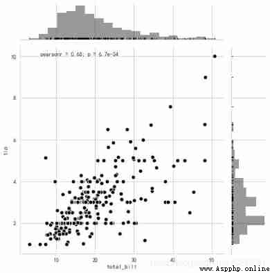
seaborn The Pearson correlation coefficient and P value
pearson Calculation of correlation coefficient :
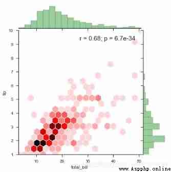
# Regression chart + Edge histogram
with sns.axes_style("ticks"):
sns.jointplot(x='total_bill', y='tip',data = tips,
kind="hex", color="r", # The main drawing is a hexagonal box drawing
size=6,space=0.1,
joint_kws=dict(gridsize=20,edgecolor='w'), # Main diagram parameter settings
marginal_kws=dict(bins=20,color='g',
hist_kws={
'edgecolor':'k'}), # Edge graph settings
annot_kws=dict(stat='r',fontsize=15)) # Modify statistical notes
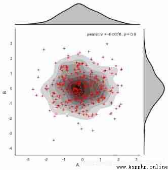
# Density map
rs = np.random.RandomState(15)
df = pd.DataFrame(rs.randn(300,2),columns = ['A','B'])
# Create data
with sns.axes_style("white"):# Set the style of the current drawing
g = sns.jointplot(x=df['A'], y=df['B'],data = df,
kind="kde", color="k",shade_lowest=False)
# Create a density chart
g.plot_joint(plt.scatter,c="r", s=30, linewidth=1, marker="+")
# Add scatter chart
I talked about it before. jointplot It's actually JoinGrid An encapsulation of , To have more flexible settings , have access to JoinGrid class
# Can be split to draw a scatter chart
# plot_joint() + ax_marg_x.hist() + ax_marg_y.hist()
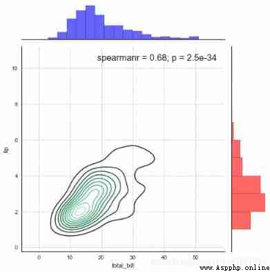
sns.set_style("white")
# Set style
g = sns.JointGrid(x="total_bill", y="tip", data=tips, size=7)
# Create a drawing table area , Set it up x、y Corresponding data
g.plot_joint(sns.kdeplot, color ='m', edgecolor = 'white') # Set the chart in the box ,scatter
g.ax_marg_x.hist(tips["total_bill"], color="b", alpha=.6,
edgecolor='k',bins=np.arange(0, 60, 3))
# Set up x Axis histogram , Be careful bins It's an array
g.ax_marg_y.hist(tips["tip"], color="r", alpha=.6,
orientation="horizontal",edgecolor='k',
bins=np.arange(0, 12, 1))
# Set up y Axis histogram , Pay attention to the need for orientation Parameters
from scipy import stats
g.annotate(stats.spearmanr , fontsize=16, loc='best')
# Set up labels , It can be for pearsonr,spearmanr, Or a custom function
plt.grid(linestyle = '--')
# Can be split to draw a scatter chart
# plot_joint() + plot_marginals()
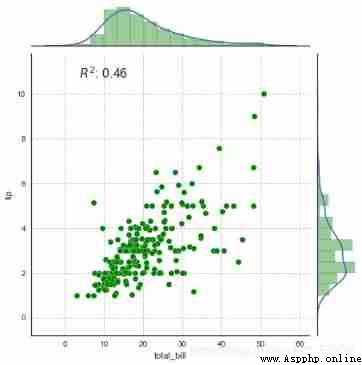
g = sns.JointGrid(x="total_bill", y="tip", data=tips,size=6.5,ratio=6)
# Create a drawing table area , Set it up x、y Corresponding data
g = g.plot_joint(plt.scatter,color="g", s=50, edgecolor="white") # Draw a scatter plot
plt.grid(linestyle = '--') # Set gridlines
g.plot_marginals(sns.distplot, kde=True, hist_kws={
'color':'g','edgecolor':'k'}) # Set the edge graph
rsquare = lambda a, b: stats.pearsonr(a, b)[0] ** 2 # Custom statistical functions
g = g.annotate(rsquare, template="{stat}: {val:.2f}",
stat="$R^2$", loc="upper left", fontsize=16) # Set comments
# 1、 Comprehensive scatter diagram - JointGrid()
# Can be split to draw a scatter chart
# plot_joint() + plot_marginals()
# kde - Density map
g = sns.JointGrid(x="total_bill", y="tip", data=tips,space=0)
# Create a drawing table area , Set it up x、y Corresponding data
g = g.plot_joint(sns.regplot) # Draw a density map
plt.grid(linestyle = '--')
g.plot_marginals(sns.distplot, color="r",bins=20,hist_kws={
'edgecolor':'k'}) # draw x,y Axial density diagram
g.annotate(stats.pearsonr)

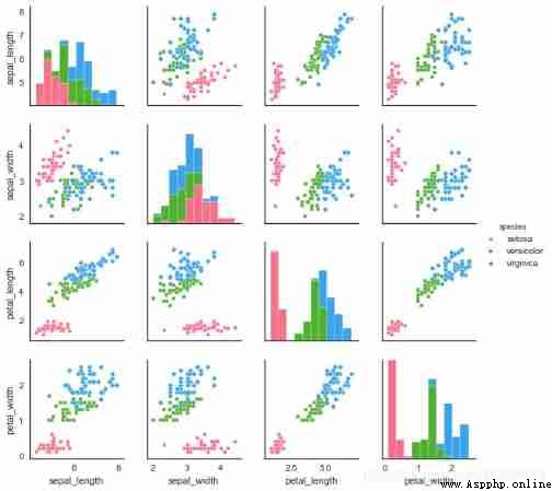
Usually our data does not have only one or two variables , So for multiple variables , We often need to explore the distribution and relationship between two variables pairplot function
Or is it PairGrid class
seaborn.pairplot(data,hue = None,hue_order = None,palette = None,vars = None,x_vars = None,y_vars = None,kind =‘scatter’,diag_kind =‘auto’,markers = None,s = 2.5,aspect = 1,dropna = True,plot_kws = None,diag_kws = None,grid_kws = None)
# 2、 Matrix scatter - pairplot()
# sns.set_style("white")
# Set style
iris = sns.load_dataset("iris")
print(iris.head())
# Read iris data
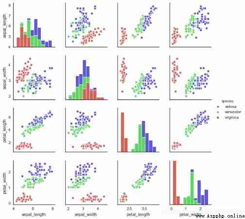
sns.pairplot(iris,
kind = 'scatter', # Scatter plot / Regression distribution diagram {‘scatter’, ‘reg’}
diag_kind="hist", # Set diagonal histogram / Density map {‘hist’, ‘kde’}
hue="species", # Sort by a field
palette="husl", # Set up the palette
markers=["o", "s", "D"], # Set different series of point styles ( Here, according to the number of reference categories )
size = 2, # Chart size
plot_kws={
's':20}, # Set point size
diag_kws={
'edgecolor':'w'}) # Set diagonal histogram style
plt.show()
 sepal_length sepal_width petal_length petal_width species
0 5.1 3.5 1.4 0.2 setosa
1 4.9 3.0 1.4 0.2 setosa
2 4.7 3.2 1.3 0.2 setosa
3 4.6 3.1 1.5 0.2 setosa
4 5.0 3.6 1.4 0.2 setosa
# 2、 Matrix scatter - pairplot()
# Other parameter settings
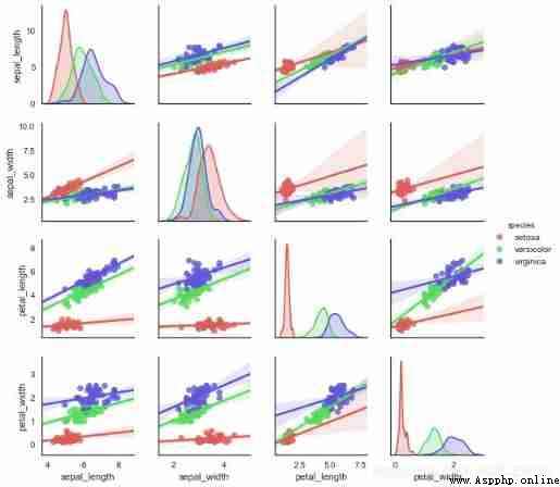
sns.pairplot(iris, kind="reg",hue='species', # Set regression graph
diag_kind='kde',palette='hls', # Set diagonal chart type and color palette
diag_kws=dict(shade=True),size=2)
amount to jointplot and JointGrid The relationship between ,PairGrid It has more flexible control over matrix scatter diagram
# 2、 Matrix scatter - PairGrid()
# Can be split to draw a scatter chart
# map_diag() + map_offdiag()
g = sns.PairGrid(iris,hue="species",palette = 'hls',size=2,
vars = ['sepal_length','sepal_width','petal_length','petal_width'], # Can be screened
)
# Create a drawing table area , Set it up x、y Corresponding data , according to species classification
g.map_diag(plt.hist,
histtype = 'barstacked', # Optional :'bar', 'barstacked', 'step', 'stepfilled'
linewidth = 1, edgecolor = 'w')
# Diagonal chart ,plt.hist/sns.kdeplot
g.map_offdiag(plt.scatter,
edgecolor="w", s=40,linewidth = 1 # Set point color 、 size 、 Stroke width
)
# Other charts ,plt.scatter/plt.bar...
g.add_legend()
# Add legend
# 2、 Matrix scatter - PairGrid()
# Can be split to draw a scatter chart
# map_diag() + map_lower() + map_upper()
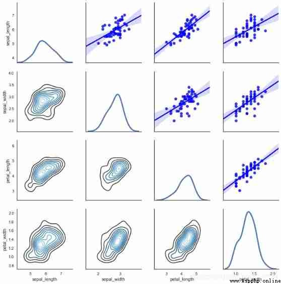
g = sns.PairGrid(iris[iris['species']=='versicolor'])
g.map_diag(sns.kdeplot, lw=3) # Set diagonal chart
g.map_upper(sns.regplot, color = 'b') # Set the chart at the top of the diagonal
g.map_lower(sns.kdeplot, cmap="Blues_d") # Set the chart at the bottom of the diagonal
See many times , It's better to write by yourself , Only in the practical application of continuous practice , Keep thinking . To really play the role of data visualization .