Hello everyone , I meet you again , I'm your friend, Quan Jun .
Author:AXYZdong Automation Engineering Male A little bit of thinking , Have a little idea , A little bit rational ! [email protected],CSDN First episode , For more, please go to AXYZdong The blog of
Environmental Science :Python 3.7 The library used :matplotlib and csv
install matplotlib library , At the command prompt, enter
pip install matplotlibThe installation may be a little slow , Wait patiently .
About matplotlib How to use the library , You can refer to :Matplotlib.pyplot Common methods
Script site :https://greasyfork.org/zh-CN/scripts
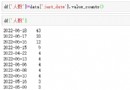
Download statistics from superstar assistant .csv file , And keep it with python Files in the same directory .
remind : After getting the data , Delete the English in the first line , Otherwise datetime.strptime() An error occurs when the function converts data
# =============================================
# --*-- coding: utf-8 --*--
# @Time : 2020-04-28
# @Author : AXYZdong
# @CSDN : https://blog.csdn.net/qq_43328313
# @FileName: demo_1.py
# @Software: Python3.7
# =============================================
import matplotlib.pyplot as plt # Import library
from datetime import datetime # The import module datetime Medium datetime class
import csv
date=[] # Create a list of
installs=[]
update_checks=[]
with open('stats.csv', 'r') as f: # extract stats.csv And save the data in the corresponding list
reader = csv.reader(f)
dates,installs = [],[]
for row in reader:
current_date = datetime.strptime(row[0],"%Y-%m-%d") # Data containing date information row[0] To datetime object
dates.append(current_date)
install = int(row[1])
installs.append(install)
update_checks.append(row[2])
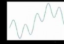
plt.plot(dates,installs,color= 'red') # Use bar charts , The color is set to red
plt.title('the picture about xuexitong help installs', fontsize = 16) # Set picture name
plt.xticks(rotation=300) #x Axis label rotation
plt.ylabel("", fontsize = 16)
plt.ylabel("Number", fontsize = 16)
plt.show() Just change one code
plt.bar(date,installs,color= 'red') The statistical data is 2018-06-19 ~ 2020-04-13 Number of installations .
so :2020-03~2020-04 During this period of time, the data burst , What is the specific reason , Do you know ( Manual funny )
Another big man began to take over , Another script
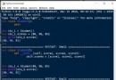
# =============================================
# --*-- coding: utf-8 --*--
# @Time : 2020-04-28
# @Author : AXYZdong
# @CSDN : https://blog.csdn.net/qq_43328313
# @FileName: demo_2.py
# @Software: Python3.7
# =============================================
import matplotlib.pyplot as plt # Import library
from datetime import datetime # The import module datetime Medium datetime class
import csv
date=[] # Create a list of
installs=[]
update_checks=[]
with open('stats1.csv', 'r') as f: # extract stats1.csv And save the data in the corresponding list
reader = csv.reader(f)
dates,installs = [],[]
for row in reader:
current_date = datetime.strptime(row[0],"%Y-%m-%d") # Data containing date information row[0] To datetime object
dates.append(current_date)
install = int(row[1])
installs.append(install)
update_checks.append(row[2])
plt.plot(dates,installs,color= 'blue') # Use bar charts , The color is set to blue
plt.title('the picture about xuexitong help installs', fontsize = 16) # Set picture name
plt.xticks(rotation=300) #x Axis label rotation
plt.ylabel("", fontsize = 16)
plt.ylabel("Number", fontsize = 16)
plt.show() In order to achieve the desired results , It's been a long time At first it was x The problem of shaft label , The picture is always dark , I thought it was the problem of too much data , I didn't think about it After uploading to the blog , It is found that the coordinate value is wrong , The result is different from what I expected . Start looking for all kinds of information , In the end 《Python Programming From introduction to practice 》 We found a solution . Xiaobai's me Study Python, Encountered various problems , Slowly solve them one by one , To achieve the desired results .
You are welcome to criticize and correct
Publisher : Full stack programmer stack length , Reprint please indicate the source :https://javaforall.cn/151755.html Link to the original text :https://javaforall.cn