To make a global earthquake scatterplot,I downloaded a dataset online,It recorded all the earthquakes that occurred worldwide in a month,But these data areJSON格式存儲的,因此需要用json模塊來進行處理.
First, let's open the downloaded dataset and browse: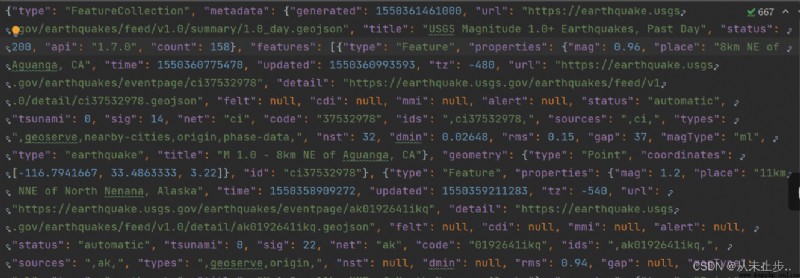 You will find that the data is densely packed,Not read by humans at all,因此,Next we will process the data,Make it easy to read.
import json#導入json模塊,for easy loading of data from the file
filename='eq_data_1_day_m1.json'
with open(filename) as f:
all_eq_data=json.load(f)#json.load(),將數據轉化為Python能夠處理的格式
readable_file='eq_data_1_day_m1.json'#創建一個文件,in order to write this data into it in an easy-to-read manner
with open(readable_file,'w') as f:
json.dump(all_eq_data,f,indent=4)#json.dump()Read data into it
#參數indent讓dump()使用與數據結構匹配的縮進量來設置數據的格式
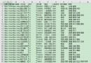
經過處理之後,When we open this file again, we will find that the data in it becomes much clearer.
From it we can quickly get a lot of information about the data,such as the number of earthquakes,類型等等,不僅如此,We were also able to know something about this data,比如,its generation time,How does he get it on the web and so on.
如果indent是非負整數或字符串,則JSON數組元素和對象成員將使用該縮進級別進行打印.如果indent為0,負數或“”只會插入換行符.
None(默認)then choose the most compact representation.,Using a positive integer indent will indent each level by multiple spaces.,If the indent is a string(例如“
t”),則該字符串用於縮進每個級別.
When we modify the indent to 0時,The typography of the document also changes:
json.dump(all_eq_data,f,indent=0)
import json
filename='eq_data_1_day_m1.json'
with open(filename) as f:
all_eq_data=json.load(f)#對文件進行處理
all_eq_dicts=all_eq_data['features']
print(len(all_eq_dicts))#Extract all earthquakes recorded in this file
輸出結果如下:
158
是的,from the beginning of the file,We can determine the number of earthquakes as 158次,因此輸出結果正確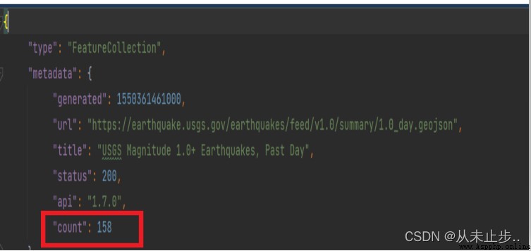
The method is to create a new list to store the relevant data of the earthquake source,Extract the dictionary againfeatures的properties部分的mag.
代碼如下:
import json
filename='eq_data_1_day_m1.json'
with open(filename) as f:
all_eq_data=json.load(f)
all_eq_dicts=all_eq_data['features']
mags=[]
for eq_dict in all_eq_dicts:
mag=eq_dict['properties']['mag']
mags.append(mag)
print(mags[:10])#Print the magnitude data for the first ten earthquakes
[0.96, 1.2, 4.3, 3.6, 2.1, 4, 1.06, 2.3, 4.9, 1.8]
首先,We need to find the section about longitude and latitude in the file,如下所示,We found in the file,它是存在於geometryunder the dictionary,coordinates鍵中的.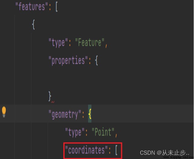
---snip---
all_eq_dicts=all_eq_data['features']
mags,titles,lons,lats=[],[],[],[]
for eq_dict in all_eq_dicts:
mag=eq_dict['properties']['mag']
title=eq_dict['properties']['title']
lon=eq_dict['geometry']['coordinates'][0]#提取coordinatesThe index value in the key is 0的數據
lat=eq_dict['geometry']['coordinates'][1]
mags.append(mag)
titles.append(title)
lons.append(lon)
lats.append(lat)
print(mags[:10])
print(titles[:2])
print(lons[:5])#Output the first five longitudes
print(lats[:5])#Output the first five dimensions
輸出結果如下:
[0.96, 1.2, 4.3, 3.6, 2.1, 4, 1.06, 2.3, 4.9, 1.8]
['M 1.0 - 8km NE of Aguanga, CA', 'M 1.2 - 11km NNE of North Nenana, Alaska']
[-116.7941667, -148.9865, -74.2343, -161.6801, -118.5316667]
[33.4863333, 64.6673, -12.1025, 54.2232, 35.3098333]
Via the data we extracted earlier about the source,Below we can visualize the extracted data:
import plotly.express as px#Plotly Express是Plotly的高級接口,相當於Matplotlib是一個工具
fig=px.scatter(
x=lons,
y=lats,
labels={
'x':'經度','y':'維度'},
range_x=[-200,200],
range_y=[-90,90],
#width和heightRepresents the height and width of the chart800像素
width=800,
height=800,
title="全球地震散點圖",
)
fig.write_html('global_earthquakes.html')#Save the visualization as html文件
fig.show()
After the scatter plot configuration is complete,Next we look for the visualization we saved in the program directory(global_earthquakes.html),Open it again with a browserhtml文件
如下所示,is a scatter plot: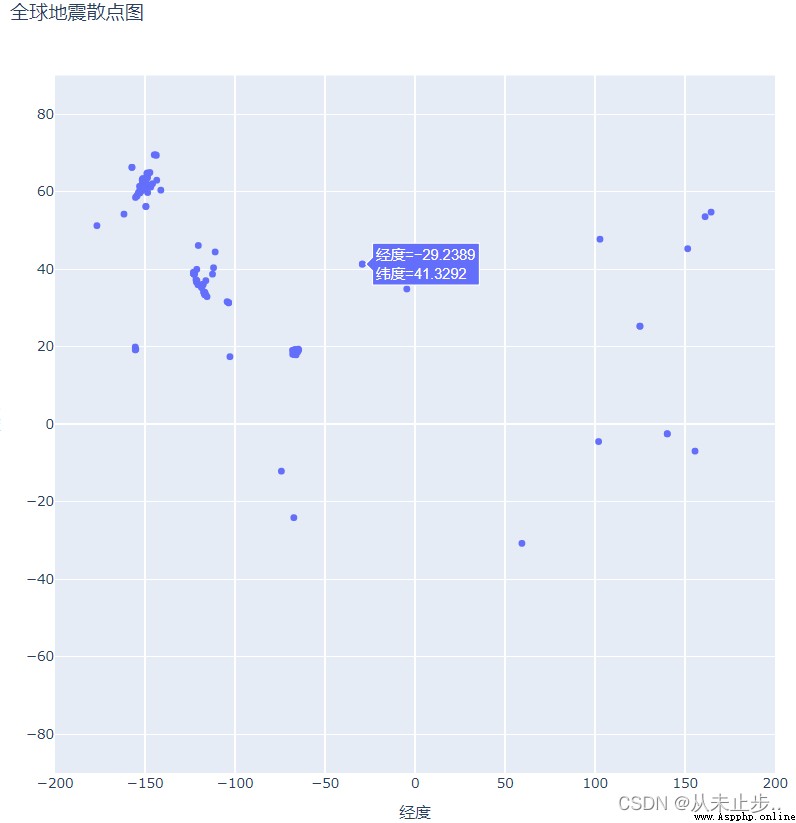
Above we draw the earthquake scatter plot by manually configuring the latitude and longitude,通過將x,y和經度,Latitude makes connections:
x=lons,
y=lats,
labels={
'x':'經度','y':'維度'},
But this is not the easiest way in data processing,Below we introduce another way of specifying data for charts,Need to combine what we mentioned abovepandas數據分析工具.
import pandas as pd#導入pandas模塊x
data=pd.DataFrame(data=zip(lons,lats,titles,mags),colums=['經度','緯度','位置','震級'])#使用DataFrameEncapsulate the data to be processed,注意:DataFrameThe last two parameters are optional,If these two parameters exist,The lengths of these two parameters must be summedDataFrame的長度匹配
#zip()函數的作用:Packs corresponding elements in an iterable into multiple tuples,Then return a list of these tuples
data.head()
它是Python中pandas庫中的一種數據結構,和excel比較相似,It is not only possible to set column namescolumns和行名index,And its cells can store values,字符串等.
data.head():Returns the first few rows of data,The default is the first five lines,Write if requireddata.head(‘指定的行數’)
data.tail():返回data的後幾行數據,默認為後五行,Write if requireddata.tail(‘指定的行數’)
After the data is encapsulated,The configuration method of the parameters can be modified as :
data,
x='經度',
y='緯度',
Now we use this parameter configuration method to draw the seismic scatter plot:
#創建地震列表,提取數據
import json
filename='eq_data_1_day_m1.json'
with open(filename) as f:
all_eq_data=json.load(f)
all_eq_dicts=all_eq_data['features']
mags,titles,lons,lats=[],[],[],[]
for eq_dict in all_eq_dicts:
mag=eq_dict['properties']['mag']
title=eq_dict['properties']['title']
lon=eq_dict['geometry']['coordinates'][0]#提取coordinatesThe index value in the key is 0的數據
lat=eq_dict['geometry']['coordinates'][1]
mags.append(mag)
titles.append(title)
lons.append(lon)
lats.append(lat)
#Parameter configuration settings
import pandas as pd
data=pd.DataFrame(
data=zip(lons,lats,titles,mags),columns=['經度','緯度','位置','震級']
)
data.head()
#繪制散點圖
import plotly.express as px
fig = px.scatter(
data,
x='經度',
y='緯度',
range_x=[-200, 200],
range_y=[-90, 90],
width=800,
height=800,
title="全球地震散點圖",
)
fig.write_html('global_earthquake.html')
fig.show()
配置完成後,Next we look for the visualization we saved in the program directory(global_earthquakes.html),Open it again with a browserhtml文件如下圖所示:
通過輸出結果,我們可得出,Regardless of which parameter configuration method is used,The output is the same,But the second way is in key-value pairs,更加清晰.
Similar to the temperature-dependent scatterplot we mentioned in the previous article,We would like to know these special and important information such as maximum and minimum temperatures,So does the scatterplot of the hypocenter,The source scatter diagram we designed in the above figure just shows the latitude and longitude on the map,But the source of the earthquake is not reflected.
下面,We also present the magnitude on the scatterplot:
方法:使用sizeThe size of each dimension in a parametric design scatterplot:
size='震級',
size_max=10,
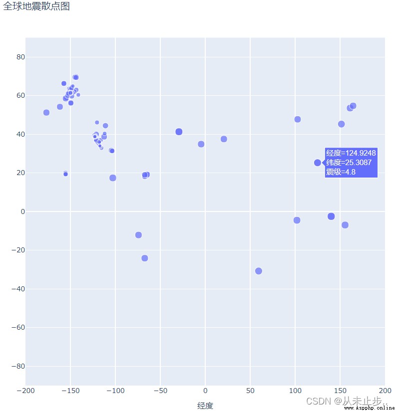 Compare the two pictures above,We will find that the information about the earthquake in the scatterplot also increases the magnitude,不僅如此,The size of the scatter is also related to the magnitude of the earthquake,The greater the magnitude,The larger the size of the scatter,這樣一來,We can easily observe earthquake strength in different places,But that's not intuitive enough,In order to be able to present the earthquake situation more directly,We also designed the color of the scatter for a clearer display.
方法:
color='震級', #The default gradient color ranges from blue to red to yellow,The smaller the value, the bluer the mark,而數值越大則標記越黃.
Just download it online30Day data files are copied to the program directory,將參數color添加其中,再繪制散點圖.,注意修改文件名.
如下圖所示: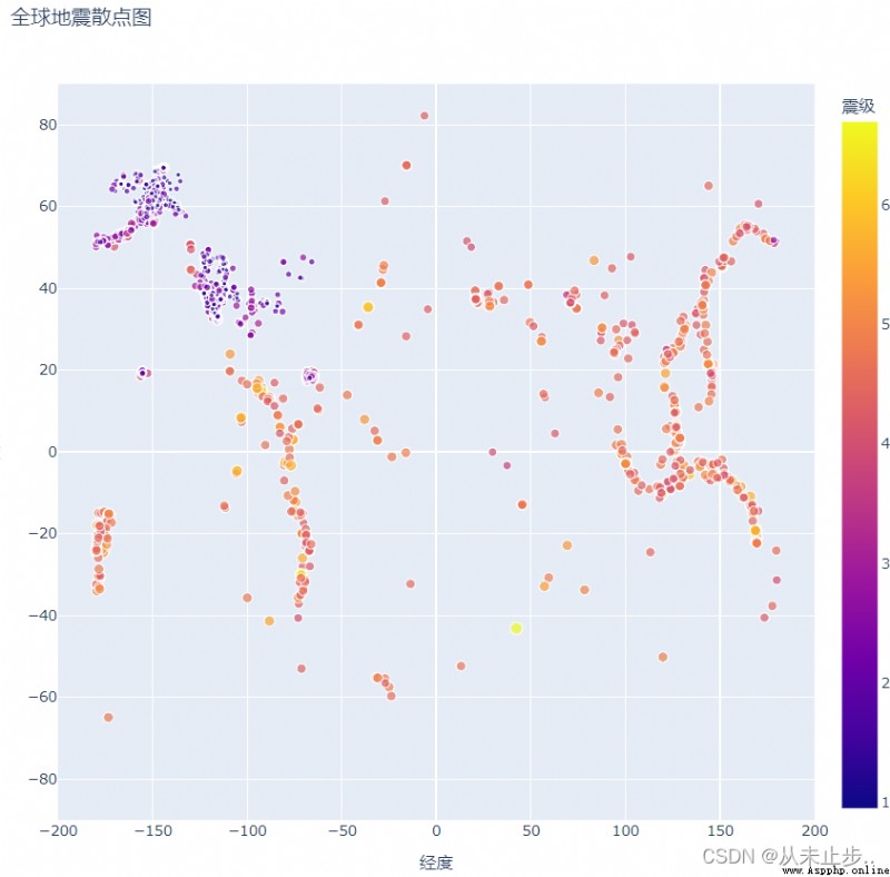 Beautified scatterplot,Not only is it much prettier in color,Gradient colors also more clearly reflect the severity of the earthquake.
不僅如此,Plotly ExpressAlso provides us with a lot of gradient colors,And these gradients are inpx.colors.named_colorscales()中定義的,Let's get these gradients:
import plotly.express as px
for key in px.colors.named_colorscales():
print(key,end='/')
輸出結果如下:
aggrnyl/agsunset/blackbody/bluered/blues/blugrn/bluyl/brwnyl/bugn/bupu/burg/burgyl/cividis
/darkmint/electric/emrld/gnbu/greens/greys/hot/inferno/jet/magenta/magma/mint/orrd/oranges
/oryel/peach/pinkyl/plasma/plotly3/pubu/pubugn/purd/purp/purples/purpor/rainbow/rdbu/rdpu
/redor/reds/sunset/sunsetdark/teal/tealgrn/turbo/viridis/ylgn/ylgnbu/ylorbr/ylorrd/algae
/amp/deep/dense/gray/haline/ice/matter/solar/speed/tempo/thermal/turbid/armyrose/brbg/earth
/fall/geyser/prgn/piyg/picnic/portland/puor/rdgy/rdylbu/rdylgn/spectral/tealrose/temps/tropic
/balance/curl/delta/oxy/edge/hsv/icefire/phase/twilight/mrybm/mygbm/
此外,We can also reverse the corresponding color list:
方法:
px.colors.diverging.RdYlGn[::-1]
此外,Plotly除了有px.colors.divergingRepresents a continuous color scheme,還有px.colors.sequential和px.colors.qualitative表示離散變量.Each gradient color has a start color and an end color,Some gradients also define one or more intermediate colors.
方法,使用參數hover_name,參數配置為data的‘位置’
hover_name='位置',
修改後,The output of the scatter plot is shown below: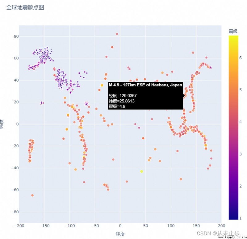 我們發現,Compare to the previous chart,At this time, the location information is added,此時,We have drawn a complete scatterplot of seismic information.