目錄
Plot sine and cosine curves with Chinese labels and legends
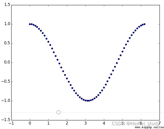
繪制散點圖
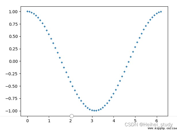
Modify the scatter symbol and size
修改顏色
繪制餅狀圖
Display the formula in the legend
Multiple images are displayed individually
Draws a histogram with stroke and fill effects
Use a radar chart to display student grades
繪制三維曲面
設置圖例樣式
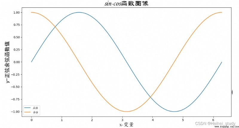
import numpy as np
import pylab as pl
import matplotlib.font_manager as fm
# Key parameters must be usedfname,The font file path must be correct
myfont = fm.FontProperties(fname=r'C:\Windows\Fonts\STKAITI.ttf') #設置字體
t = np.arange(0.0, 2.0*np.pi, 0.01) # 自變量取值范圍
s = np.sin(t) # 計算正弦函數值
z = np.cos(t) # 計算余弦函數值
pl.plot(t, s, label='正弦')
pl.plot(t, z, label='余弦')
pl.xlabel('x-變量', fontproperties='STKAITI', fontsize=18) # 設置x標簽
pl.ylabel('y-正弦余弦函數值', fontproperties='simhei', fontsize=18)
pl.title('sin-cos函數圖像', fontproperties='STLITI', fontsize=24) # 標題
pl.legend(prop=myfont) # 設置圖例
pl.show()
>>> a = np.arange(0, 2.0*np.pi, 0.1)
>>> b = np.cos(a)
>>> pl.scatter(a,b)
>>> pl.show()
>>> pl.scatter(a, b, s=20, marker='+')
>>> pl.show()
修改顏色
>>> import matplotlib.pylab as pl
>>> import numpy as np
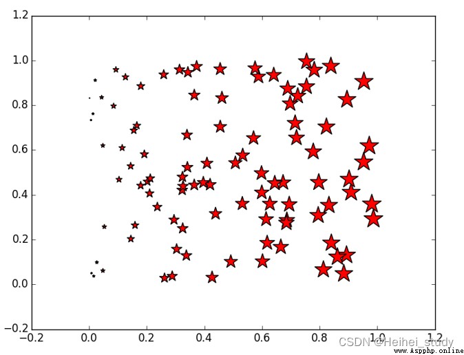
>>> x = np.random.random(100)
>>> y = np.random.random(100)
>>> pl.scatter(x, y, s=x*500, c=u'r', marker=u'*')
# s指大小,c指顏色,markerRefers to the symbol shape
>>> pl.show()
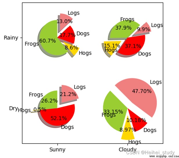
import numpy as np
import matplotlib.pyplot as plt
#The slices will be ordered and plotted counter-clockwise.
labels = 'Frogs', 'Hogs', 'Dogs', 'Logs'
colors = ['yellowgreen', 'gold', '#FF0000', 'lightcoral']
explode = (0, 0.1, 0, 0.1) # Make a pie chart2Pieces and Articles4sheet split
fig = plt.figure()
ax = fig.gca()
ax.pie(np.random.random(4), explode=explode, labels=labels, colors=colors,
autopct='%1.1f%%', shadow=True, startangle=90,
radius=0.25, center=(0, 0), frame=True) # autopctFormat the percentage within the pie
ax.pie(np.random.random(4), explode=explode, labels=labels, colors=colors,
autopct='%1.1f%%', shadow=True, startangle=45,
radius=0.25, center=(1, 1), frame=True)
ax.pie(np.random.random(4), explode=explode, labels=labels, colors=colors,
autopct='%1.1f%%', shadow=True, startangle=90,
radius=0.25, center=(0, 1), frame=True)
ax.pie(np.random.random(4), explode=explode, labels=labels, colors=colors,
autopct='%1.2f%%', shadow=False, startangle=135,
radius=0.35, center=(1, 0), frame=True)
ax.set_xticks([0, 1]) # 設置坐標軸刻度
ax.set_yticks([0, 1])
ax.set_xticklabels(["Sunny", "Cloudy"]) # Sets the labels on the axis ticks
ax.set_yticklabels(["Dry", "Rainy"])
ax.set_xlim((-0.5, 1.5)) # Set the axis span
ax.set_ylim((-0.5, 1.5))
ax.set_aspect('equal') # 設置縱橫比相等
plt.show()
python使用matplotlib繪制餅狀圖_Chen Xiaoxia's blog-CSDN博客_matplotlib餅狀圖
python 數據可視化———繪制餅狀圖(bar)_a1227406795的博客-CSDN博客_python餅狀圖
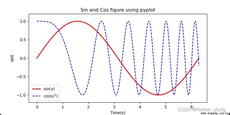
import numpy as np
import matplotlib.pyplot as plt
x = np.linspace(0, 2*np.pi, 500)
y = np.sin(x)
z = np.cos(x*x)
plt.figure(figsize=(8,4))
# 標簽前後加$will use inlineLaTexThe engine displays it as a formula
plt.plot(x,y,label='$sin(x)$',color='red',linewidth=2) # 紅色,2個像素寬
plt.plot(x,z,'b--',label='$cos(x^2)$') # 藍色,虛線
plt.xlabel('Time(s)')
plt.ylabel('Volt')
plt.title('Sin and Cos figure using pyplot')
plt.ylim(-1.2,1.2)
plt.legend() # 顯示圖例
plt.show() # 顯示繪圖窗口
import numpy as np
import matplotlib.pyplot as plt
x= np.linspace(0, 2*np.pi, 500) # 創建自變量數組
y1 = np.sin(x) # Create an array of function values
y2 = np.cos(x)
y3 = np.sin(x*x)
plt.figure(1) # 創建圖形
ax1 = plt.subplot(2,2,1) # 第一行第一列圖形
ax2 = plt.subplot(2,2,2) # 第一行第二列圖形
ax3 = plt.subplot(212, facecolor='y') # 第二行
plt.sca(ax1) # 選擇ax1
plt.plot(x,y1,color='red') # Draw a red curve
plt.ylim(-1.2,1.2) # 限制y坐標軸范圍
plt.sca(ax2) # 選擇ax2
plt.plot(x,y2,'b--') # Draw a blue curve
plt.ylim(-1.2,1.2)
plt.sca(ax3) # 選擇ax3
plt.plot(x,y3,'g--')
plt.ylim(-1.2,1.2)
plt.show()
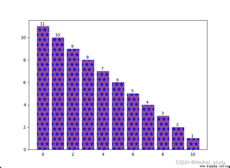
import numpy as np
import matplotlib.pyplot as plt
#生成測試數據
x = np.linspace(0, 10, 11)
y = 11-x
#繪制柱狀圖
plt.bar(x, y,
color='#772277', #柱的顏色
alpha=0.8, #透明度
edgecolor='blue', #邊框顏色
linestyle='--', #The border style is dashed
linewidth=1, #邊框線寬
hatch='*') #The interior is filled with five-pointed stars
#Add text labels to each column
for xx, yy in zip(x,y):
plt.text(xx-0.2, yy+0.1, '%2d' % yy)
#顯示圖形
plt.show()
import numpy as np
import matplotlib.pyplot as plt
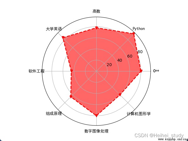
courses = ['C++', 'Python', '高數', '大學英語', '軟件工程',
'組成原理', '數字圖像處理', '計算機圖形學']
scores = [80, 95, 78, 85, 45, 65, 80, 60]
dataLength = len(scores) # 數據長度
# angles數組把圓周等分為dataLength份
angles = np.linspace(0, # 數組第一個數據
2*np.pi, # The last data in the array
dataLength, # The number of data in the array
endpoint=False) # 不包含終點
scores.append(scores[0])
angles = np.append(angles, angles[0]) # 閉合
# 繪制雷達圖
plt.polar(angles, # 設置角度
scores, # 設置各角度上的數據
'rv--', # 設置顏色、線型和端點符號
linewidth=2) # 設置線寬
# 設置角度網格標簽
plt.thetagrids(angles*180/np.pi,
courses,
fontproperties='simhei')
# 填充雷達圖內部
plt.fill(angles,
scores,
facecolor='r',
alpha=0.6)
plt.show()報錯的解決:
PythonResolution of pits encountered when drawing radar maps_Python-免費資源網
You can also add one more sentence
courses.append(courses[0])
np.mgrid使用 - 碼農教程
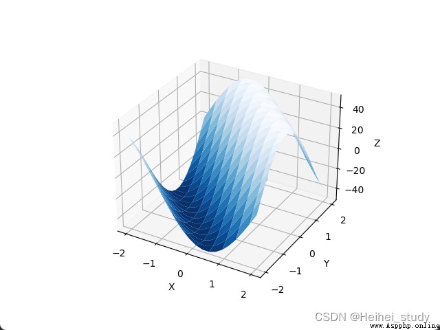
import numpy as np
import matplotlib.pyplot as plt
import mpl_toolkits.mplot3d
x,y = np.mgrid[-2:2:20j, -2:2:20j] # The step size uses an imaginary number
# The imaginary part represents the number of points
# 並且包含end
z = 50 * np.sin(x+y) # 測試數據
ax = plt.subplot(111, projection='3d') # 三維圖形
ax.plot_surface(x,y,z,rstride=2, cstride=1, cmap=plt.cm.Blues_r)
ax.set_xlabel('X') # 設置坐標軸標簽
ax.set_ylabel('Y')
ax.set_zlabel('Z')
plt.show()
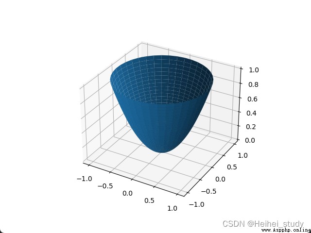
import pylab as pl
import numpy as np
import mpl_toolkits.mplot3d
rho, theta = np.mgrid[0:1:40j, 0:2*np.pi:40j]
z = rho**2
x = rho*np.cos(theta)
y = rho*np.sin(theta)
ax = pl.subplot(111, projection='3d')
ax.plot_surface(x,y,z)
pl.show()
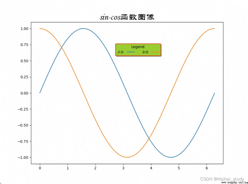
import numpy as np
import matplotlib.pyplot as plt
import matplotlib.font_manager as fm
t = np.arange(0.0, 2*np.pi, 0.01)
s = np.sin(t)
z = np.cos(t)
plt.plot(t, s, label='正弦')
plt.plot(t, z, label='余弦')
plt.title('sin-cos函數圖像', #標題文本
fontproperties='STLITI', #標題字體
fontsize=24) #標題字號
myfont = fm.FontProperties(fname=r'C:\Windows\Fonts\STKAITI.ttf')
plt.legend(prop=myfont, #圖例字體
title='Legend', #圖例標題
loc='lower left', #The bottom left corner of the legend is on the graph(0.43,0.75)的位置
bbox_to_anchor=(0.43,0.75),
shadow=True, #顯示陰影
facecolor='yellowgreen', #圖例背景色
edgecolor='red', #圖例邊框顏色
ncol=2, #顯示為兩列
markerfirst=False) #圖例文字在前,符號在後
plt.show()
 Super detailed Python information. Dont worry about getting started or advanced
Python3.11 To be released in t
 This plug-in can connect Python and excel and generate code automatically!
Load one Jupyter After the plu