Modify the image on the right
Please change the style of the graphics
請將 x The axis data is changed to -10 到 10
Please construct one yourself y 值的函數
Put the numbers on the histogram,Change the position to the inner vertical center of the column chart
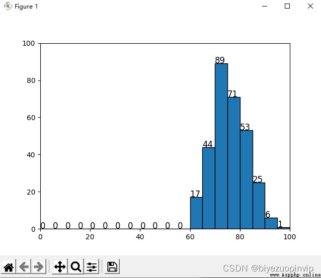
for grade data data1402.csv Segment statistics:每 5 points as a fractional segment,Displays a histogram of the number of people in each fractional segment.
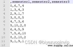
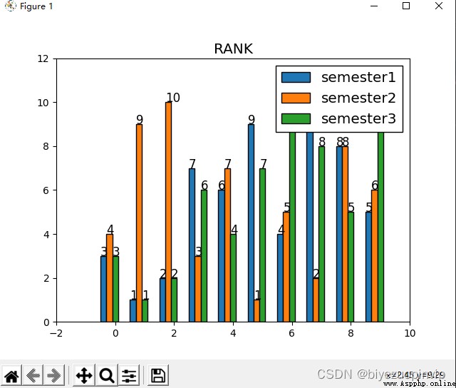
Create it yourself 10 個學生的 3 Semester ranking data,And compare and display through histogram.
線圖
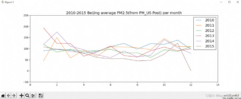
Display Beijing air quality data with a line graph
展示 10-15 年 PM Changes in the monthly average of the index,There is a picture 6 條曲線,每年 1 條曲線.
Microsoft Windows 10 版本18363
PyCharm 2020.2.1 (Community Edition)
Python 3.8(Scrapy 2.4.0 + numpy 1.19.4 + pandas 1.1.4 + matplotlib 3.3.3)
from matplotlib import pyplot as plt
import numpy as np
fig, ax = plt.subplots()
plt.style.use('classic')
plt.title("square numbers")
ax.set_xlim(-11, 11)
ax.set_ylim(0, 100)
x = np.array(range(-10, 11))
y = x * x
rect1 = plt.bar(x, y)
for r in rect1:
ax.text(r.get_x(), r.get_height() / 2, r.get_height())
plt.show()
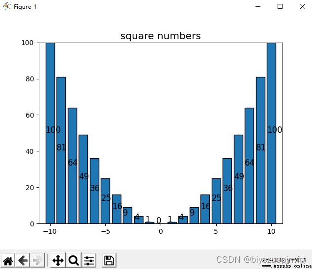
如圖使用 classic 風格,x 軸數據為[-10, 10]的整數,The constructed function is y=x2,Displayed the position and changed the value to be vertically centered inside the column chart.
from matplotlib import pyplot as plt
import numpy as np
import pandas as pd
df = pd.read_csv("./data1402.csv", encoding='utf-8', dtype=str)
df = pd.DataFrame(df, columns=['score'], dtype=np.float)
section = np.array(range(0, 105, 5))
result = pd.cut(df['score'], section)
count = pd.value_counts(result, sort=False)
fig, ax = plt.subplots()
plt.style.use('classic')
ax.set_xlim(0, 100)
rect1 = plt.bar(np.arange(2.5, 100, 5), count, width=5)
for r in rect1:
ax.text(r.get_x(), r.get_height(), r.get_height())
plt.show()
import random
semester1 = np.arange(1, 11)
semester2 = np.arange(1, 11)
semester3 = np.arange(1, 11)
random.shuffle(semester1)
random.shuffle(semester2)
random.shuffle(semester3)
df = pd.DataFrame({'semester1':semester1, 'semester2':semester2, 'semester3':semester3})
print(df)
df.to_csv("data1403.csv", encoding="utf-8")
Use the code above to create random ranking data.
df = pd.read_csv("./data1403.csv", encoding='utf-8', dtype=str)
df = pd.DataFrame(df, columns=['semester1', 'semester2', 'semester3'], dtype=np.int)
df['total'] = (df['semester1'] + df['semester2'] + df['semester3']) / 3
df = df.sort_values('total')
fig, ax = plt.subplots()
plt.style.use('classic')
plt.title('RANK')
width = 0.2
x = np.array(range(0, 10))
rect1 = ax.bar(x-2*width, df['semester1'], width=width, label='semester1')
rect2 = ax.bar(x-width, df['semester2'], width=width, label='semester2')
rect3 = ax.bar(x, df['semester3'], width=width, label='semester3')
for r in rect1:
ax.text(r.get_x(), r.get_height(), r.get_height())
for r in rect2:
ax.text(r.get_x(), r.get_height(), r.get_height())
for r in rect3:
ax.text(r.get_x(), r.get_height(), r.get_height())
plt.legend(ncol=1)
plt.show()
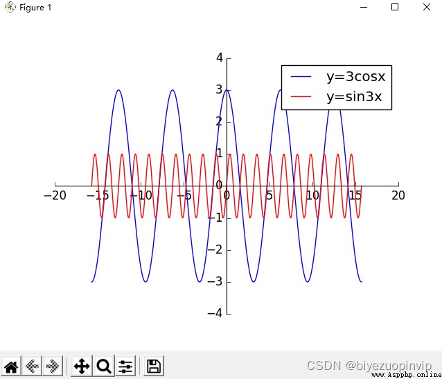
Plot the code above:
import numpy as np
from matplotlib import pyplot as plt
x = np.linspace(-5 * np.pi, 5 * np.pi, 500)
y1 = 3 * np.cos(x)
y2 = np.sin(4*x)
fig, ax = plt.subplots()
plt.style.use('classic')
ax.spines["right"].set_visible(False)
ax.spines["top"].set_visible(False)
ax.spines['bottom'].set_position(('data',0))
ax.xaxis.set_ticks_position('bottom')
ax.spines['left'].set_position(('data',0))
ax.yaxis.set_ticks_position('left')
plt.plot(x, y1, color='blue', linestyle='-', label='y=3cosx')
plt.plot(x, y2, color='red', linestyle='-', label='y=sin3x')
plt.legend()
plt.show()
展示 10-15 年 PM Changes in the monthly average of the index,There is a picture 6 條曲線,每年 1 條曲線.
 import numpy as np
import pandas as pd
from matplotlib import pyplot as plt
orig_df = pd.read_csv("./BeijingPM20100101_20151231.csv", encoding='utf-8', dtype=str)
orig_df = pd.DataFrame(orig_df, columns=['year', 'month', 'PM_US Post'])
df = orig_df.dropna(0, how='any')
df['month'] = df['month'].astype(int)
df['year'] = df['year'].astype(int)
df['PM_US Post'] = df['PM_US Post'].astype(int)
df.reset_index(drop=True, inplace=True)
num = len(df)
section = np.arange(1, 13)
record = 0
fig, ax = plt.subplots()
plt.style.use('classic')
plt.title("2010-2015 Beijing average PM2.5(from PM_US Post) per month")
for nowyear in range(2010, 2016):
i = record
result = [0 for i in range(13)]
nowsum = 0
cntday = 0
nowmonth = 1
while i < num:
if df['month'][i] == nowmonth:
cntday = cntday + 1
nowsum = nowsum + df['PM_US Post'][i]
else:
if df['year'][i] != nowyear:
record = i
result[nowmonth] = nowsum / cntday
break
result[nowmonth] = nowsum / cntday
cntday = 1
nowsum = df['PM_US Post'][i]
nowmonth = df['month'][i]
i = i + 1
result = result[1:]
#
x = np.array(range(1, 13))
plt.plot(x, result, linestyle='-', label=str(nowyear))
plt.legend()
plt.show()