Today, big data Well known , But in this age of information explosion , There is no practical value in using massive data , Not to mention helping managers make business decisions . So what's the value of data ? What means can be used to express the value of data intuitively and clearly ?
The answer is to provide intuition like the human eye 、 Interactive and responsive visualization Environmental Science . Data visualization is a perfect combination of technology and art , With the help of graphical means , Convey and communicate information clearly and effectively , intuitive 、 Visually display massive amounts of data and information , And interactive processing .
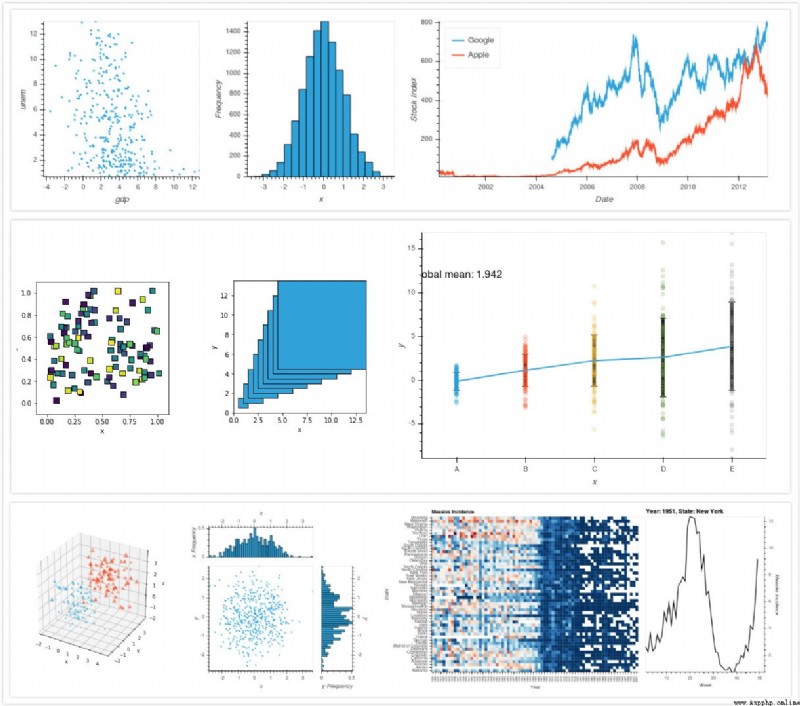
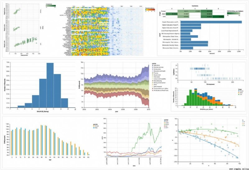
Data visualization It's widely used , It can almost be applied to Natural Science 、 Engineering technology 、 Finance 、 Various fields such as communication and business . Now we are based on Python, This paper briefly introduces several practical visualization libraries that are applicable to various fields , Get you started quickly !!
Matplotlib — Visualization with Python
Matplotlib It's a Python 2 Dimensional drawing library , Has become a python A recognized data visualization tool in , adopt Matplotlib You can easily draw some simple or complex map shapes , A few lines of code can generate a line graph 、 Histogram 、 Power spectrum 、 Bar chart 、 Error map 、 Scatter plot and so on .
For some simple drawings , Especially with IPython When used in combination ,pyplot The module provides one matlab Interface . You can use an object-oriented interface or some MATLAB To change the control line style 、 Font properties 、 Axis properties, etc .
install :
Method 1 :
sudo apt-get install python-dev
sudo apt-get install python-matplotlib
Method 2 :
pip install matplotlib
Download the corresponding installation package first pyproj and matplotlib
open Anaconda Prompt, Enter the path where the installation package is located , Then type in
pip install pyproj 1.9.5.1 cp36 cp36m win_amd64.whl # Enter the downloaded pyproj file name
pip install matplotlib_tests‑2.1.0‑py2.py3‑none‑any.whl
Method 1 :
pip install matplotlib
Method 2 :
sudo curl -O https://bootstrap.pypa.io/get-pip.py
sudo python get-pip.py
Quick start
import numpy as np
import matplotlib.mlab as mlab
import matplotlib.pyplot as plt
# Generate random numbers
np.random.seed(19680801)
# Define the distribution characteristics of data
mu = 100
sigma = 15
x = mu + sigma * np.random.randn(437)
num_bins = 50
fig, ax = plt.subplots()
n, bins, patches = ax.hist(x, num_bins, normed=1)
# Add chart elements
y = mlab.normpdf(bins, mu, sigma)
ax.plot(bins, y, '--')
ax.set_xlabel('Smarts')
ax.set_ylabel('Probability density')
ax.set_title(r'Histogram of IQ: $\mu=100$, $\sigma=15$')
# Picture display and preservation
fig.tight_layout()
plt.savefig("Histogram.png")
plt.show()
Running results 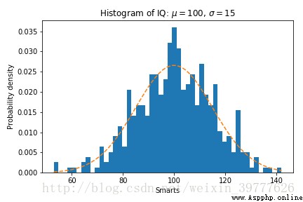
seaborn: statistical data visualization — seaborn 0.11.2 documentation
Seaborn Is based on matplotlib A module generated , Specialized in statistical visualization , You can talk to pandas Make seamless links , Make it easier for beginners to get started . be relative to matplotlib,Seaborn The grammar is more concise , The relationship between them is similar to numpy and pandas The relationship between .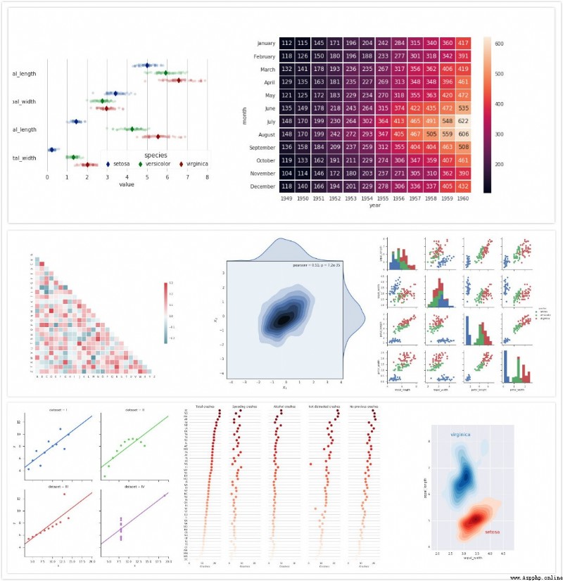
install :
sudo pip install seaborn
pip install seaborn
Quick start
import seaborn as sns
sns.set()
from matplotlib import pyplot
# Load data set
tips = sns.load_dataset("tips")
# mapping
sns.boxplot(x="day", y="total_bill", hue="sex", data=tips, palette="PRGn")
sns.despine(offset=10, trim=True)
# Picture display and preservation
pyplot.savefig("GroupedBoxplots.png")
pyplot.show()
Running results 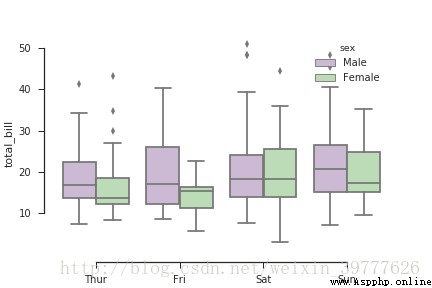
Installation — HoloViews v1.14.8
HoloViews It's an open source Python library , It can be done in very few lines of code data Analysis and Visualization , Except for the default matplotlib Rear end outside , And added a Bokeh Back end .Bokeh Provides a powerful platform , By combining Bokeh Interactive widget provided , have access to HTML5 canvas and WebGL Quickly generate interactivity and high-dimensional visualization , Very suitable for data Interactive Explore .
install
Method 1 :
pip install HoloViews
Method 2 :
conda install -c ioam/label/dev holoviews
Method 3 :
git clone git://github.com/ioam/holoviews.git
cd holoviews
pip install -e
Method four :
Click on download install
Quick start
import numpy as np
import holoviews as hv
# call bokeh
hv.extension('bokeh')
# data input
frequencies = [0.5, 0.75, 1.0, 1.25]
# Define the curve
def sine_curve(phase, freq):
xvals = [0.1* i for i in range(100)]
return hv.Curve((xvals, [np.sin(phase+freq*x) for x in xvals]))
# Call function , Output image
dmap = hv.DynamicMap(sine_curve, kdims=['phase', 'frequency'])
dmap.redim.range(phase=(0.5,1)).redim.range(frequency=(0.5,1.25))
Running results 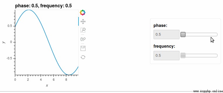
Altair: Declarative Visualization in Python — Altair 4.2.0 documentation
Altair yes Python A recognized statistical visualization Library . its API Simple 、 friendly 、 Agreement , And built on a strong vega - lite( Interactive graphics Syntax ) above .Altair API Does not contain actual visual rendering code , But according to vega - lite Specification issue JSON data structure . The resulting data can be presented in the user interface , This elegant simplicity produces beautiful and effective visualization , And with very little code .
The data source is a DataFrame, It consists of columns of different data types .DataFrame It's a neat format , The row corresponds to the sample , The columns correspond to the observed variables . The data is mapped to the visual attributes of the usage group through data transformation ( Location 、 Color 、 size 、 shape 、 Panel, etc ).
install
Method 1 :
pip install Altair
Method 2 :
conda install altair --channel conda-forge
Quick start
import altair as alt
# Load data set
cars = alt.load_dataset('cars')
# mapping
alt.Chart(cars).mark_point().encode(
x='Horsepower',
y='Miles_per_Gallon',
color='Origin',
)
PyQtGraph - Scientific Graphics and GUI Library for Python
PyQtGraph Is in PyQt4 / PySide and numpy Pure built on python Of GUI Graphics library . It is mainly used in mathematics , science , Engineering field . Even though PyQtGraph It's all in python Writing in the , But it is a very capable graphics system , It can process a large amount of data , Number operation ; Used Qt Of GraphicsView The framework optimizes and simplifies the workflow , Realize data visualization with minimum workload , And it's very fast .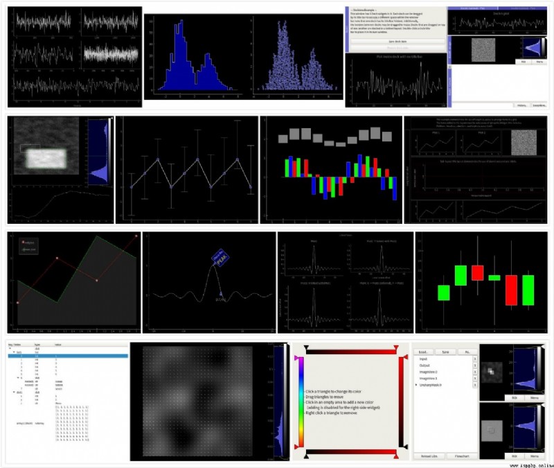
install
Method 1
pip install PyQtGraph
Method 2
Click on download install
Quick start
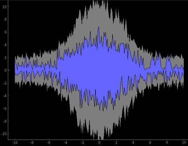
import pyqtgraph as pg
from pyqtgraph.Qt import QtGui, QtCore
import numpy as np
# Create a drawing area
win = pg.plot()
win.setWindowTitle('pyqtgraph example: FillBetweenItem')
win.setXRange(-10, 10)
win.setYRange(-10, 10)
# curve
N = 200
x = np.linspace(-10, 10, N)
gauss = np.exp(-x**2 / 20.)
mn = mx = np.zeros(len(x))
curves = [win.plot(x=x, y=np.zeros(len(x)), pen='k') for i in range(4)]
brushes = [0.5, (100, 100, 255), 0.5]
fills = [pg.FillBetweenItem(curves[i], curves[i+1], brushes[i]) for i in range(3)]
for f in fills:
win.addItem(f)
def update():
global mx, mn, curves, gauss, x
a = 5 / abs(np.random.normal(loc=1, scale=0.2))
y1 = -np.abs(a*gauss + np.random.normal(size=len(x)))
y2 = np.abs(a*gauss + np.random.normal(size=len(x)))
s = 0.01
mn = np.where(y1<mn, y1, mn) * (1-s) + y1 * s
mx = np.where(y2>mx, y2, mx) * (1-s) + y2 * s
curves[0].setData(x, mn)
curves[1].setData(x, y1)
curves[2].setData(x, y2)
curves[3].setData(x, mx)
# time axis
timer = QtCore.QTimer()
timer.timeout.connect(update)
timer.start(30)
# start-up Qt
if __name__ == '__main__':
import sys
if (sys.flags.interactive != 1) or not hasattr(QtCore, 'PYQT_VERSION'):
QtGui.QApplication.instance().exec_()
http://ggplot.yhathq.com/
ggplot Is based on R Of ggplot2 And graphic grammar Python The drawing system of , Less code and more professional graphics .
It uses an advanced and expressive API To achieve line , Addition of elements such as points , The combination or addition of different types of visual components such as color change , Instead of reusing the same code , However, for those who are trying to be highly customized ,ggplot It's not the best choice , Although it can also make some very complicated 、 Nice graphics .
ggplot And pandas Close ties . If you plan to use ggplot, It's best to keep the data in DataFrames in .
install :
pip install numpy
pip install scipy
pip install statsmodels
pip install ggplot
download ggplot Install the package and run
pip install ggplot‑0.11.5‑py2.py3‑none‑any.whl
Quick start
from ggplot import *
ggplot(aes(x='date', y='beef', ymin='beef - 1000', ymax='beef + 1000'), data=meat) + \
geom_area() + \
geom_point(color='coral')
Running results 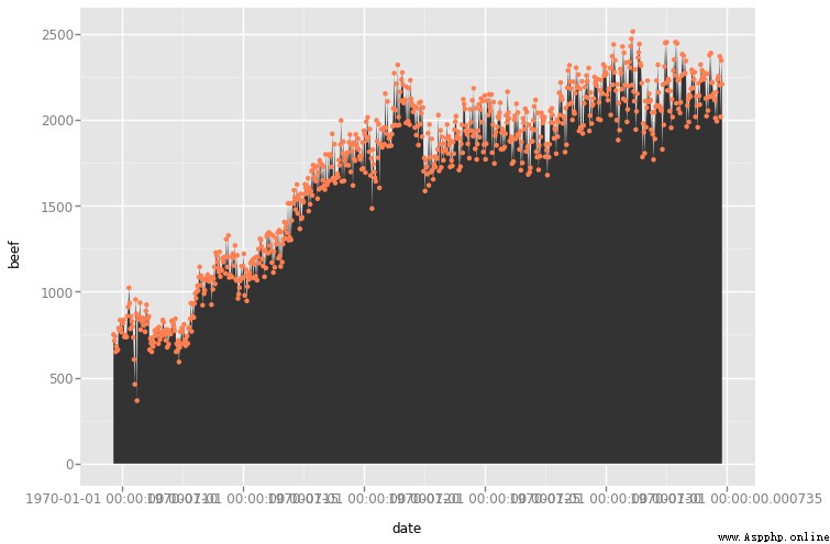
Bokeh documentation — Bokeh 2.4.2 Documentation
Bokeh It's a Python Interactive visualization Library , Support modernization web Browser display ( The chart can be output as JSON object ,HTML Documents or interactive web applications ). It offers elegant style 、 concise D3.js Graphical style of , And extend this function to high-performance interactive data sets , On the data stream . Use Bokeh You can quickly and easily create interactive drawings 、 Dashboards and data applications .
Bokeh Can and NumPy,Pandas,Blaze And most of the data structures in array or table format .
install :
Method 1 : If you have configuration anaconda If so, use the following command ( recommend )
conda install bokeh
Method 2 :
pip install numpy
pip install pandas
pip install redis
pip install bokeh
Quick start
from bokeh.plotting import figure, output_file, show
# Create diagrams
p = figure(plot_width=300, plot_height=300, tools="pan,reset,save")
# A circle
p.circle([1, 2.5, 3, 2], [2, 3, 1, 1.5], radius=0.3, alpha=0.5)
# Define the output file format
output_file("foo.html")
# Pictures show
show(p)
Running results 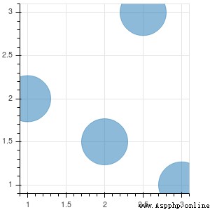
Pygal — pygal 2.0.0 documentation
pygal Is an open standard vector graphics language , It's based on XML(Extensible Markup Language), High resolution that can generate multiple output formats Web Graphic page , It also supports html Table export . Users can directly use the code to describe the image , It can be opened with any word processing tool SVG Images , Make the image interactive by changing part of the code , And can be inserted into HTML You can watch it in a browser .
install :
pip install pygal
The order is similar to
python -m pip install --user pygal==1.7
The order is similar to
Method 1 :
pip install --user pygal==1.7
Method 2 :
pip install git+https://github.com/vispy/vispy.git
Quick start
import pygal
# Declare chart type
bar_chart = pygal.StackedBar()
# mapping
bar_chart.add('Fibonacci', [0, 1, 1, 2, 3, 5, 8, 13, 21, 34, 55])
bar_chart.add('Padovan', [1, 1, 1, 2, 2, 3, 4, 5, 7, 9, 12])
# Save the picture
bar_chart.render_to_png('bar1.png')
Running results 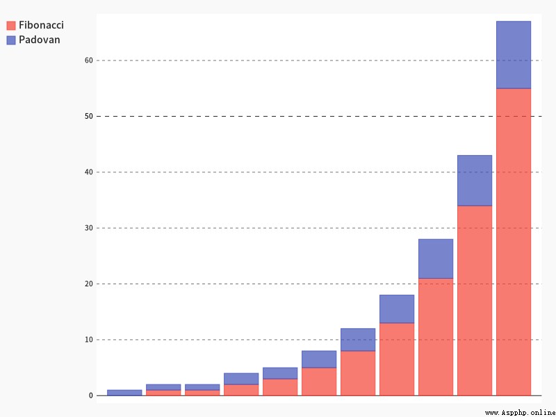
http://vispy.org/gallery.html
VisPy Is an interactive scientific visualization Python library , Fast 、 Telescopic 、 And easy to use , It's a high-performance interactive 2D / 3D Data visualization Library , Using modern graphics processing unit (gpu) Computing power , adopt OpenGL Library to display very large data sets .
install
pip install VisPy
Quick start
from vispy.plot import Fig
# Calling class (Fig)
fig = Fig()
# establish PlotWidget
ax_left = fig[0, 0]
ax_right = fig[0, 1]
# mapping
import numpy as np
data = np.random.randn(2, 3)
ax_left.plot(data)
ax_right.histogram(data[1])
Running results 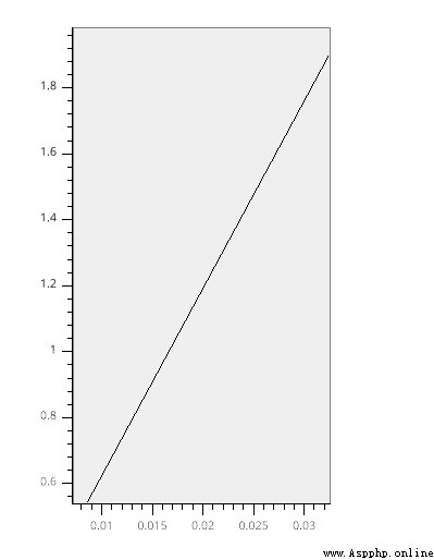
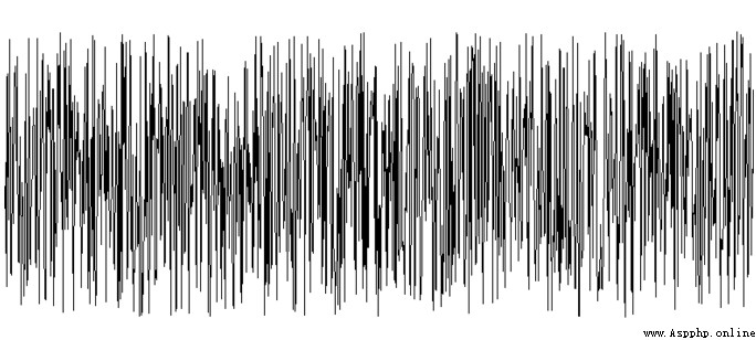
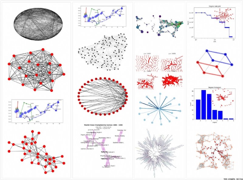
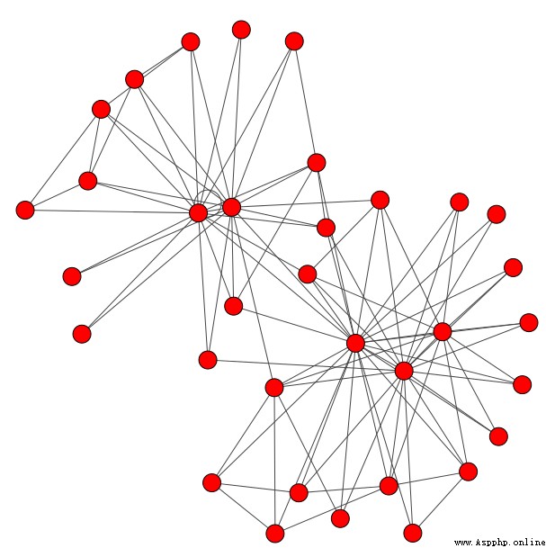
Tutorial — NetworkX 2.6.2 documentation
NetworkX It's a Python package , Used to create 、 Manipulate and study the structure of complex networks 、 And learning the structure of complex networks 、 Function and its dynamics .
NetworkX It provides charts suitable for various data structures 、 Binary alphabet and multigraph , There are also a large number of standard graph algorithms , Network structure and analysis measures , Random networks can be generated 、 Synthetic network or classical network , And the node can be text 、 Images 、XML Records, etc. , Some sample data are provided ( Such as weight , The time series ).
NetworkX The code coverage of the test exceeds 90%, It's a diversity , Easy to teach , Can quickly generate graphics Python platform .
install
Method 1 :
pip install networkx
Method 2 :
Click on download install
Quick start
import matplotlib.pyplot as plt
import networkx as nx
import numpy.linalg
# Generate random number
n = 1000
m = 5000
G = nx.gnm_random_graph(n, m)
# Define data distribution characteristics
L = nx.normalized_laplacian_matrix(G)
e = numpy.linalg.eigvals(L.A)
# Draw and display
plt.hist(e, bins=100)
plt.xlim(0, 2)
plt.show()
Running results 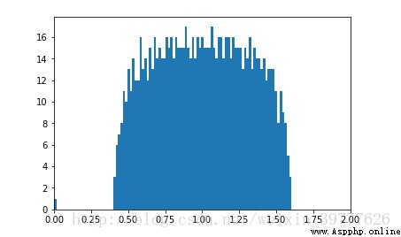
Plotly Python Graphing Library | Python | Plotly
Plotly Of Python graphing library It provides interactive on the Internet 、 Open , High quality chart sets , But with R、python、matlab Wait for software docking . It has several chart types that are hard to find in other libraries , Such as contour map , Tree charts and three-dimensional charts , Icon types are also very rich , Yes API After key , You can synchronize statistical graphs to the cloud with one click . But the beauty is , Opening foreign websites will be time-consuming , And an account can only be created 25 A chart , Unless you upgrade or delete some charts .

install :
pip install plotly
Quick start
import plotly.plotly as py
import plotly.graph_objs as go
trace1 = go.Scatter(
x=[0, 1, 2, 3, 4, 5],
y=[1.5, 1, 1.3, 0.7, 0.8, 0.9]
)
trace2 = go.Bar(
x=[0, 1, 2, 3, 4, 5],
y=[1, 0.5, 0.7, -1.2, 0.3, 0.4]
)
data = [trace1, trace2]
py.iplot(data, filename='bar-line')
Running results 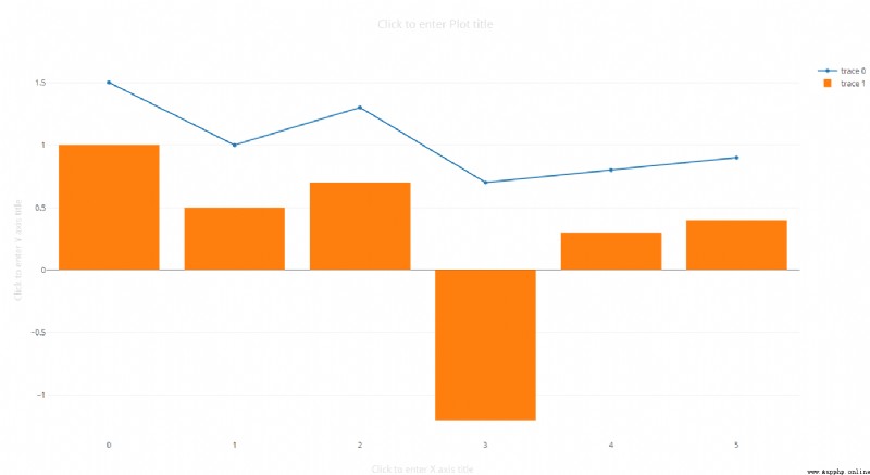
geoplot: geospatial data visualization — geoplot 0.4.4 documentation
Basemap and Cartopy The package supports multiple geographic projections , And provide some visual effects , Including point diagram 、 Thermogram 、 Contour map and shape file .PySAL It's a by Python The open source library of spatial analysis functions , It provides many basic tools , Mainly used for shape files . however , These libraries do not allow users to draw map maps , And visualization of customization 、 Limited support for interactivity and animation .
geoplotlib yes python A toolkit for geographic data visualization and mapping , It also provides a basic interface between raw data and all visualizations , Support in pure python Develop hardware accelerated interactive visualization in , And provide point mapping 、 Kernel density estimation 、 Spatial map 、 Tyson polygon 、 Shape files and many more common implementations of spatial visualization . In addition to providing built-in visualization functions for common geographic data visualization ,geoplotlib It also allows you to define complex data visualizations by defining custom layers ( draw OpenGL, Such as scores 、 Rows and polygons with high performance ), Create animation .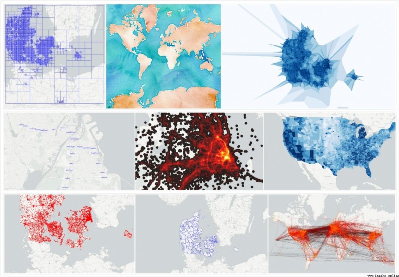
install :
pip install geoplotlib
Quick start
from geoplotlib.layers import DelaunayLayer
import geoplotlib
from geoplotlib.utils import read_csv, BoundingBox
data = read_csv('data/bus.csv')
geoplotlib.delaunay(data, cmap='hot_r')
geoplotlib.set_bbox(BoundingBox.DK)
geoplotlib.set_smoothing(True)
geoplotlib.show()
Running results 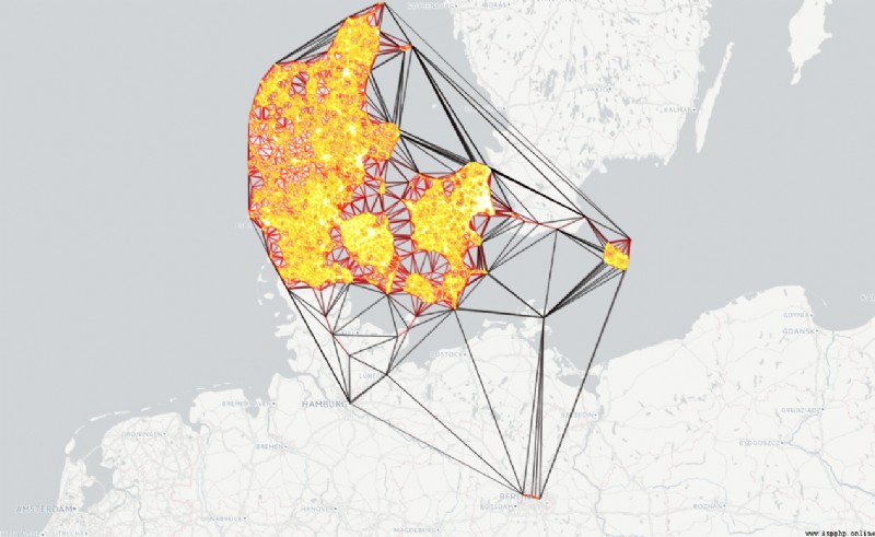
Folium — Folium 0.12.1 documentation
folium It's a building on Python On top of the system js library , It is easy to put in Python The data operated in is visualized as an interactive single map , And will closely link the data with the map , Customizable arrows , Grid, etc HTML Format map marker . The library also has some built-in terrain data .
install
Method 1 :
pip install folium
Method 2 :
conda install folium
Method 3 :
Click on download install
Quick start
import folium
# Determine latitude and longitude
m = folium.Map(location=[45.5236, -122.6750])
m
Running results 
Gleam Allow you to use only Python Build interactive data , Generate visual web applications . Not required HTML CSS or JaveScript knowledge , You can use either Python Visual library control input . When you create a chart , You can add a field to it , Let anyone play with your data in real time , Make your data easier to understand .
install :
pip install Gleam
Quick start
from wtforms import fields
from ggplot import *
from gleam import Page, panels
# Define the drawing function
class ScatterInput(panels.InputPanel):
title = fields.StringField(label="Title of plot:")
yvar = fields.SelectField(label="Y axis",
choices=[("beef", "Beef"),
("pork", "Pork")])
smoother = fields.BooleanField(label="Smoothing Curve")
class ScatterPlot(panels.PlotPanel):
name = "Scatter"
def plot(self, inputs):
p = ggplot(meat, aes(x='date', y=inputs.yvar))
if inputs.smoother:
p = p + stat_smooth(color="blue")
p = p + geom_point() + ggtitle(inputs.title)
return p
class ScatterPage(Page):
input = ScatterInput()
output = ScatterPlot()
# function
ScatterPage.run()
Running results 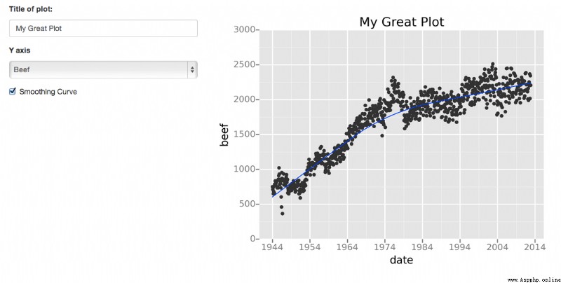
Vincent: A Python to Vega Translator — Vincent 0.4 documentation
Vincent Is a cool visualization tool , It uses Python Data structure as data source , Then translate it into Vega Visual grammar , And can be in d3js Up operation . This allows you to use Python Script to create beautiful 3D Graph to show your data .Vincent Bottom use Pandas and DataFrames data , And support a large number of charts ---- Bar chart 、 Line graph 、 Scatter plot 、 Heat map 、 Stacking bar graph 、 Grouped bars 、 The pie chart 、 Cycle graph 、 Maps, etc .
install
pip install vincent
Quick start
import vincent
bar = vincent.Bar(multi_iter1['y1'])
bar.axis_titles(x='Index', y='Value')
bar.to_json('vega.json')
Running results 
mpld3 — Bringing Matplotlib to the Browser
mpld3 be based on python Of graphing library and D3js, A collection of Matplotlib Of popular projects JavaScript library , Used to create web Interactive data visualization . Through a simple API, take matplotlib Export drawing as HTML Code , these HTML The code can be used in the browser .
install
Method 1 :
pip install mpld3
Method 2 :
Click on download install
Quick start
import matplotlib.pyplot as plt
import numpy as np
import mpld3
from mpld3 import plugins
fig, ax = plt.subplots()
x = np.linspace(-2, 2, 20)
y = x[:, None]
X = np.zeros((20, 20, 4))
X[:, :, 0] = np.exp(- (x - 1) ** 2 - (y) ** 2)
X[:, :, 1] = np.exp(- (x + 0.71) ** 2 - (y - 0.71) ** 2)
X[:, :, 2] = np.exp(- (x + 0.71) ** 2 - (y + 0.71) ** 2)
X[:, :, 3] = np.exp(-0.25 * (x ** 2 + y ** 2))
im = ax.imshow(X, extent=(10, 20, 10, 20),
origin='lower', zorder=1, interpolation='nearest')
fig.colorbar(im, ax=ax)
ax.set_title('An Image', size=20)
plugins.connect(fig, plugins.MousePosition(fontsize=14))
mpld3.show()
Running results 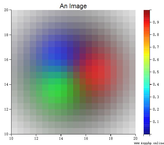
python-igraph
Python Interface igraph High performance graphics library , It mainly focuses on the research and analysis of complex networks
install
Method 1 :
pip install python-igraph
Method 2 :
Click on download install
Quick start
from igraph import *
layout = g.layout("kk")
plot(g, layout = layout)
Running results 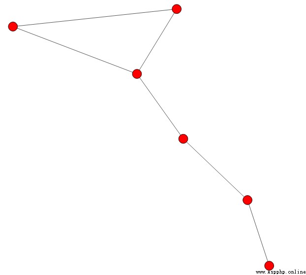
GitHub - ResidentMario/missingno: Missing data visualization module for Python.
There is no high-quality data , There is no high-quality data mining results , When we do supervised learning algorithms , It is inevitable to encounter chaotic data sets , Missing value , When the missing ratio is very small , The missing records can be discarded directly or handled manually ,missingno Provides a small, flexible 、 Easy to use data visualization and utility set , Using images allows you to quickly assess the lack of data , Instead of struggling in the data sheet . You can sort or filter the data according to the integrity of the data , Or consider revising the data according to the heat map or tree view .
missingno Is based on matplotlib Build a module , So it's very fast , And can handle flexibly pandas data .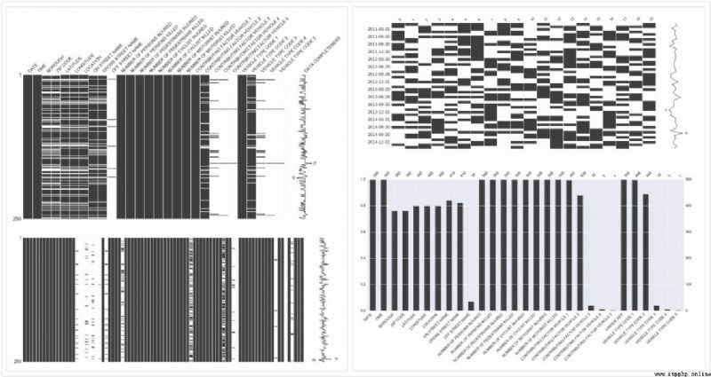
install :
Method 1 :
pip install missingno
Method 2 :
Click on download install
Quick start
import missingno as msno
import pandas as pd
import pandas_datareader.data as web
import numpy as np
p=print
save_loc = '/YOUR/PROJECT/LOCATION/'
logo_loc = '/YOUR/WATERMARK/LOCATION/'
# get index and fed data
f1 = 'USREC' # recession data from FRED
start = pd.to_datetime('1999-01-01')
end = pd.datetime.today()
mkt = '^GSPC'
MKT = (web.DataReader([mkt,'^VIX'], 'yahoo', start, end)['Adj Close']
.resample('MS') # month start b/c FED data is month start
.mean()
.rename(columns={mkt:'SPX','^VIX':'VIX'})
.assign(SPX_returns=lambda x: np.log(x['SPX']/x['SPX'].shift(1)))
.assign(VIX_returns=lambda x: np.log(x['VIX']/x['VIX'].shift(1)))
)
data = (web.DataReader([f1], 'fred', start, end)
.join(MKT, how='outer')
.dropna())
p(data.head())
p(data.info())
msno.matrix(data)
Running results 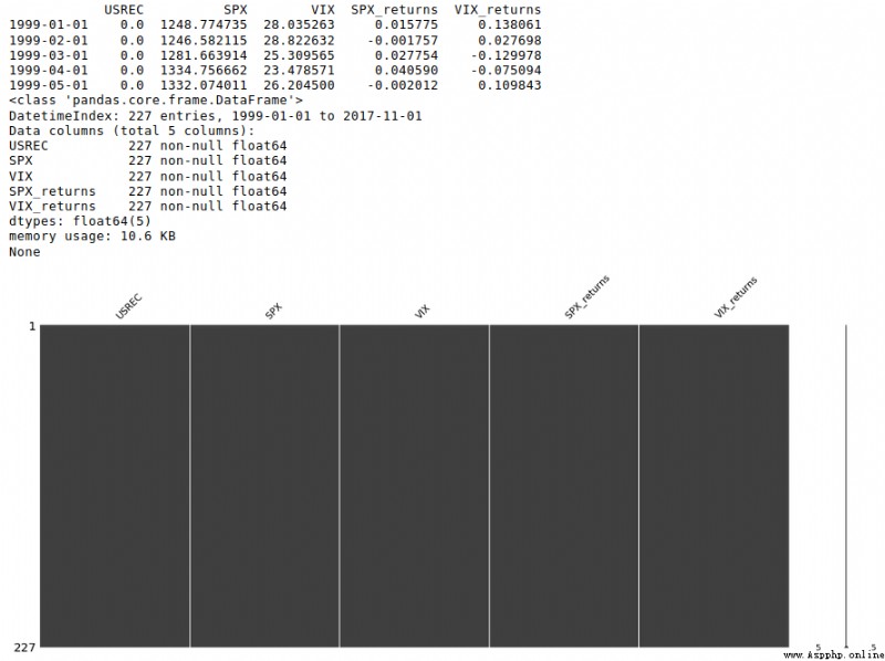
Enthought Tool Suite :: Enthought, Inc.
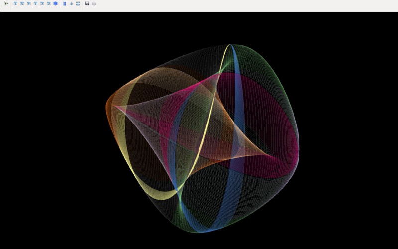
Mayavi2 It's a universal 、 Cross platform 3D scientific data visualization tool . Scalars can be displayed in both 2D and 3D space 、 Vector and tensor data . You can customize the source 、 Modules and data filters are easily extended .Mayavi2 It can also be used as a drawing engine , Generate matplotlib or gnuplot Script , It can also be used as an interactive visualization library for other applications , Embed the generated image in other applications .
 !
!
install
pip install mayavi
Quick start
import numpy
from mayavi import mlab
def lorenz(x, y, z, s=10., r=28., b=8. / 3.):
"""The Lorenz system."""
u = s * (y - x)
v = r * x - y - x * z
w = x * y - b * z
return u, v, w
# sampling .
x, y, z = numpy.mgrid[-50:50:100j, -50:50:100j, -10:60:70j]
u, v, w = lorenz(x, y, z)
fig = mlab.figure(size=(400, 300), bgcolor=(0, 0, 0))
# Trace the flow with appropriate parameters .
f = mlab.flow(x, y, z, u, v, w, line_width=3, colormap='Paired')
f.module_manager.scalar_lut_manager.reverse_lut = True
f.stream_tracer.integration_direction = 'both'
f.stream_tracer.maximum_propagation = 200
# Extract features and draw
src = f.mlab_source.m_data
e = mlab.pipeline.extract_vector_components(src)
e.component = 'z-component'
zc = mlab.pipeline.iso_surface(e, opacity=0.5, contours=[0, ],
color=(0.6, 1, 0.2))
# Background setting
zc.actor.property.backface_culling = True
# Pictures show
mlab.view(140, 120, 113, [0.65, 1.5, 27])
mlab.show()
Running results 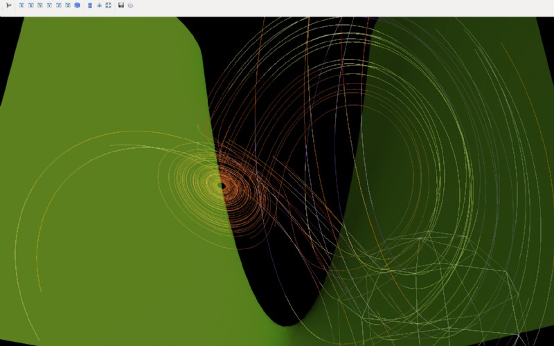
Examples — leather 0.3.4 documentation
Leather A readable and user-friendly API, Novices can also quickly master . The finished image is very basic , For all data types , Optimized for exploratory charts , Produce something independent of proportion SVG chart , So you don't lose image quality when you resize the image 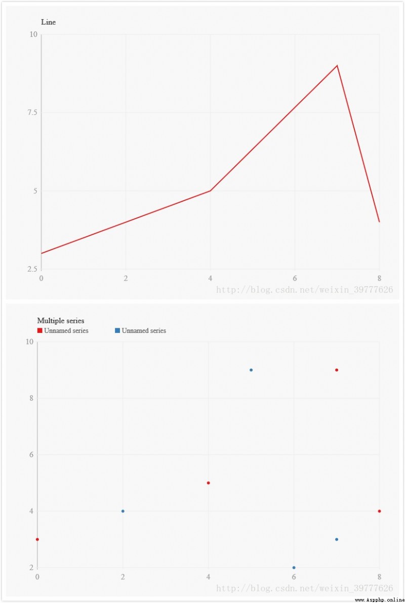
install
Method 1 :
pip install leather
Method 2 :
Click on download install
Quick start
import csv
import leather
with open('gii.csv') as f:
reader = csv.reader(f)
next(reader)
data = list(reader)[:10]
for row in data:
row[1] = float(row[1]) if row[1] is not None else None
chart = leather.Chart('Data from CSV reader')
chart.add_bars(data, x=1, y=0)
chart.to_svg('csv_reader.svg')
Running results 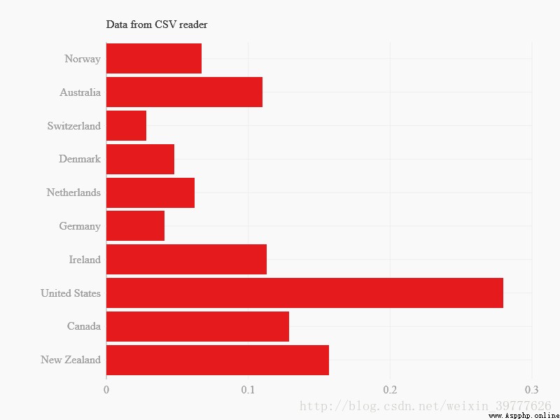
# Conclusion :
stay Python in , There are many options for visualizing data , So when to choose which solution becomes very challenging .
If you want to do some professional statistical charts , I recommend that you use Seaborn,Altair; mathematics , science , Scholars in the field of Engineering choose PyQtGraph,VisPy,Mayavi2; Network research and analysis ,NetworkX,python-igraph It would be a good choice .
Geographical projection is chosen geoplotlib,folium; If the evaluation data is missing, choose missingno; With HoloViews No longer have to worry about high-dimensional graphics ; If you don't like fancy decorations , The choice of the Leather.
If you are a novice but have MATLAB Basics ,matplotlib It'll be good ; Yes R Choose the basic one ggplot; If you are a novice or an advanced cancer patient ,Plotly It will be a great blessing , It provides a large number of chart sets for you to choose and use .
Source of the article :Python Visualization Library _As The blog of -CSDN Blog _python visualization