Experimental data sets : Download the national work data set
import pandas as pd
import numpy as np
from pyecharts.charts import *
from pyecharts import options as opts
from pyecharts.commons.utils import JsCode
from pyecharts.globals import SymbolType
from pyecharts.components import Table
import textwrap
path = r'2022 Annual data analysis post recruitment data .csv'# Modify the file storage directory
data = pd.read_csv(path)
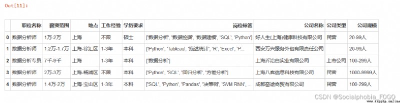
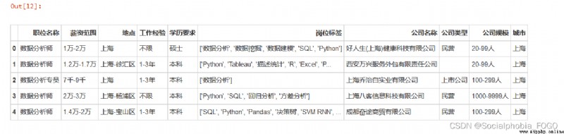
data.head()
# Urban data processing
data[' City '] = data[' place '].apply(lambda x:x.split('-')[0])
data.head()
# Salary data processing
# Remove non scope data
data2 = data[data[' salary range '] != ' Face to face discussion ']
data2 = data2[~data2. salary range .str.contains('/ God ')]
data2 = data2[~data2. salary range .str.contains(' following ')]
data2[' Salary floor '] = data2. salary range .apply(lambda x:x.split('-')[0])
data2[' Salary cap '] = data2. salary range .apply(lambda x:x.split('-')[1])
# Define a function to convert the salary into a numerical form
def salary_handle(word):
if word[-1] == ' ten thousand ':
num = float(word.strip(' ten thousand ')) * 10000
elif word[-1] == ' thousand ':
num = float(word.strip(' thousand ')) * 1000
return num
data2[' Salary floor '] = data2. Salary floor .apply(lambda x:salary_handle(x))
data2[' Salary cap '] = data2. Salary cap .apply(lambda x:salary_handle(x))
data2[' Average salary '] = round((data2. Salary cap + data2. Salary floor )/2,2)
data2.head()
print(' The amount of nonstandard data is :',data.shape[0] - data2.shape[0])
The amount of nonstandard data is : 330
# Remove outliers
data2 = data2.reset_index(drop = True)
# data2[data2[' Work experience ']=='10 In the above ']
data2 = data2.drop(index = 5860)
In the data preprocessing part , Did the following .
 First import the data , Check the basic data . Because the data is self crawling , So the data of each field is basically understood , This part is omitted .
Then process the city data . In the recruitment information released by the enterprise , Most of the information about the workplace is accurate to the specific urban area . Therefore, the cities in the work area are extracted here , Convenient for follow-up statistics .
Then process the salary range in the data . Because the data of salary range is ‘1 ten thousand -2 ten thousand ’ Or is it ‘7 thousand -9 thousand ’ Or is it ' Face to face discussion ' Or is it ‘200 element / God ’ Form like this , Therefore, you need to process salary data . View salary data , It is found that most of the salary data are based on ‘7 thousand -9 thousand ’ In the form of such a range , Only a small part of the data is ‘ Face to face discussion ’ Or is it ‘200/ God ’ Form like this , Such irregular data totals 330 strip , The proportion is not very large , Therefore, this part of data is directly removed . And will be in the scope of 7 thousand 、1 Data in the form of million are converted into specific numerical data , Facilitate subsequent statistical analysis . And take the average of the upper and lower salary limits as a new field for analysis .
Let's first look at , Which city has the most job demand for data analysis posts ?
Draw the job demand list of each city as follows .
# Draw fillet histogram function
def echarts_bar(x,y,title = ' Main title ',subtitle = ' Subtitle ',label = ' legend '):
""" x: Function is introduced to x Axis label data y: Function is introduced to y Axis data title: Main title subtitle: Subtitle label: legend """
bar = Bar(
init_opts=opts.InitOpts(
# bg_color='#080b30', # Set the background color
theme='shine', # Set the theme
width='1000px', # Set the width of the graph
height='700px' # Set the height of the graph
)
)
bar.add_xaxis(x)
bar.add_yaxis(label,y,
label_opts=opts.LabelOpts(is_show=True) # Show data or not
,category_gap="50%" # Column width setting
)
bar.reversal_axis()
bar.set_series_opts( # Custom chart styles
label_opts=opts.LabelOpts(
is_show=True,
position='right', # position The location of the label Optional 'top','left','right','bottom','inside','insideLeft','insideRight'
font_size=15,
color= '#333333',
font_weight = 'bolder', # font_weight The thickness of the text font 'normal','bold','bolder','lighter'
font_style = 'oblique', # font_style The style of the font , Optional 'normal','italic','oblique'
), # Whether to display data labels
itemstyle_opts={

"normal": {

"color": JsCode(
"""new echarts.graphic.LinearGradient(0, 0, 0, 1, [{ offset: 0,color: '#FC7D5D'} ,{offset: 1,color: '#C45739'}], false) """
), # Adjust the color gradient of the column
'shadowBlur': 6, # The size of light and shadow
"barBorderRadius": [100, 100, 100, 100], # Adjust the column fillet radian
"shadowColor": "#999999", # Adjust shadow color
'shadowOffsetY': 2,
'shadowOffsetX': 2, # Offset
}
}
)
bar.set_global_opts(
# Title Setting
title_opts=opts.TitleOpts(
title=title, # Main title
subtitle=subtitle, # Subtitle
pos_left='center', # Title display position
title_textstyle_opts=opts.TextStyleOpts(color='#2C3B4C', font_size=20,font_weight='bolder')
),
# Legend settings
legend_opts=opts.LegendOpts(
is_show=True, # Show legend or not
pos_left='right', # Legend display location
pos_top='3%', # The distance from the top of the legend
orient='horizontal' # Legend horizontal layout
),
tooltip_opts=opts.TooltipOpts(
is_show=True, # Whether to use the prompt box
trigger='axis', # Trigger type
trigger_on='mousemove|click', # The trigger condition , Click or hover to start
axis_pointer_type='cross', # Type of indicator , Move the mouse to the chart area to view the effect
),
yaxis_opts=opts.AxisOpts(
is_show=True,
splitline_opts=opts.SplitLineOpts(is_show=False), # Split line
axistick_opts=opts.AxisTickOpts(is_show=False), # The scale does not show
axislabel_opts=opts.LabelOpts( # Axis label configuration
font_size=13, # font size
font_weight='bolder' # Word again
),
), # close Y Axis display
xaxis_opts=opts.AxisOpts(
boundary_gap=True, # There is no space on both sides
axistick_opts=opts.AxisTickOpts(is_show=True), # The scale does not show
splitline_opts=opts.SplitLineOpts(is_show=False), # Split lines are not displayed
axisline_opts=opts.AxisLineOpts(is_show=True), # The axis doesn't show
axislabel_opts=opts.LabelOpts( # Axis label configuration
font_size=13, # font size
font_weight='bolder' # Word again
),
),
)
return bar
job_demand = data2. City .value_counts().sort_values(ascending = True)
echarts_bar(job_demand.index.tolist(),job_demand.values.tolist(),title = ' Ranking of job demands of data analysis posts all over the country ',subtitle = ' ',
label = ' Job demand ').render_notebook()
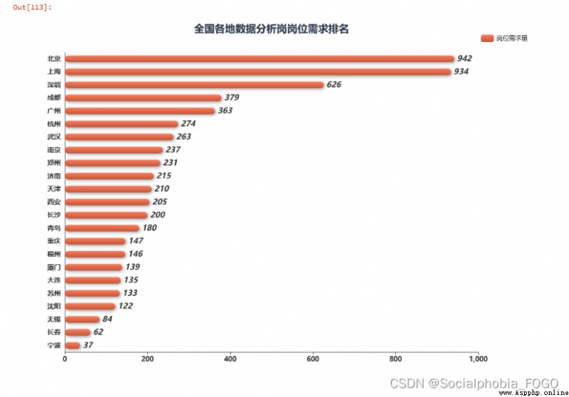 Through the ranking of post demand of data analysis posts all over the country, we can find , Beijing and Shanghai have the most job demand . Next is Shenzhen . Among the four first tier cities in Beijing, Shanghai, Guangzhou and Shenzhen , Guangzhou has the least demand for data analysis jobs . The demand for data analysis posts in Chengdu has increased rapidly in recent years , Even more than Guangzhou . Next is Hangzhou 、 wuhan 、 Nanjing and other cities .
Therefore, you need to find a little partner who works in the data analysis post or internship , It is recommended to go to the first tier cities like Beijing, Shanghai, Guangzhou and Shenzhen .
Let's take a closer look at Beijing, Shanghai, Guangzhou, Shenzhen and Chengdu 、 Hangzhou and other data analysis Posts rank top in job demand 9 In the city , Where are the data analysis Posts mainly distributed .
# Job demand in Beijing, Shanghai, Guangzhou, Shenzhen, Chengdu and Hangzhou
beijing_demand = data[data[' City '] == ' Beijing '][' place '].value_counts().sort_values(ascending = False)
shanghai_demand = data[data[' City '] == ' Shanghai '][' place '].value_counts().sort_values(ascending = False)
shenzhen_demand = data[data[' City '] == ' Shenzhen '][' place '].value_counts().sort_values(ascending = False)
guangzhou_demand = data[data[' City '] == ' Guangzhou '][' place '].value_counts().sort_values(ascending = False)
chengdu_demand = data[data[' City '] == ' Chengdu '][' place '].value_counts().sort_values(ascending = False)
hangzhou_demand = data[data[' City '] == ' Hangzhou '][' place '].value_counts().sort_values(ascending = False)
def bar_chart(desc, title_pos):
df_t = data[(data[' City '] == desc)&(data[' place '] != desc)][' place '].value_counts().sort_values(ascending = False).reset_index()
df_t.columns = [desc,' Job demand ']
df_t[desc] = df_t[desc].apply(lambda x:x.split('-')[1])
# Create a new one Bar
chart = Bar(
init_opts=opts.InitOpts(
# bg_color='#2C3B4C', # Set the background color
theme='white', # Set the theme
width='400px', # Set the width of the graph
height='400px'
)
)
chart.add_xaxis(
df_t[desc].tolist()
)
chart.add_yaxis(
'',
df_t[' Job demand '].tolist()
)
chart.set_series_opts( # Custom chart styles
label_opts=opts.LabelOpts(
is_show=True,
position='top', # position The location of the label Optional 'top','left','right','bottom','inside','insideLeft','insideRight'
font_size=15,
color= '#727F91',
font_weight = 'bolder', # font_weight The thickness of the text font 'normal','bold','bolder','lighter'
font_style = 'oblique', # font_style The style of the font , Optional 'normal','italic','oblique'
), # Whether to display data labels
itemstyle_opts={

"normal": {

'shadowBlur': 10, # The size of light and shadow
"barBorderRadius": [100, 100, 0, 0], # Adjust the column fillet radian
"shadowColor": "#94A4B4", # Adjust shadow color
'shadowOffsetY': 6,
'shadowOffsetX': 6, # Offset
}
}
)
# Bar Global configuration items for
chart.set_global_opts(
xaxis_opts=opts.AxisOpts(
name=' region ',
is_scale=True,
axislabel_opts=opts.LabelOpts(rotate = 45),
# Grid line configuration
splitline_opts=opts.SplitLineOpts(
is_show=False,
linestyle_opts=opts.LineStyleOpts(
type_='dashed'))
),
yaxis_opts=opts.AxisOpts(
is_scale=True,
name=' Job demand ',
type_="value",
# Grid line configuration
splitline_opts=opts.SplitLineOpts(
is_show=False,
linestyle_opts=opts.LineStyleOpts(
type_='dashed'))
),
# Title Configuration
title_opts=opts.TitleOpts(
title=desc,
pos_left=title_pos[0],
pos_top=title_pos[1],
title_textstyle_opts=opts.TextStyleOpts(color='#2C3B4C', font_size=20)
),
tooltip_opts=opts.TooltipOpts(
is_show=True, # Whether to use the prompt box
trigger='axis', # Trigger type
# is_show_content = True,
trigger_on='mousemove|click', # The trigger condition , Click or hover to start
axis_pointer_type='cross', # Type of indicator , Move the mouse to the chart area to view the effect
),
)
return chart
grid = Grid(
init_opts=opts.InitOpts(
theme='white',
width='1200px',
height='1200px',
)
)
# Add price comparison under different attributes in turn Bar
grid.add(
bar_chart(' Beijing ', ['15%', '3%']),
# is_control_axis_index=False,
grid_opts=opts.GridOpts(
pos_top='10%', # Appoint Grid The position of the neutron diagram
pos_bottom='70%',
pos_left='5%',
pos_right='70%'
)
)
grid.add(
bar_chart(' Shanghai ', ['50%', '3%']),
# is_control_axis_index=False,
grid_opts=opts.GridOpts(
pos_top='10%',
pos_bottom='70%',
pos_left='40%',
pos_right='35%'
)
)
grid.add(
bar_chart(' Guangzhou ', ['85%', '3%']),
# is_control_axis_index=False,
grid_opts=opts.GridOpts(
pos_top='10%',
pos_bottom='70%',
pos_left='75%',
pos_right='0%'
)
)
grid.add(
bar_chart(' Shenzhen ', ['15%', '33%']),
# is_control_axis_index=False,
grid_opts=opts.GridOpts(
pos_top='40%',
pos_bottom='40%',
pos_left='5%',
pos_right='70%'
)
)
grid.add(
bar_chart(' Chengdu ', ['50%', '33%']),
# is_control_axis_index=False,
grid_opts=opts.GridOpts(
pos_top='40%',
pos_bottom='40%',
pos_left='40%',
pos_right='35%'
)
)
grid.add(
bar_chart(' Hangzhou ', ['85%', '33%']),
# is_control_axis_index=False,
grid_opts=opts.GridOpts(
pos_top='40%',
pos_bottom='40%',
pos_left='75%',
pos_right='0%'
)
)
grid.add(
bar_chart(' wuhan ', ['15%', '63%']),
# is_control_axis_index=False,
grid_opts=opts.GridOpts(
pos_top='70%',
pos_bottom='10%',
pos_left='5%',
pos_right='70%'
)
)
grid.add(
bar_chart(' nanjing ', ['50%', '63%']),
# is_control_axis_index=False,
grid_opts=opts.GridOpts(
pos_top='70%',
pos_bottom='10%',
pos_left='40%',
pos_right='35%'
)
)
grid.add(
bar_chart(' zhengzhou ', ['85%', '63%']),
# is_control_axis_index=False,
grid_opts=opts.GridOpts(
pos_top='70%',
pos_bottom='10%',
pos_left='75%',
pos_right='0%'
)
)
grid.render_notebook()
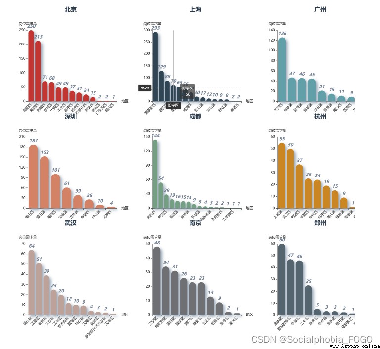
By drawing a histogram, we can find , Beijing is the city with the most job demand , Its data analysis posts are mainly distributed in Chaoyang District and Haidian District , Other districts have less than one-third of the job demand of these two districts .
Pudong New Area has the largest demand for data analysis posts in Shanghai , The second is Xuhui District , And the job demand of Xuhui District is less than half of that of Pudong New Area .
The demand for data analysis posts in Guangzhou is mainly distributed in Tianhe District , Haizhu Yuexiu Whampoa also has some data analysis posts , But the most important thing is re Tianhe District .
The demand for data analysis posts in Shenzhen is mainly distributed in Nanshan District 、 Futian District and Longgang District .
…
Let's take a look at the issues that most of my friends are concerned about , Is the salary level . The calculation here adopts the average value of the salary range of recruitment published by the enterprise .
city_salary = data2[[' City ',' Average salary ']].groupby(' City ').mean().round(0).sort_values(by = ' Average salary ',ascending = True).reset_index()
echarts_bar(city_salary[' City '].tolist(),city_salary[' Average salary '].tolist(),title = ' Ranking of average salary level of data analysis posts in cities across the country ',
subtitle = '',label = ' Average salary ').render_notebook()
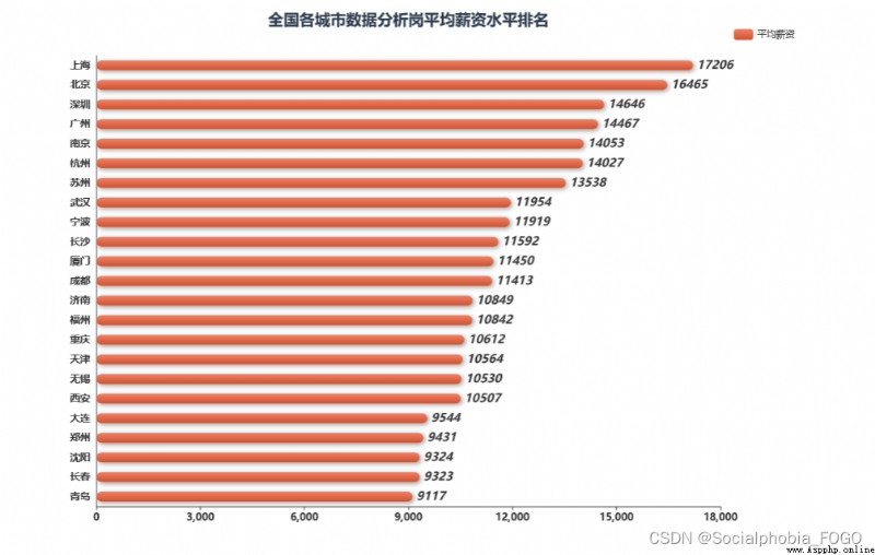
Looking at the salary level of each city, you can find , Beijing, Shanghai, Guangzhou and Shenzhen are the four first tier cities with the most developed economy , The salary level is also the highest . The city with the highest salary for data analysis post is Shanghai , Among the four cities, Guangzhou has the lowest salary . The salaries of Nanjing and Suzhou and Hangzhou followed closely , It is worth mentioning that , Chengdu, where the demand for jobs exceeds that of Guangzhou , The salary level is in the middle level .
After knowing which city has a higher salary level , Let's take a look at the distribution of salary levels for different work experiences and different degrees
# Different degrees 、 Different experiences 、 junior college - Cross analysis of different experiences 、 Undergraduate - Cross analysis of different experiences 、 master - Cross analysis of different experiences 、 Education is unlimited - Cross analysis of different experiences
job_exp = data2[[' Work experience ',' Average salary ']].groupby(' Work experience ').mean().round(0).sort_values(by = ' Average salary ',ascending = False).reset_index()
job_edu = data2[[' Degree required ',' Average salary ']].groupby(' Degree required ').mean().round(0).sort_values(by = ' Average salary ',ascending = False).reset_index()
benke_exp = data2[data2[' Degree required '] == ' Undergraduate '][[' Work experience ',' Average salary ']].groupby(' Work experience ').mean().round(0).\
sort_values(by = ' Average salary ',ascending = False).reset_index()
dazhuan_exp = data2[data2[' Degree required '] == ' junior college '][[' Work experience ',' Average salary ']].groupby(' Work experience ').mean().round(0).\
sort_values(by = ' Average salary ',ascending = False).reset_index()
shuoshi_exp = data2[data2[' Degree required '] == ' master '][[' Work experience ',' Average salary ']].groupby(' Work experience ').mean().round(0).\
sort_values(by = ' Average salary ',ascending = False).reset_index()
buxian_exp = data2[data2[' Degree required '] == ' Education is unlimited '][[' Work experience ',' Average salary ']].groupby(' Work experience ').mean().round(0).\
sort_values(by = ' Average salary ',ascending = False).reset_index()
boshi_exp = data2[data2[' Degree required '] == ' Doctor '][[' Work experience ',' Average salary ']].groupby(' Work experience ').mean().round(0).\
sort_values(by = ' Average salary ',ascending = False).reset_index()
gaozhong_exp = data2[data2[' Degree required '] == ' high school '][[' Work experience ',' Average salary ']].groupby(' Work experience ').mean().round(0).\
sort_values(by = ' Average salary ',ascending = False).reset_index()
zhongzhuan_exp = data2[data2[' Degree required '] == ' secondary specialized school / Zhongji '][[' Work experience ',' Average salary ']].groupby(' Work experience ').mean().round(0).\
sort_values(by = ' Average salary ',ascending = False).reset_index()
def bar_chart2(x,y,title_pos,title = ' Main title ',subtitle = ' Subtitle '):
# Create a new one Bar
chart = Bar(
init_opts=opts.InitOpts(
# bg_color='#2C3B4C', # Set the background color
theme='white', # Set the theme
width='400px', # Set the width of the graph
height='400px'
)
)
chart.add_xaxis(
x
)
chart.add_yaxis(
'',
y
)
chart.set_series_opts( # Custom chart styles
label_opts=opts.LabelOpts(
is_show=True,
position='top', # position The location of the label Optional 'top','left','right','bottom','inside','insideLeft','insideRight'
font_size=15,
color= '#727F91',
font_weight = 'bolder', # font_weight The thickness of the text font 'normal','bold','bolder','lighter'
font_style = 'oblique', # font_style The style of the font , Optional 'normal','italic','oblique'
), # Whether to display data labels
itemstyle_opts={

"normal": {

'shadowBlur': 10, # The size of light and shadow
"barBorderRadius": [100, 100, 0, 0], # Adjust the column fillet radian
"shadowColor": "#94A4B4", # Adjust shadow color
'shadowOffsetY': 6,
'shadowOffsetX': 6, # Offset
}
}
)
# Bar Global configuration items for
chart.set_global_opts(
xaxis_opts=opts.AxisOpts(
name=' ',
is_scale=True,
axislabel_opts=opts.LabelOpts(rotate = 45),
# Grid line configuration
splitline_opts=opts.SplitLineOpts(
is_show=False,
linestyle_opts=opts.LineStyleOpts(
type_='dashed'))
),
yaxis_opts=opts.AxisOpts(
is_scale=True,
name=' Average salary ',
type_="value",
# Grid line configuration
splitline_opts=opts.SplitLineOpts(
is_show=False,
linestyle_opts=opts.LineStyleOpts(
type_='dashed'))
),
# Title Configuration
title_opts=opts.TitleOpts(
title=title,
subtitle = subtitle,
pos_left=title_pos[0],
pos_top=title_pos[1],
title_textstyle_opts=opts.TextStyleOpts(color='#2C3B4C', font_size=20)
),
tooltip_opts=opts.TooltipOpts(
is_show=True, # Whether to use the prompt box
trigger='axis', # Trigger type
# is_show_content = True,
trigger_on='mousemove|click', # The trigger condition , Click or hover to start
axis_pointer_type='cross', # Type of indicator , Move the mouse to the chart area to view the effect
),
)
return chart
grid = Grid(
init_opts=opts.InitOpts(
theme='white',
width='1200px',
height='1200px',
)
)
# Add price comparison under different attributes in turn Bar
grid.add(
bar_chart2(job_exp[' Work experience '].tolist(), job_exp[' Average salary '].tolist(), ['15%', '3%'], title=' Salary comparison of different work experience ',
subtitle=' '),
grid_opts=opts.GridOpts(
pos_top='10%', # Appoint Grid The position of the neutron diagram
pos_bottom='70%',
pos_left='5%',
pos_right='70%'
)
)
grid.add(
bar_chart2(job_edu[' Degree required '].tolist(), job_edu[' Average salary '].tolist(), ['50%', '3%'], title=' Salary comparison of different education requirements ',
subtitle=' '),
grid_opts=opts.GridOpts(
pos_top='10%',
pos_bottom='70%',
pos_left='40%',
pos_right='35%'
)
)
grid.add(
bar_chart2(buxian_exp[' Work experience '].tolist(), buxian_exp[' Average salary '].tolist(), ['85%', '3%'], title=' Education is unlimited ',
subtitle=' '),
grid_opts=opts.GridOpts(
pos_top='10%',
pos_bottom='70%',
pos_left='75%',
pos_right='0%'
)
)
grid.add(
bar_chart2(dazhuan_exp[' Work experience '].tolist(), dazhuan_exp[' Average salary '].tolist(), ['15%', '33%'], title=' junior college ',
subtitle=' '),
grid_opts=opts.GridOpts(
pos_top='40%',
pos_bottom='40%',
pos_left='5%',
pos_right='70%'
)
)
grid.add(
bar_chart2(benke_exp[' Work experience '].tolist(), benke_exp[' Average salary '].tolist(), ['50%', '33%'], title=' Undergraduate ',
subtitle=' '),
grid_opts=opts.GridOpts(
pos_top='40%',
pos_bottom='40%',
pos_left='40%',
pos_right='35%'
)
)
grid.add(
bar_chart2(shuoshi_exp[' Work experience '].tolist(), shuoshi_exp[' Average salary '].tolist(), ['85%', '33%'], title=' master ',
subtitle=' '),
grid_opts=opts.GridOpts(
pos_top='40%',
pos_bottom='40%',
pos_left='75%',
pos_right='0%'
)
)
grid.add(
bar_chart2(boshi_exp[' Work experience '].tolist(), boshi_exp[' Average salary '].tolist(), ['15%', '63%'], title=' Doctor ',
subtitle=' '),
grid_opts=opts.GridOpts(
pos_top='70%',
pos_bottom='10%',
pos_left='5%',
pos_right='70%'
)
)
grid.add(
bar_chart2(gaozhong_exp[' Work experience '].tolist(), gaozhong_exp[' Average salary '].tolist(), ['50%', '63%'], title=' high school ',
subtitle=' '),
grid_opts=opts.GridOpts(
pos_top='70%',
pos_bottom='10%',
pos_left='40%',
pos_right='35%'
)
)
grid.add(
bar_chart2(zhongzhuan_exp[' Work experience '].tolist(), zhongzhuan_exp[' Average salary '].tolist(), ['85%', '63%'], title=' secondary specialized school / Zhongji ',
subtitle=' '),
grid_opts=opts.GridOpts(
pos_top='70%',
pos_bottom='10%',
pos_left='75%',
pos_right='0%'
)
)
grid.render_notebook()
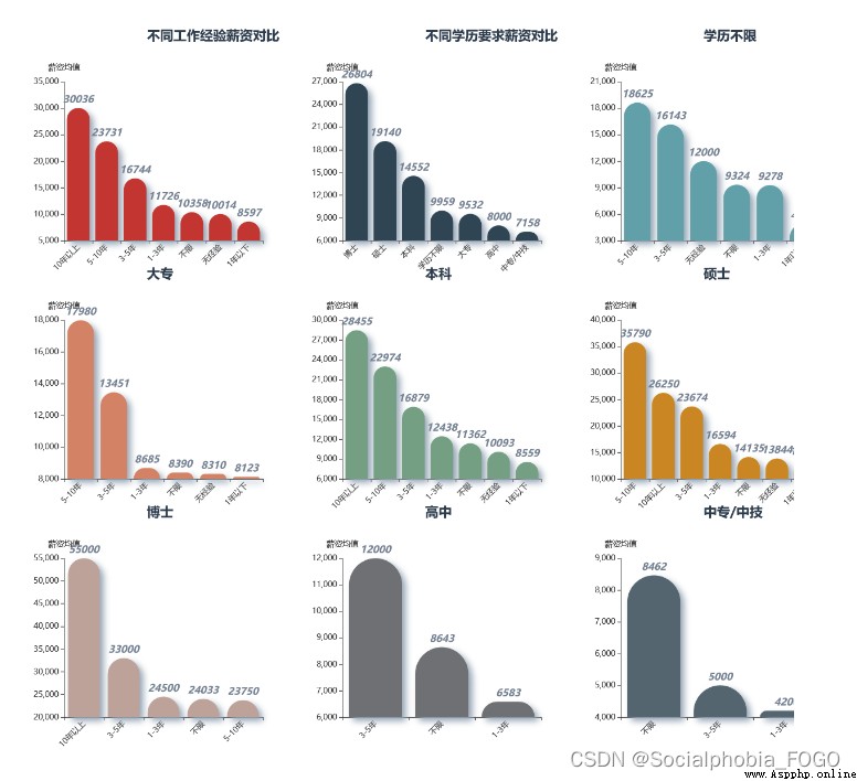
On the whole, work experience 、 The relationship between education and salary , You can find , The higher the work experience and educational background , The corresponding salary is higher , There is no doubt that .
Through different educational background , Cross analysis of different work experience and salary , It's not hard to see. , The higher academic qualifications , The corresponding salary has a higher rising space .
def bar_chart(desc, title_pos):
df_t = data2[data2[' City '] == desc][[' Work experience ',' Average salary ']].groupby(' Work experience ').mean().round(0).sort_values(by = ' Average salary ',
ascending = False).reset_index()
# Create a new one Bar
chart = Bar(
init_opts=opts.InitOpts(
# bg_color='#2C3B4C', # Set the background color
theme='white', # Set the theme
width='400px', # Set the width of the graph
height='400px'
)
)
chart.add_xaxis(
df_t[' Work experience '].tolist()
)
chart.add_yaxis(
'',
df_t[' Average salary '].tolist()
)
chart.set_series_opts( # Custom chart styles
label_opts=opts.LabelOpts(
is_show=True,
position='top', # position The location of the label Optional 'top','left','right','bottom','inside','insideLeft','insideRight'
font_size=15,
color= '#727F91',
font_weight = 'bolder', # font_weight The thickness of the text font 'normal','bold','bolder','lighter'
font_style = 'oblique', # font_style The style of the font , Optional 'normal','italic','oblique'
), # Whether to display data labels
itemstyle_opts={

"normal": {

'shadowBlur': 10, # The size of light and shadow
"barBorderRadius": [100, 100, 0, 0], # Adjust the column fillet radian
"shadowColor": "#94A4B4", # Adjust shadow color
'shadowOffsetY': 6,
'shadowOffsetX': 6, # Offset
}
}
)
# Bar Global configuration items for
chart.set_global_opts(
xaxis_opts=opts.AxisOpts(
name=' Work experience ',
is_scale=True,
axislabel_opts=opts.LabelOpts(rotate = 45),
# Grid line configuration
splitline_opts=opts.SplitLineOpts(
is_show=False,
linestyle_opts=opts.LineStyleOpts(
type_='dashed'))
),
yaxis_opts=opts.AxisOpts(
is_scale=True,
name=' Average salary ',
type_="value",
# Grid line configuration
splitline_opts=opts.SplitLineOpts(
is_show=False,
linestyle_opts=opts.LineStyleOpts(
type_='dashed'))
),
# Title Configuration
title_opts=opts.TitleOpts(
title=desc,
pos_left=title_pos[0],
pos_top=title_pos[1],
title_textstyle_opts=opts.TextStyleOpts(color='#2C3B4C', font_size=20)
),
tooltip_opts=opts.TooltipOpts(
is_show=True, # Whether to use the prompt box
trigger='axis', # Trigger type
# is_show_content = True,
trigger_on='mousemove|click', # The trigger condition , Click or hover to start
axis_pointer_type='cross', # Type of indicator , Move the mouse to the chart area to view the effect
),
)
return chart
grid = Grid(
init_opts=opts.InitOpts(
theme='white',
width='1200px',
height='1200px',
)
)
# Add price comparison under different attributes in turn Bar
grid.add(
bar_chart(' Beijing ', ['15%', '3%']),
# is_control_axis_index=False,
grid_opts=opts.GridOpts(
pos_top='10%', # Appoint Grid The position of the neutron diagram
pos_bottom='70%',
pos_left='5%',
pos_right='70%'
)
)
grid.add(
bar_chart(' Shanghai ', ['50%', '3%']),
# is_control_axis_index=False,
grid_opts=opts.GridOpts(
pos_top='10%',
pos_bottom='70%',
pos_left='40%',
pos_right='35%'
)
)
grid.add(
bar_chart(' Guangzhou ', ['85%', '3%']),
# is_control_axis_index=False,
grid_opts=opts.GridOpts(
pos_top='10%',
pos_bottom='70%',
pos_left='75%',
pos_right='0%'
)
)
grid.add(
bar_chart(' Shenzhen ', ['15%', '33%']),
# is_control_axis_index=False,
grid_opts=opts.GridOpts(
pos_top='40%',
pos_bottom='40%',
pos_left='5%',
pos_right='70%'
)
)
grid.add(
bar_chart(' Chengdu ', ['50%', '33%']),
# is_control_axis_index=False,
grid_opts=opts.GridOpts(
pos_top='40%',
pos_bottom='40%',
pos_left='40%',
pos_right='35%'
)
)
grid.add(
bar_chart(' Hangzhou ', ['85%', '33%']),
# is_control_axis_index=False,
grid_opts=opts.GridOpts(
pos_top='40%',
pos_bottom='40%',
pos_left='75%',
pos_right='0%'
)
)
grid.add(
bar_chart(' wuhan ', ['15%', '63%']),
# is_control_axis_index=False,
grid_opts=opts.GridOpts(
pos_top='70%',
pos_bottom='10%',
pos_left='5%',
pos_right='70%'
)
)
grid.add(
bar_chart(' nanjing ', ['50%', '63%']),
# is_control_axis_index=False,
grid_opts=opts.GridOpts(
pos_top='70%',
pos_bottom='10%',
pos_left='40%',
pos_right='35%'
)
)
grid.add(
bar_chart(' zhengzhou ', ['85%', '63%']),
# is_control_axis_index=False,
grid_opts=opts.GridOpts(
pos_top='70%',
pos_bottom='10%',
pos_left='75%',
pos_right='0%'
)
)
grid.render_notebook()
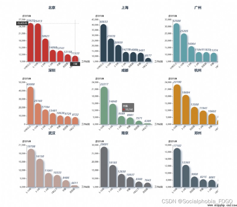
Look at the corresponding lower and upper salary limits in each city , You can find , The lower limit and upper limit of Beijing, Shanghai, Guangzhou and Shenzhen are very high , It's OK to go to the first tier cities for data analysis ~
After knowing the salary , Next, let's take a look at the job requirements of the data analysis post ~
pie1 = data[[' Work experience ',' Job title ']].groupby(' Work experience ').count().sort_values(by = ' Job title ',ascending = False).reset_index()
pie2 = data[[' Degree required ',' Job title ']].groupby(' Degree required ').count().sort_values(by = ' Job title ',ascending = False).reset_index()
pie1 = (Pie()
.add('', [list(z) for z in zip(pie1[' Work experience '], pie1[' Job title '])])
.set_global_opts(
title_opts=opts.TitleOpts(
title=' Work experience demand ',
title_textstyle_opts=opts.TextStyleOpts(color='#2C3B4C', font_size=20)
)
)
)
pie2 = (Pie()
.add('', [list(z) for z in zip(pie2[' Degree required '], pie2[' Job title '])])
.set_global_opts(
title_opts=opts.TitleOpts(
title=' Educational requirements ',
title_textstyle_opts=opts.TextStyleOpts(color='#2C3B4C', font_size=20)
)
)
)
page = Page()
page.add(pie1,pie2)
page.render_notebook()

First, work experience . The data analysis post is above the requirements of work experience ,1-3 Years of work experience is the most , Not limited to work experience and 3-5 The demand for years of work experience is also relatively large .
Above the educational requirements , Undergraduate and junior colleges account for the vast majority , Only a few require master's and doctoral degrees . Therefore, the requirements of the data analysis post for academic qualifications are not very high .
Next, let's take a look at what skills the data analysis post should have ~
The data here is crawled from the position tag in the position information released by the company , Not the position JD
tag_array = data[' Job label '].apply(lambda x:eval(x)).tolist()
tag_lis = []
for tag in tag_array:
tag_lis += tag
tag_df = pd.DataFrame(tag_lis,columns = [' Position label '])
tag_df_cnt = tag_df[' Position label '].value_counts().reset_index()
tag_df_cnt.columns = [' Position label ',' Count ']
word_cnt_lis = [tag for tag in zip(tag_df_cnt[' Position label '],tag_df_cnt[' Count '])]
wc = (
WordCloud()
.add("",
word_cnt_lis,
)
.set_global_opts(
title_opts=opts.TitleOpts(title=" Post label word cloud chart "),
)
)
wc.render_notebook()
By drawing a cloud of words, we can find , Among the numerous job labels , The most frequent occurrence is python and sql 了 , So it can be said that ,sql and python It is a necessary skill for data analysis post , Of course excel Skills are also used frequently in daily work .
Data mining in word cloud 、 Data cleaning 、SPSS、BI Some words such as tools also appear more , It also depends on the specific needs of each post .
Next, let's look at the enterprises that employ data analysis posts , What are the main types of enterprises , And the size of the company .
company_type_cnt = data[[' Company type ',' The company size ']].groupby(' Company type ').count().sort_values(by = ' The company size ',ascending = False).reset_index()
# Delete null
company_type_cnt = company_type_cnt.drop(index = 10)
company_type_cnt.columns = [' Company type ',' Number ']
company_size_cnt = data[[' Company type ',' The company size ']].groupby(' The company size ').count().sort_values(by = ' Company type ',ascending = False).reset_index()
company_size_cnt.columns = [' The company size ',' Number ']
pie1 = (Pie()
.add('', [list(z) for z in zip(company_type_cnt[' Company type '], company_type_cnt[' Number '])])
.set_global_opts(
title_opts=opts.TitleOpts(
title=' Demand for data analysis posts of various types of companies ',
title_textstyle_opts=opts.TextStyleOpts(color='#2C3B4C', font_size=20)
)
)
)
pie2 = (Pie()
.add('', [list(z) for z in zip(company_size_cnt[' The company size '], company_size_cnt[' Number '])])
.set_global_opts(
title_opts=opts.TitleOpts(
title=' Demand for data analysis posts in companies of all sizes ',
title_textstyle_opts=opts.TextStyleOpts(color='#2C3B4C', font_size=20)
)
)
)
page = Page()
page.add(pie1,pie2)
page.render_notebook()
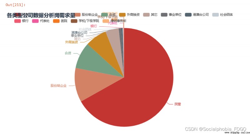
We can find out , Enterprises that recruit data analysis posts , Mainly private enterprises , More than half of them .
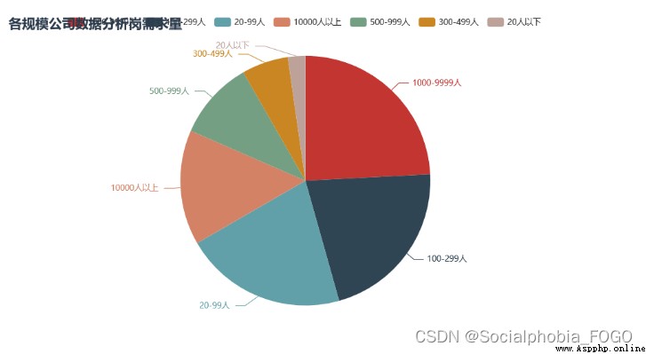
The scale of the company is 1000-9999 as well as 10000 Large-scale enterprises with more than employees are mainly , The digital construction of large factories is relatively complete and mature , Therefore, there will be more data analysis requirements . There are also some small and medium-sized enterprises , It may be some outsourcing enterprises .
Next , We calculate the salary top front 50 The enterprise , I hope it can provide some reference for you ~
company_rank = data2[[' Job title ',' Corporate name ',' Average salary ',' The company size ']].groupby([' Corporate name ',' The company size ',' Job title ']).mean().\
sort_values(by = [' Average salary '],ascending = False).reset_index()
table = Table()
table_rows = [company_rank.iloc[i,:].tolist() for i in range(50)]
table.add(company_rank.columns.tolist(), table_rows)
table.render_notebook()
 The method of calculating the number of lines in large files with Python and its performance comparison
How to use Python Quickly and
 unbtun中pip安裝pandas時報錯ModuleNotFoundError: No module named ‘_ctypes‘解決方法
在安裝pandas發現報錯ModuleNotFoundErr