import pandas as pd
import numpy as np
import matplotlib.pyplot as plt
import seaborn as sns
# 顏色
color = sns.color_palette()
print(color)
# 數據精度
pd.set_option('precision', 3)
[(0.8862745098039215, 0.2901960784313726, 0.2), (0.20392156862745098, 0.5411764705882353, 0.7411764705882353), (0.596078431372549, 0.5568627450980392, 0.8352941176470589), (0.4666666666666667, 0.4666666666666667, 0.4666666666666667), (0.984313725490196, 0.7568627450980392, 0.3686274509803922), (0.5568627450980392, 0.7294117647058823, 0.25882352941176473), (1.0, 0.7098039215686275, 0.7215686274509804)]
df=pd.read_csv('winequality-red.csv',sep = ';')
df.head()
# 字段含義
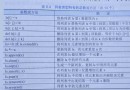
#"fixed acidity";"volatile acidity";"citric acid";"residual sugar";"chlorides";"free sulfur dioxide";"total sulfur dioxide";"density";"pH";"sulphates";"alcohol";"quality"
# “固定酸度”;“Volatile acid度”; “檸檬酸”; “殘糖”; 氯化物”;“游離二氧化硫”; “總二氧化硫”; “密度”;“pH”;“硫酸鹽”;“酒精”;“質量”
df.info()
df.describe()
<class 'pandas.core.frame.DataFrame'>
RangeIndex: 1599 entries, 0 to 1598
Data columns (total 12 columns):
fixed acidity 1599 non-null float64
volatile acidity 1599 non-null float64
citric acid 1599 non-null float64
residual sugar 1599 non-null float64
chlorides 1599 non-null float64
free sulfur dioxide 1599 non-null float64
total sulfur dioxide 1599 non-null float64
density 1599 non-null float64
pH 1599 non-null float64
sulphates 1599 non-null float64
alcohol 1599 non-null float64
quality 1599 non-null int64
dtypes: float64(11), int64(1)
memory usage: 150.0 KB
# Get all the style of their own
print(plt.style.available)
# 使用pltBuilt-in style beautification
plt.style.use('ggplot')
['bmh', 'classic', 'dark_background', 'fast', 'fivethirtyeight', 'ggplot', 'grayscale', 'seaborn-bright', 'seaborn-colorblind', 'seaborn-dark-palette', 'seaborn-dark', 'seaborn-darkgrid', 'seaborn-deep', 'seaborn-muted', 'seaborn-notebook', 'seaborn-paper', 'seaborn-pastel', 'seaborn-poster', 'seaborn-talk', 'seaborn-ticks', 'seaborn-white', 'seaborn-whitegrid', 'seaborn', 'Solarize_Light2', 'tableau-colorblind10', '_classic_test']
# 獲取每個字段
# 方法1
colnm = df.columns.to_list()
print(colnm)
print(len(colnm))
# 方法2
print()
print(list(df))
['fixed acidity', 'volatile acidity', 'citric acid', 'residual sugar', 'chlorides', 'free sulfur dioxide', 'total sulfur dioxide', 'density', 'pH', 'sulphates', 'alcohol', 'quality']
12
['fixed acidity', 'volatile acidity', 'citric acid', 'residual sugar', 'chlorides', 'free sulfur dioxide', 'total sulfur dioxide', 'density', 'pH', 'sulphates', 'alcohol', 'quality']
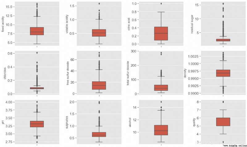
# 繪制箱線圖1
fig = plt.figure(figsize=(15,9))
for i in range(12):
plt.subplot(3,4,i+1) # 三行四列 位置是i+1的子圖
# orient:"v"|"h" 用於控制圖像使水平還是豎直顯示(這通常是從輸入變量的dtype推斷出來的,This parameter is general when not tox、y,只傳入data的時候使用)
sns.boxplot(df[colnm[i]], orient="v", width = 0.3, color = color[0])
plt.ylabel(colnm[i],fontsize = 13)
# plt.xlabel('one_pic')
# 圖形調整
plt.subplots_adjust(left=0.2, wspace=0.8, top=0.9, hspace=0.1) # Son figure on the left side of the The width of the interval between subgraph Subgraph high The height of the interval between subgraph
# tight_layout會自動調整子圖參數,使之填充整個圖像區域
plt.tight_layout()
print('箱線圖')
箱線圖
# 繪制直方圖
fig = plt.figure(figsize=(15, 9))
for i in range(12):
plt.subplot(3,4,i+1) # 3行4列 位置是i+1的子圖
df[colnm[i]].hist(bins=80, color=color[1]) # bins Specify how many bar
plt.xlabel(colnm[i], fontsize=13)
plt.ylabel('Frequency')
# tight_layout會自動調整子圖參數,使之填充整個圖像區域
plt.tight_layout()
# plt.savefig('hist.png')
print('直方圖')
直方圖
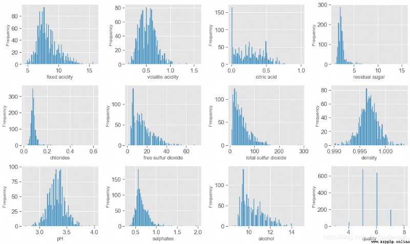
According to the boxplot and histogram,This data set is mainly study the relationship between wine quality and physical and chemical properties,Quality quality evaluation scope is0-10,This is the scope of data set evaluation3-8,其中82%的品質是5和6.
“fixed acidity”;“volatile acidity”;“citric acid”;“free sulfur dioxide” ;total sulfur dioxide; “sulphates”; PH
“固定酸度”; “Volatile acid度”; “檸檬酸”; “游離二氧化硫” “總二氧化硫”; “硫酸鹽”;
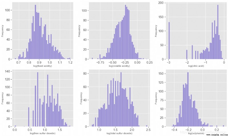
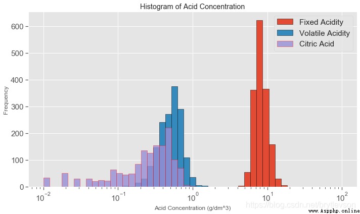
The data sets, a total of seven and acidity have a relationship;The first six characteristics are acidity andph有關系的, pHIs in logarithmic scale,下面對前6Characteristics of the exponential and makehistogram.另外,pHValue is mainly withfixed acidity有關,fixed acidity比volatile acidity和citric acid高1到2個數量級(Figure 4),比free sulfur dioxide, total sulfur dioxide, sulphates高3個數量級.A new featuretotal acidFrom the first three characteristics and.
acidityFeat = ['fixed acidity', 'volatile acidity', 'citric acid',
'free sulfur dioxide', 'total sulfur dioxide', 'sulphates']
fig = plt.figure(figsize=(15, 9))
for i in range(6):
plt.subplot(2,3,i+1)
v = np.log10(np.clip(df[acidityFeat[i]].values, a_min = 0.001, a_max = None)) # clip這個函數將將數組中的元素限制在a_min, a_max之間,大於a_max的就使得它等於 a_max,小於a_min,的就使得它等於a_min
plt.hist(v, bins = 50, color = color[2])
plt.xlabel('log(' + acidityFeat[i] + ')',fontsize = 12)
plt.ylabel('Frequency')
plt.tight_layout()
print('\nFigure 3: Acidity Features in log10 Scale')
Figure 3: Acidity Features in log10 Scale
plt.figure(figsize=(10,6))
# print(np.linspace(-2, 2))
bins = 10**(np.linspace(-2, 2)) # 間隔采樣 默認stop=True Can take in the end
# bins= 20
plt.hist(df['fixed acidity'], bins = bins, edgecolor = 'k', label = 'Fixed Acidity') # edgecolor 直方圖邊框顏色
plt.hist(df['volatile acidity'], bins = bins, edgecolor = 'black', label = 'Volatile Acidity')
plt.hist(df['citric acid'], bins = bins, edgecolor = 'red', alpha = 0.8, label = 'Citric Acid')
plt.xscale('log') # The current graphicsxThe shaft is set to logarithmic coordinate.
plt.xlabel('Acid Concentration (g/dm^3)')
plt.ylabel('Frequency')
plt.title('Histogram of Acid Concentration')
plt.legend()
plt.tight_layout()
print('Figure 4')
Figure 4
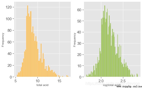
# 總酸度
df['total acid'] = df['fixed acidity'] + df['volatile acidity'] + df['citric acid']
# print(df)
plt.figure(figsize = (8,5))
plt.subplot(121) # # The first figure in the arrangement of images1行2Listed in the first picture
plt.hist(df['total acid'], bins = 50, color = color[4])
plt.xlabel('total acid')
plt.ylabel('Frequency')
plt.subplot(122)
plt.hist(np.log(df['total acid']), bins = 80 , color = color[5])
plt.xlabel('log(total acid)')
plt.ylabel('Frequency')
plt.tight_layout()
print("Figure 5: Total Acid Histogram")
# 不設置plt.subplot The word is a picture
# plt.hist(df['total acid'], bins = 50, color = color[4])
# plt.xlabel('total acid')
# plt.ylabel('Frequency')
# plt.hist(np.log(df['total acid']), bins = 80 , color = color[5])
# plt.xlabel('log(total acid)')
# plt.ylabel('Frequency')
Figure 5: Total Acid Histogram
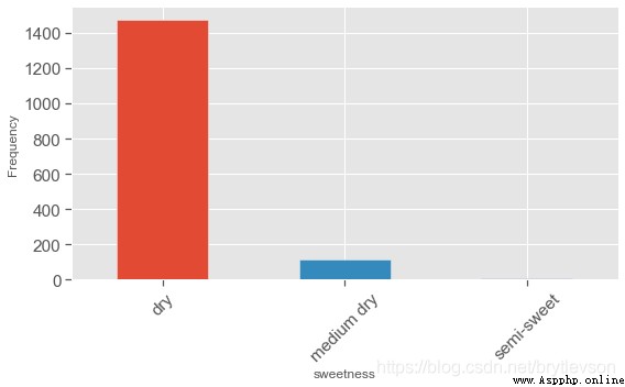
Residual sugar “殘糖” Associated with the sweetness of wine,Usually used to distinguish all kinds of red wine,干紅(<=4 g/L), 半干(4-12 g/L),半甜(12-45 g/L),And sweet(>45 g/L). 這個數據中,Mainly for the dry red,No sweet wines.
# 構建新的dataframe ['Residual sugar'] 0,4 dry 4,12 medium dry 12,45 semi-sweet
df['sweetness'] = pd.cut(df['residual sugar'], bins = [0, 4, 12, 45],
labels=["dry", "medium dry", "semi-sweet"])
# print(df.head(10))
print()
print(df['sweetness'].value_counts())
dry 1474
medium dry 117
semi-sweet 8
Name: sweetness, dtype: int64
plt.figure(figsize = (8,5))
df['sweetness'].value_counts().plot(kind='bar', color=color)
plt.xticks(rotation=45)
plt.xlabel('sweetness', fontsize = 12)
plt.ylabel('Frequency', fontsize = 12)
plt.tight_layout()
print("Figure 6: Sweetness")
Figure 6: Sweetness
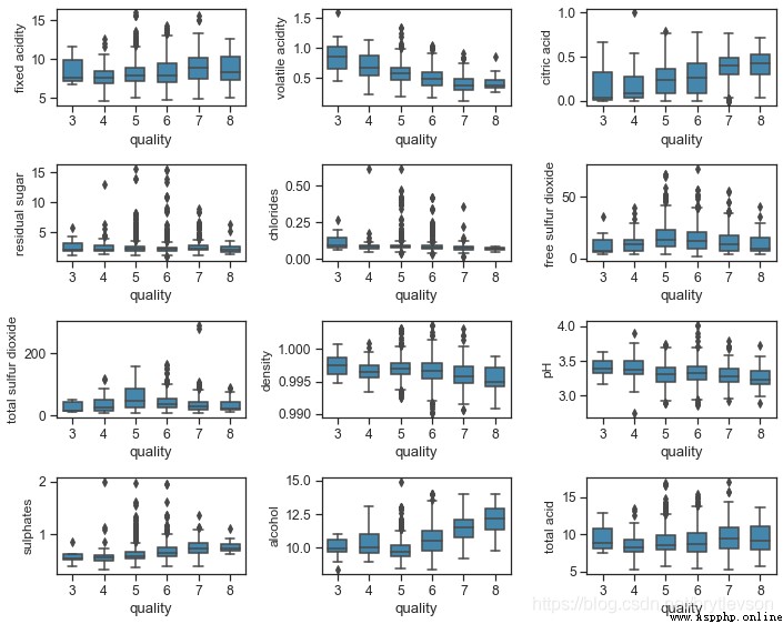
下面Figure 7和8Respectively shows the relationship of physical and chemical characteristics and quality red wine.There can be seen the trend of:
The wine has a higher citric acid with good quality,硫酸鹽,And alcohol degree.硫酸鹽(硫酸鈣)Join usually is to adjust the acidity of the wine.Alcohol degree and the quality has the highest correlation.
The wine with good quality with low volatile acids,密度,和pH.
The residual sugar,氯離子,Sulfur dioxide seems to be little effects on the quality of the wine.
# set_style There are five presetseaborn主題:暗網格(darkgrid),白網格(whitegrid),全黑(dark),全白(white),Full scale(ticks).
# 樣式控制 set_style(), set_context()會設置matplotlib的默認參數.
sns.set_style('ticks')
sns.set_context("notebook", font_scale= 1.1)
# s = df.columns.tolist()
# print(s)
# colnm = df.columns.tolist()[:11] + ['total acid']
# print(colnm)
# 獲取指定的列
colnm = df.columns.to_list()[:11] + ['total acid']
# print(df)
# print(colnm)
# final_df = df[colnm]
# print(final_df)
plt.figure(figsize = (10, 8))
for i in range(12):
plt.subplot(4,3,i+1)
sns.boxplot(x ='quality', y = colnm[i], data = df, color = color[1], width = 0.6)
plt.ylabel(colnm[i],fontsize = 12)
plt.tight_layout()
print("\nFigure 7: Physicochemical Properties and Wine Quality by Boxplot")
Figure 7: Physicochemical Properties and Wine Quality by Boxplot
sns.set_style("dark")
plt.figure(figsize = (10,8))
colnm = df.columns.to_list()[:11] + ['total acid', 'quality']
# Does not meet the continuous data,正態分布,線性關系,用spearmanThe correlation coefficient is the most just,When two sequencing between measurement data withspearman相關系數
# pearson:Pearson相關系數來衡量兩個數據集合是否在一條線上面,即針對線性數據的相關系數計算,針對非線性數據便會有誤差.
# kendall:用於反映分類變量相關性的指標,即針對無序序列的相關系數,非正太分布的數據
# spearman:非線性的,非正太分析的數據的相關系數
# mcorr = df[colnm].corr(method='spearman')
# 如果不是數字 get_dummies one_hot 編碼之後 計算相關系數
mcorr = df[colnm].corr()
# print(mcorr)
# zeros_likeMain () function to achieve constructs a matrixW_update,其維度與矩陣W一致,並為其初始化為全0;這個函數方便的構造了新矩陣,無需參數指定shape大小
# mask = np.zeros_like(mcorr, dtype=None) # 0 0 0 0
mask = np.zeros_like(mcorr, dtype=np.bool)
# print(mask)
mask[np.triu_indices_from(mask)] = True # 1
# print(mask)
# 調色盤 對圖表整體顏色、Proportion of style Settings,Including the color swatches, etc Call for data visualization system style
cmap = sns.diverging_palette(220, 10, as_cmap=True)
# 熱力圖
g = sns.heatmap(mcorr, mask=mask, cmap=cmap, square=True, annot=True, fmt='0.2f')
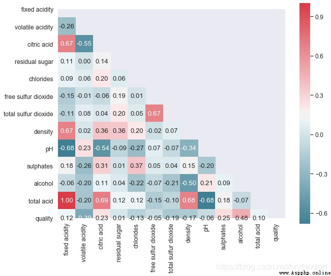
print("\nFigure 8: Pairwise Correlation Plot")
Figure 8: Pairwise Correlation Plot
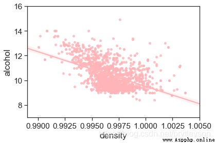
Density and alcohol concentration is related,物理上,Is not a linear relationship between.Figure 9Show the relationship between the.Density is also related to other substances content in liquor,But the relationship is very small.
sns.set_style('ticks')
sns.set_context("notebook", font_scale= 1.4)
# plot figure
plt.figure(figsize = (6,4))
# scatter_kws 設置點的大小 density
sns.regplot(x='density', y = 'alcohol', data = df, scatter_kws = {
's':15}, color = color[6])
# 設置y軸刻度
plt.xlim(0.989, 1.005)
plt.ylim(7,16)
print('Figure 9: Density vs Alcohol')
Figure 9: Density vs Alcohol
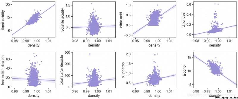
由圖10可以看出來 Density and fixed the correlation of the acidity and alcohol is best
otherFeat = ['fixed acidity', 'volatile acidity', 'citric acid',"chlorides",
'free sulfur dioxide', 'total sulfur dioxide', 'sulphates', 'alcohol']
fig = plt.figure(figsize=(15, 9))
for i in range(8):
plt.subplot(3,4,i+1)
sns.regplot(x='density', y = otherFeat[i], data = df, scatter_kws = {
's':15}, color = color[2])
plt.tight_layout()
print('Figure 10: Density vs Other')
Figure 10: Density vs Other
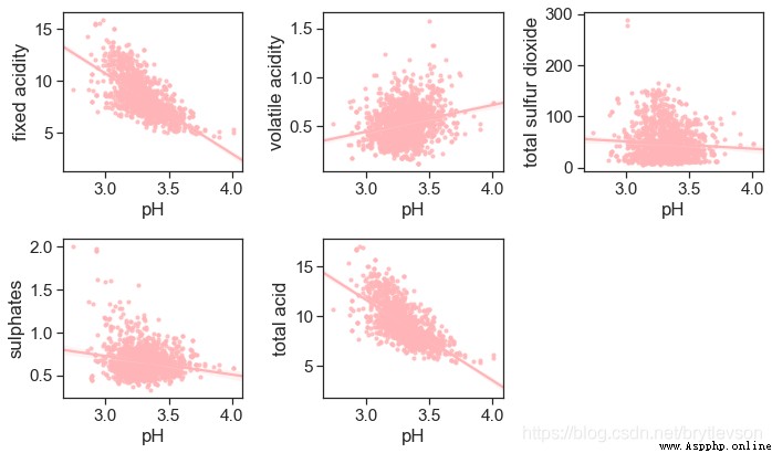
pHAnd non-volatile acid-0.683的相關性.Because of non-volatile acid content is much higher than other acid,Total acid(total acidity)This feature is not too much meaning.
acidity_related = ['fixed acidity', 'volatile acidity', 'total sulfur dioxide',
'sulphates', 'total acid']
plt.figure(figsize = (10,6))
for i in range(5):
plt.subplot(2,3,i+1)
sns.regplot(x='pH', y = acidity_related[i], data = df, scatter_kws = {
's':10}, color = color[6])
plt.tight_layout()
print("Figure 11: pH vs acid")
Figure 11: pH vs acid
With the highest quality correlation are the three features of alcohol concentration,Volatile acid度,And citric acid.The following figure shows the alcohol concentration,Volatile acid and quality of relationship.
酒精濃度,Volatile acid and quality:
For good wine(7,8)And the bad wine(3,4),Relationship clearly.But for medium wine(5,6),The concentration of alcohol volatile acidity has greatly cross.
According to the chart can get Good quality wine alcohol content is higher, Quality is bad wine volatile acid is higher.
plt.style.use('ggplot') # 樣式美化
# 繪制回歸模型
# lmplot hue, col, row #定義數據子集的變量,並在不同的圖像子集中繪制
# col_wrap: int, #設置每行子圖數量 order: int, optional #多項式回歸,設定指數 markers: Define a scatter icon
sns.lmplot(x = 'alcohol', y = 'volatile acidity', hue = 'quality',
data = df, fit_reg = True, scatter_kws={
's':10}, height = 5)
print("Figure 12-1: Scatter Plots of Alcohol, Volatile Acid and Quality")
plt.show()
sns.lmplot(x = 'alcohol', y = 'volatile acidity', hue = 'quality',
data = df, fit_reg = False, scatter_kws={
's':10}, height = 5)
print("Figure 12-2: Scatter Plots of Alcohol, Volatile Acid and Quality")
plt.show()
Figure 12-1: Scatter Plots of Alcohol, Volatile Acid and Quality

Figure 12-2: Scatter Plots of Alcohol, Volatile Acid and Quality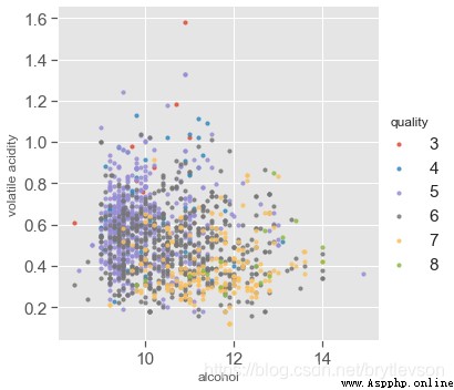
# hue, col, row #定義數據子集的變量,並在不同的圖像子集中繪制 col Columns represent elements 顯示格式:col=1
# col_wrap: int, #設置每行子圖數量,The limit column order: int, optional #多項式回歸,設定指數 markers: Define a scatter icon
sns.lmplot(x = 'alcohol', y = 'volatile acidity', col='quality', hue = 'quality',
data = df,fit_reg = False, height = 3, aspect = 0.8, col_wrap=3,
scatter_kws={
's':20})
print("Figure 12-3: Scatter Plots of Alcohol, Volatile Acid and Quality")
print()
plt.show()
sns.lmplot(x = 'alcohol', y = 'volatile acidity', col='quality', hue = 'quality',
data = df,fit_reg = True, height = 3, aspect = 0.9, col_wrap=3,
scatter_kws={
's':20})
print("Figure 12-4: Scatter Plots of Alcohol, Volatile Acid and Quality")
Figure 12-3: Scatter Plots of Alcohol, Volatile Acid and Quality
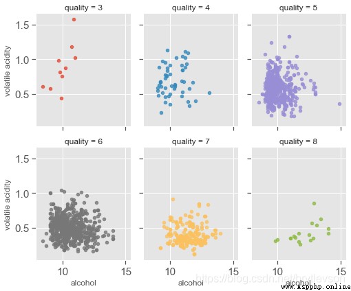
Figure 12-4: Scatter Plots of Alcohol, Volatile Acid and Quality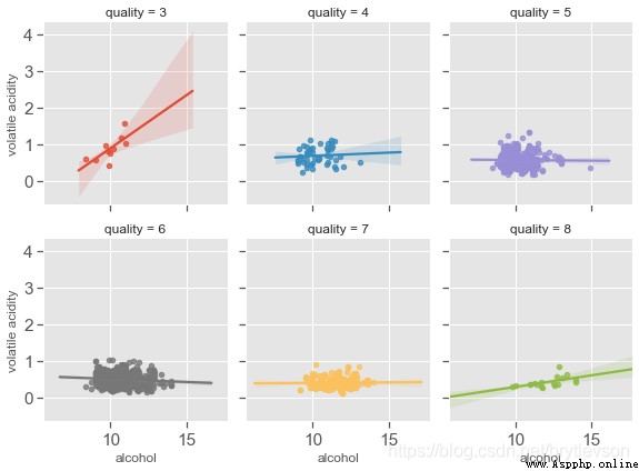
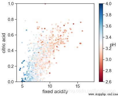
pHAnd non-volatile acid and citric acid has correlation.The overall trend is also very reasonable,濃度越高,pH越低,The more wine acid.
# style
sns.set_style('ticks')
sns.set_context("notebook", font_scale= 1.4)
plt.figure(figsize=(6,5))
#get_cmapThe value can be:Possible values are: Accent, Accent_r, Blues, Blues_r, BrBG, BrBG_r, BuGn, BuGn_r, BuPu, BuPu_r,
# CMRmap, CMRmap_r, Dark2, Dark2_r, GnBu, GnBu_r, Greens, Greens_r, Greys, Greys_r, OrRd, OrRd_r, Oranges, Oranges_r,
# PRGn, PRGn_r, Paired, Paired_r, Pastel1, Pastel1_r, Pastel2, Pastel2_r, PiYG, PiYG_r, PuBu, PuBuGn, PuBuGn_r, PuBu_r,
# PuOr, PuOr_r, PuRd, PuRd_r, Purples, Purples_r, RdBu, RdBu_r, RdGy, RdGy_r, RdPu, RdPu_r, RdYlBu, RdYlBu_r, RdYlGn,
# RdYlGn_r, Reds, Reds_r, Set1, Set1_r, Set2, Set2_r, Set3, Set3_r, Spectral, Spectral_r, Wistia, Wistia_r, YlGn,
# YlGnBu, YlGnBu_r, YlGn_r, YlOrBr, YlOrBr_r, YlOrRd, YlOrRd_r...At the end of which addrColor is the not.
cm = plt.cm.get_cmap('RdBu')
sc = plt.scatter(df['fixed acidity'], df['citric acid'], c=df['pH'], vmin=2.6, vmax=4, s=15, cmap=cm)
bar = plt.colorbar(sc)
bar.set_label('pH', rotation = 0)
plt.xlabel('fixed acidity')
plt.ylabel('citric acid')
plt.xlim(4,18)
plt.ylim(0,1)
print('Figure 12-1: pH with Fixed Acidity and Citric Acid')
Figure 12: pH with Fixed Acidity and Citric Acid
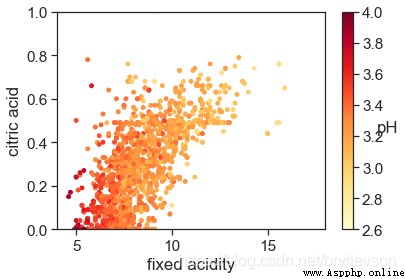
cm = plt.cm.get_cmap('YlOrRd')
sc = plt.scatter(x=df['fixed acidity'], y=df['citric acid'], c=df['pH'], vmin=2.6, vmax=4, s=15, cmap=cm)
bar = plt.colorbar(sc)
bar.set_label('pH', rotation = 0)
plt.xlabel('fixed acidity')
plt.ylabel('citric acid')
plt.xlim(4,18)
plt.ylim(0,1)
print('Figure 12-2: pH with Fixed Acidity and Citric Acid')
Figure 12-2: pH with Fixed Acidity and Citric Acid
參考:阿裡天池