Generally used matplotlib The library or sub library will be written as (as)plt, Easy to use at the back , It is also basically a consensus .
Before drawing, you need to plt.figure() Produce an image
x = np.linspace(-3,3,50)
y1 = 2*x + 1
y2 = x**2
Learn from the above data
`plt.plot(x,y1) # You can set specific parameters ,color、linestyle、lineswith、lable( The name of this line ) wait
plt.hlines(1,-1,2) # One x∈(-1,2)y=1 The straight line of The vertical line is vlines(2,-1,3) y∈(-1,3)x=2 The straight line of
new_ticks = np.linspace(-1,2,5) # -1~2 Average out in the middle 5 Number
plt.xticks(new_ticks) # x The axis becomes Up there 5 Number
plt.yticks([-2,-1,-0.5,1,2],[r"$really bad$",r"$bad$",r"$nomal$",r"$good$",r"$very good$"])
# This one above y The axis becomes the following mark at the corresponding position
plt.xlim(-1,2) # Now? x Axis range y Axis ylim
ax = plt.gca() # gca Get the current coordinate content ,spines The side to be modified , right\left\top\bottom
ax.spines['right'].set_color("none")
ax.spines['top'].set_color("none")
ax.spines['bottom'].set_position(('data', 0))
ax.spines["left"].set_position(("data",1))
ax.xaxis.set_ticks_position("bottom") # take x The position of the shaft is set at the bottom
ax.spines["bottom"].set_position(("data",0)) # The bottom position is “y=0”
plt.xticks(()) # Cancel x Axis
# legend
# stay plot Input parameters label="sth" Add a legend for this line
# loc="upper right" Indicates that the legend will be added in the upper right corner of the figure .
# 'best' : 0,
# 'upper right' : 1,
# 'upper left' : 2,
# 'lower left' : 3,
# 'lower right' : 4,
# 'right' : 5,
# 'center left' : 6,
# 'center right' : 7,
# 'lower center' : 8,
# 'upper center' : 9,
# 'center' : 10,
plt.legend(loc = 5)
plt.legend(loc = “upper right”)
# x、y In the figure x、y The starting point of the ( You can also have z),fontdict Format the insert
plt.text(x, y, r"$this is the txet",
fontdict{"size" : 16, "color" : "r"})
# %.2f Keep two decimal places , Align horizontally and centrally ha='center', Longitudinal bottom ( Top ) alignment va='bottom'
# For example, histogram plus data representation
plt.text(x, y+0.3, "%.2f", ha="center", va="bottom")
plt.scatter(x, y) # Nothing to say , and plot similar , You can set some parameter colors size And so on.
plt.bar(x, y)
import matplotlib.pyplot as plt
import numpy as np
a = np.array([0.1,0.2,0.3,
0.4,0.5,0.6,
0.7,0.8,0.9]).reshape(3,3)
# array Array reshape Generate the above list 3 That's ok 3 Array of columns
plt.imshow(a, cmap="Blues", interpolation="nearest", origin="upper")
# cmap Parameters Set picture group color Blues It's beautiful
# interploation The difference method used ( gaussian 、 Spline or something ) There is no special requirement to set nearest
# origin Chart order ,upper( From small to large ) and lower
plt.colorbar(shrink=.92)
# The reference data figure appears next to the picture shrink Scaling
plt.show()
plt.subplot(2,2,1)
a = plt.plot(x, y)
# Divide the image into two rows and two columns , a In the first place
# Every new graph needs to declare the position in front of the graph ,plt.subplot(*,*,*)
# For graphs with different sizes , such as The first figure wants to occupy the first line , Second line production 3 A small picture You can use the following methods
plt.subplot(2,1,1)
plt(x1, y1)
plt.subplot(2,2,3) # Note that the small picture should be in 3 This position
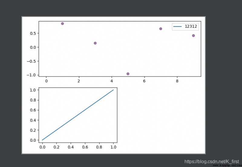
The principle is to add a coordinate system to the image , Make different coordinate systems display in the same figure ( I understand the above )
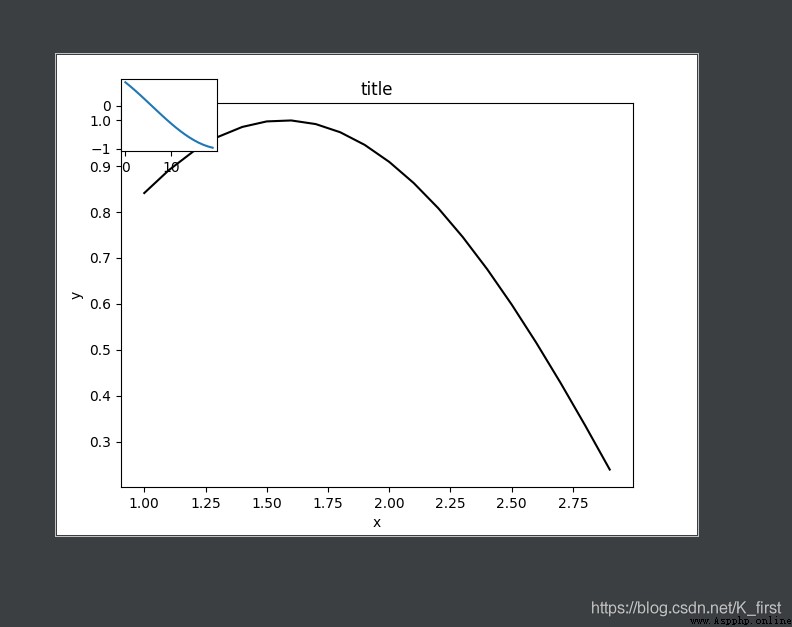
import matplotlib.pyplot as plt
import numpy as np
fig = plt.figure()
x = np.arange(1, 3, 0.1)
y = np.sin(x)
left, bottom, width, height = 0.1, 0.1, 0.8, 0.8
# The above is the coordinate system to be added to the image , among left=0.1 Indicates that the added coordinate axis is from left to right in the drawing 1/10 The location of bottom It's height
width Insert the length of the figure height Insert graphic height size
ax1 = fig.add_axes([left, bottom, width, height])
ax1.plot(x, y, 'r', c="black")
ax1.set_xlabel('x')
ax1.set_ylabel('y')
ax1.set_title('title')
# For the detailed operation of the image stay ax1.plot() In the middle of The others are the same as the conventional diagram
left, bottom, width, height = 0.1, 0.8, 0.15, 0.15
ax2 = fig.add_axes([left, bottom, width, height])
y2 = np.cos(x)
ax2.plot(y2)
Suddenly I don't know the direction , Then just bury your head in one road
2020.11.16