This article mainly introduces “Python Matplotlib Analysis of drawing examples ”, In daily operation , I believe a lot of people are Python Matplotlib There are doubts about the analysis of drawing examples , Xiao Bian consulted all kinds of materials , Sort out simple and easy-to-use operation methods , I hope to answer ”Python Matplotlib Analysis of drawing examples ” Your doubts help ! Next , Please follow Xiaobian to learn !
1. The import module
import matplotlib as mplimport matplotlib.pyplot as plt
2. Create a palette , Then adjust the drawing board
3. Defining data
4. Drawing graphics ( Including the setting of coordinate axis , Data import , Style of line , Color , And the title , legend , wait )
5.plt.show()
1.1.1**( One ) First step : Create and define a " Drawing board "**( You will draw on the drawing board you define ).
fig=plt.figure()# Define a drawing board and name it fig
stay plt.figure() There are also some parameters in brackets
for example :
huaban=plt.figure(figsize=(6,10),facecolor='b',dpi=500)#figsize Is to adjust the scale of your image , As shown above : Long / wide =6/10#facecolor Is to set the background color of the drawing board , Generally, the color code is the first letter of English #dpi Set the resolution of the image , The higher the resolution, the clearer the image #edgcolor It is a parameter for setting the border color
1.1.2**( Two ). The second step : Define your x,y data **
Here we use numpy Library functions to produce some data
So we have to import numpy function
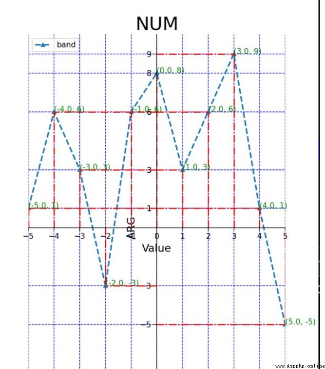
import numpy as np# Set up xy Value x=np.linspace(-5,5,11)# Here is the -5 To 5 Divide it into eleven shares on average ,(-5,-4,-3,.....)y=[1,6,3,-3,6,8,3,6,9,1,-5]
1.1.3**( 3、 ... and ). The third step : Set up x,y The size of the shaft , scale ,…**
# add to p1 To the sketchpad p1=fig.add_subplot(111)# there 111 It refers to dividing the drawing board into rows and columns , hold p1 Add to the first picture # Limit the length of the function axis p1.axis([-5,5,-10,10])#x The length of the shaft is -5 To 5,y The length of the shaft is -10 To 10# Set up x,y Axis scale plt.xticks(x)plt.yticks(y)# Here means :x,y The scale of the axis is defined previously x,y Data list # Set the upper and lower limits of the coordinate axis plt.xlim(-5,5)plt.ylim(-10,10)
1.1.4( Four ). The plot , Import x,y data , Set line style , Color , thickness , Add legend , title …
# The plot p1.plot(x,y,marker='o',ms=5,lw=2,ls='--',label='band')#x,y It is the data defined at the beginning #marker Set inflection point style :o/h/^/./+ wait #ms Is the mark size for setting the inflection point #lw Is to set the line thickness , The larger the number, the thicker the line #ls Is to set the line style , here '--' It's a dotted line #label Is to set the name and title of this line p1.legend(loc='best')# Add legend , among best It refers to adding the position of the legend to the best position ,# You can also set the location yourself , for example :upper left( top left corner )# Add the title plt.title('NUM',fontsize=24)# Set the title of the image ,fontsize Is to set the size of the title text plt.xlabel('Value',fontsize=14)# Set up x The title of the axis plt.ylabel('ARG',fontsize=14)# Set up y The title of the axis Now it is basically set , Because I draw pictures in the script , So I need to add one at the end of the code :plt.show(), It will automatically enable an event loop , And find all currently available drawing objects , Then open an interactive window to display the graphics .
1.1.5 The complete code above ( There are some details added ):
import matplotlib.pyplot as pltimport numpy as np# Set up xy Value x=np.linspace(-5,5,11)y=[1,6,3,-3,6,8,3,6,9,1,-5]# Create a drawing board huaban=plt.figure(figsize=(6,10))# add to p1 To the sketchpad p1=huaban.add_subplot(111)# Limit the length of the function axis p1.axis([-5,5,-10,10])# Set up x,y Axis scale plt.xticks(x)plt.yticks(y)# Remove the right border p1.spines['right'].set_color('none')# Remove the top border p1.spines['top'].set_color('none')# The following two lines of code will xy The intersection of axes is changed to (0,0)p1.spines['bottom'].set_position(('data',0))p1.spines['left'].set_position(('data',0))# The plot p1.plot(x,y,marker='^',ms=5,lw=2,ls='--',label='band')p1.legend(loc='upper left')# Add the title plt.title('NUM',fontsize=24)plt.xlabel('Value',fontsize=14)plt.ylabel('ARG',fontsize=14)# Add auxiliary dotted line for i in range(len(x)): x1=[x[i],x[i]] y1=[0,y[i]] plt.plot(x1,y1,'r-.')for i in range(len(x)): x2=[0,x[i]] y2=[y[i],y[i]] p1.plot(x2,y2,'r-.')# Add the coordinates of each break point for i in range(len(x)): p1.text(x[i],y[i],(x[i],y[i]),c='green')plt.grid(c='b',ls='--')# This function is the function of generating grid plt.show()Output results :
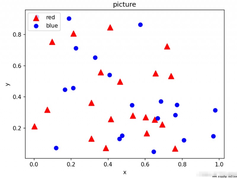
In fact, most of the syntax of the scatter diagram is similar to the above , Just put the plt.polt() Change it to plt.scatter()
Here we only need to draw a picture as an example , Just omit the steps of creating a Sketchpad , The steps of creating a Sketchpad will be useful later .
import numpy as npimport matplotlib.pyplot as plt# Randomly generate some data N=20x=np.random.rand(N)y=np.random.rand(N)x1=np.random.rand(N)y1=np.random.rand(N)plt.scatter(x,y,s=100,c='red',marker='^',label='red')#c yes color For short , Set the color plt.legend(loc='best')plt.scatter(x1,y1,s=50,c='blue',marker='o',label='blue')plt.legend(loc='upper left')# Add a legend in the upper left corner plt.xlabel('x')# Label abscissa plt.ylabel('y')# Label the ordinates plt.title('picture')# Label the image plt.show()# Display images Output results :
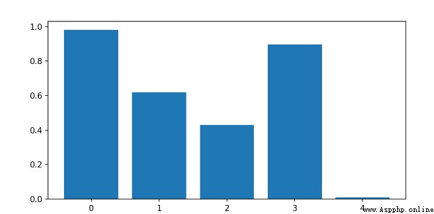
Use plt.bar() Drawing
import numpy as npimport matplotlib.pyplot as pltx=[1,2,3,4,5]y=np.random.rand(5)plt.figure(figsize=(8,4))plt.bar(x,y)x_t=list(range(len(x)))plt.xticks(x,x_t)plt.show()
Output results :
To draw a subgraph, you need to create a Sketchpad , Then divide the drawing board , Then draw different images at the separated positions .
The point is here :
p1 = huaban.add_subplot(221)p2=huaban.add_subplot(222)p3=huaban.add_subplot(223)p4=huaban.add_subplot(224)# These numbers mean , Divide the drawing board into two rows and two columns , Four positions , then p1 In position 1,p2 In position 2,p3 In position 3.......
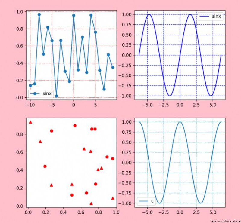
import numpy as npimport matplotlib.pyplot as pltx=range(-10,10,1)y=np.random.rand(20)huaban=plt.figure(facecolor='pink',figsize=(8,8),dpi=100)p1 = huaban.add_subplot(221)p1.plot(x,y,label="sinx",marker='o')plt.legend(loc='best')plt.grid(c='r',linestyle=':')p2=huaban.add_subplot(222)x1=np.linspace(-np.pi*2,np.pi*2,1000)y1=np.sin(x1)p2.plot(x1,y1,label="sinx",color='blue')plt.legend(loc='best')plt.grid(c='b',linestyle='--')p3=huaban.add_subplot(223)x2=np.random.rand(10)y2=np.random.rand(10)x3=np.random.rand(10)y3=np.random.rand(10)p3.scatter(x2,y2,c='red',marker='o',label=" Scatter plot ")p3.scatter(x3,y3,c='red',marker='^',label=" scattered 1")p4=huaban.add_subplot(2,2,4)p4.plot(x1,np.cos(x1),label="cosx")plt.legend('best')plt.grid(c='c',linestyle=':')plt.show()Output results :
import matplotlib.pyplot as pltx=[35,25,25,15]colors=["#14615E", "#F46C40", "#3E95C0", "#A17D3B"]name=['A','B','C','D']label=['35.00%','25.00%','25.00%','15.00%']huaban=plt.figure()p1=huaban.add_subplot(111)p1.pie(x,labels=name,colors=colors,autopct='%1.2f%%',explode = (0, 0.2, 0, 0))plt.axis('equal')plt.show()Output results :

import matplotlib.pyplot as pltimport numpy as npplt.figure(figsize=(4,4))# Fixing random state for reproducibility#np.random.seed(19680801)# Create subgraphs 1plt.subplot(211)plt.imshow(np.random.random((10, 10)), cmap="hot")# Create subgraphs 2plt.subplot(212)plt.imshow(np.random.random((5, 5)), cmap="winter")plt.subplots_adjust(bottom=0.09, right=0.5, top=0.9)cax = plt.axes([0.75, 0.1, 0.065, 0.8])plt.colorbar(cax=cax)plt.show()
Output results :

Here we are , About “Python Matplotlib Analysis of drawing examples ” That's the end of my study , I hope we can solve your doubts . The combination of theory and practice can better help you learn , Let's try ! If you want to continue to learn more related knowledge , Please continue to pay attention to Yisu cloud website , Xiaobian will continue to strive to bring you more practical articles !