Today, Xiaobian comes to chat with you Python In the middle of altair Visualization module , And draw some common charts by calling this module , With the help of Altair, We can put more energy and time on understanding the data itself and the meaning of the data , Free from the complex data visualization process .
Altair It is called statistical visualization Library , Because it can be summarized by classification 、 Data transformation 、 Data interaction 、 Comprehensively understand the data by means of graphic composition 、 Understand and analyze data , And the installation process is also very simple , Directly through pip Command to execute , as follows
pip install altair
pip install vega_datasets
pip install altair_viewer
If you are using conda Package manager to install Altair Module , The code is as follows
conda install -c conda-forge altair vega_datasets Let's simply try to draw a histogram , First create a DataFrame Data sets , The code is as follows
df = pd.DataFrame({"brand":["iPhone","Xiaomi","HuaWei","Vivo"],
                   "profit(B)":[200,55,88,60]})
Next is the code for drawing histogram
import altair as alt
import pandas as pd
import altair_viewer
chart = alt.Chart(df).mark_bar().encode(x="brand:N",y="profit(B):Q")
#  Display data , call display() Method
altair_viewer.display(chart,inline=True)
output
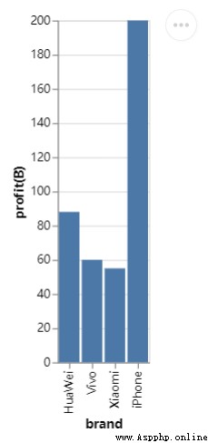
From the whole grammatical structure , use first alt.Chart() Specify the dataset to use , Then use the instance method mark_*() Style of drawing chart , Last specified X Axis and Y The data represented by the axis , You may be curious , In the middle of N as well as Q What do they represent , This is the abbreviation of variable type , let me put it another way ,Altair The module needs to know the types of variables involved in drawing graphics , That's the only way , The drawing is the effect we expect .
Among them N It represents nominal variables (Nominal), For example, the brand of mobile phones is a proper noun , and Q It represents a numerical variable (Quantitative), It can be divided into discrete data (discrete) And continuous data (continuous), In addition, there are time series data , The abbreviation is T And sequential variables (O), For example, in the process of online shopping, the ratings of merchants are 1-5 Five stars .
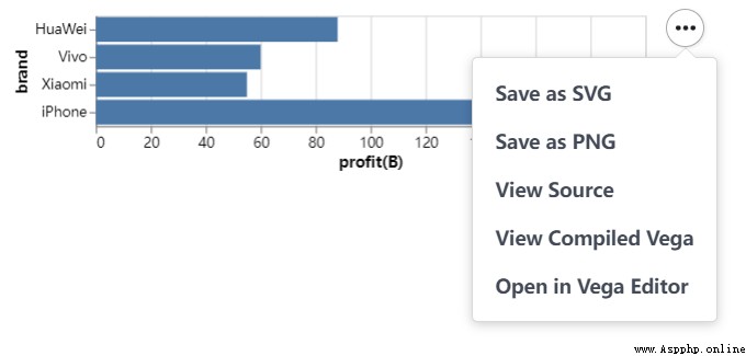
Save the last chart , We can call save() Methods to save , Save the object as HTML file , The code is as follows
chart.save("chart.html") You can save it as well JSON file , From the code point of view, it is very similar
chart.save("chart.json")Of course, we can also save files in image format , As shown in the figure below
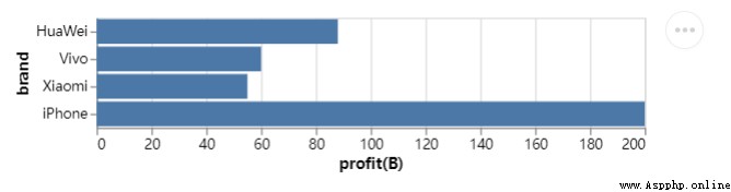
We are based on the above , Further derivation and expansion , For example, we want to draw a horizontal bar graph ,X Axis and Y Axis data exchange , The code is as follows
chart = alt.Chart(df).mark_bar().encode(x="profit(B):Q", y="brand:N")
chart.save("chart1.html")
output
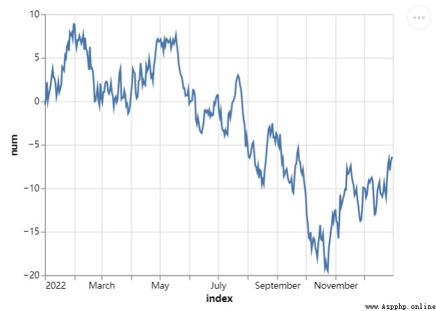
At the same time, we also try to draw a line chart , It's called mark_line() The method code is as follows
##  Create a new set of data , Take the date as the row index value
np.random.seed(29)
value = np.random.randn(365)
data = np.cumsum(value)
date = pd.date_range(start="20220101", end="20221231")
df = pd.DataFrame({"num": data}, index=date)
line_chart = alt.Chart(df.reset_index()).mark_line().encode(x="index:T", y="num:Q")
line_chart.save("chart2.html")
output
We can also draw a Gantt chart , Usually used in project management ,X The axis adds the time and date , and Y The axis shows the progress of the project , The code is as follows
project = [{"project": "Proj1", "start_time": "2022-01-16", "end_time": "2022-03-20"},
 {"project": "Proj2", "start_time": "2022-04-12", "end_time": "2022-11-20"},
 ......
 ]
df = alt.Data(values=project)
chart = alt.Chart(df).mark_bar().encode(
    alt.X("start_time:T",
          axis=alt.Axis(format="%x",
                        formatType="time",
                        tickCount=3),
          scale=alt.Scale(domain=[alt.DateTime(year=2022, month=1, date=1),
                                  alt.DateTime(year=2022, month=12, date=1)])),
    alt.X2("end_time:T"),
    alt.Y("project:N", axis=alt.Axis(labelAlign="left",
                                     labelFontSize=15,
                                     labelOffset=0,
                                     labelPadding=50)),
    color=alt.Color("project:N", legend=alt.Legend(labelFontSize=12,
                                                   symbolOpacity=0.7,
                                                   titleFontSize=15)))
chart.save("chart_gantt.html")
output
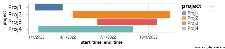
From the above figure, we can see several projects being done by the team , The degree of progress of each project is different , Yes, of course , The time span of different projects is also different , If it is shown on the chart, it will be very intuitive .
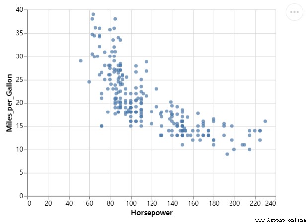
Then , Let's draw a scatter chart , It's called mark_circle() Method , The code is as follows
df = data.cars()
##  The selected area is “USA” That is, the passenger car data of the United States
df_1 = alt.Chart(df).transform_filter(
    alt.datum.Origin == "USA"
)
df = data.cars()
df_1 = alt.Chart(df).transform_filter(
    alt.datum.Origin == "USA"
)
chart = df_1.mark_circle().encode(
    alt.X("Horsepower:Q"),
    alt.Y("Miles_per_Gallon:Q")
)
chart.save("chart_dots.html")
output
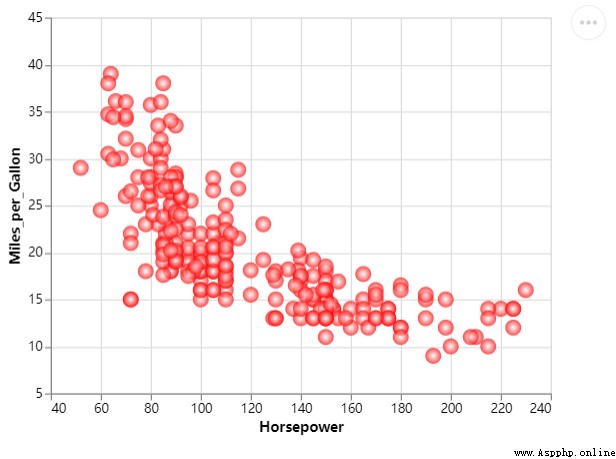
Of course, we can further optimize it , Make the chart look more beautiful , Add some colors , The code is as follows
chart = df_1.mark_circle(color=alt.RadialGradient("radial",[alt.GradientStop("white", 0.0),
                                                 alt.GradientStop("red", 1.0)]),
              size=160).encode(
    alt.X("Horsepower:Q", scale=alt.Scale(zero=False,padding=20)),
    alt.Y("Miles_per_Gallon:Q", scale=alt.Scale(zero=False,padding=20))
)
output
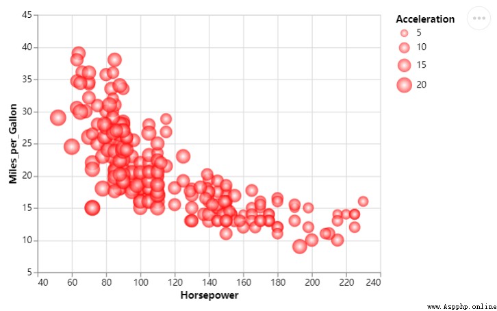
We change the size of the scatter , The size of different scatter points represents different values , The code is as follows
chart = df_1.mark_circle(color=alt.RadialGradient("radial",[alt.GradientStop("white", 0.0),
                                                 alt.GradientStop("red", 1.0)]),
              size=160).encode(
    alt.X("Horsepower:Q", scale=alt.Scale(zero=False, padding=20)),
    alt.Y("Miles_per_Gallon:Q", scale=alt.Scale(zero=False, padding=20)),
    size="Acceleration:Q"
)
output
NO.1
Previous recommendation
Historical articles
Share 5 Commonly used feature selection methods , Introduction to machine learning !!!
【 Hard core original 】 Inventory Python Common encryption algorithms in crawlers , Recommended collection !!
use Python among Plotly.Express The module draws several charts , I was really amazed !!
【 Hard core dry goods 】Pandas Data type conversion in modules
Share 、 Collection 、 give the thumbs-up 、 I'm looking at the arrangement ?


 The python program visualization I used gooey to do is packaged with pyinstaller. After the program runs, enter parameters, and click start to display a black box;
I am here pyinstaller Packed w
 When starting Django project, report attributeerror: STR object has no attribute dcode‘
Wrong presentation : File