Translation production :Python The way of data
Original author :Rizky Maulana Nurhidayat
translate :Lemon
Matplotlib Practical dry goods ,
38 A case takes you from introduction to advanced !
「Python The way of data 」 notes : The complete content of this article pdf The version is available at the end of the text .
Data visualization aims to present data in a more direct form , For example, scatter plot , Density map , Bar charts, etc . By visualizing data , Potential outliers can be detected . stay Python in , Various modules or libraries can be used to visualize data .Matplotlib Is one of the mainstream modules . have access to Matplotlib Visualize data in various drawing styles . however ,Matplotlib Cannot display dynamic graph . If you want to create a huge dynamic graph , You can from plotly Use in Dash .
This article will show you how to use Matplotlib Visualize data in a variety of ways . The complete article may have 90 Example , You can create drawings from different angles . It's not using Matplotlib The most complete tutorial for data visualization , But I believe this article can meet the needs of many people , And can be applied to many fields .
As mentioned earlier , This article will create 90 Examples of different drawings . These examples are distributed in 11 In two different style diagrams : Scatter plot , Broken line diagram , One dimensional histogram , two-dimensional histogram , Marginal graph , Bar chart , Box chart , Violin chart , The pie chart , Polar diagram , Geographic projection ,3D Figure and outline drawing . Can pass chart 1 Get a general idea of the content of this article .
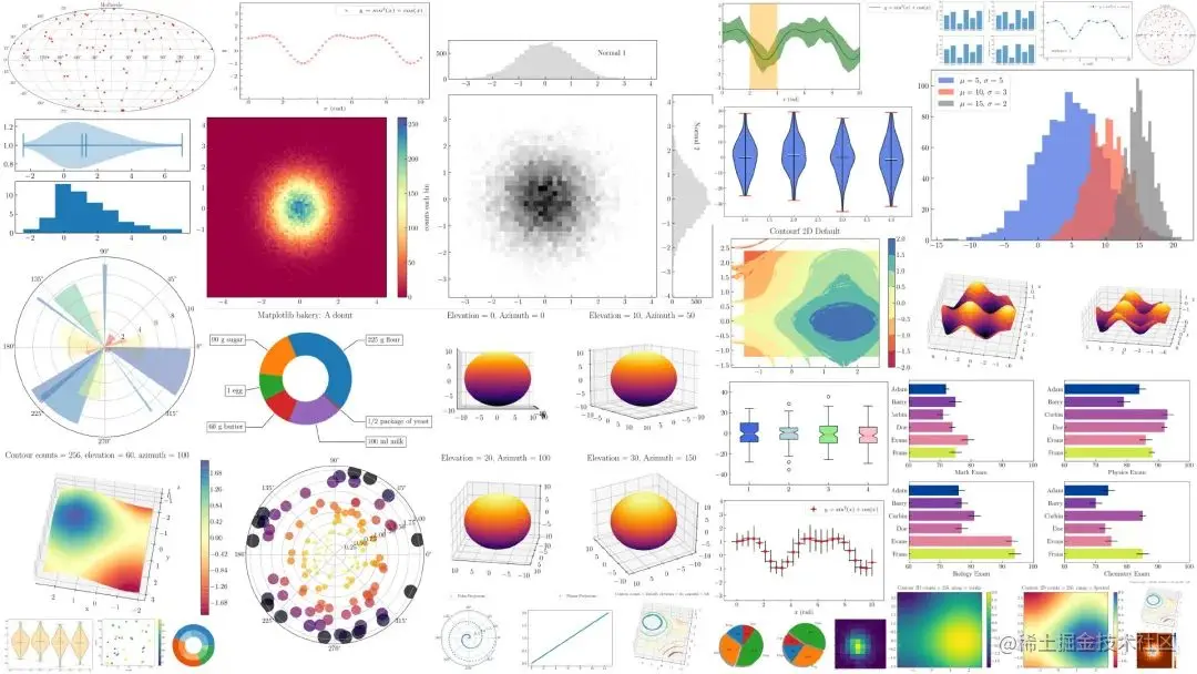
chart 1. Matplotlib Various diagrams generated in
This article will focus on creating and customizing various charts . therefore , It is assumed that the reader already knows Matplotlib Some basic knowledge of , for example , stay Matplotlib Create multiple sub graphs and custom color graphs in .
At the beginning of this article , I was going to write only one article . however , I think because of the reading time , It needs to be divided into several parts . If I write everything in one article , It will take a lot of time . therefore , I divide the whole content into 2 or 3 part .
This is the first part , share 38 individual Case study , Let's get started .
To install Matplotlib, You can use the following code through pip Install it :
pip install matplotlib
Or by conda To install :
conda install -c anaconda matplotlib
In this paper , Installed Matplotlib 3.3.2 edition . You can check the installed version number through the following code :
pip show matplotlib
If you want to in Jupyter Notebook( The following is called Jupyter) Check in , You can use the following code to check , Pictured 2 Shown .
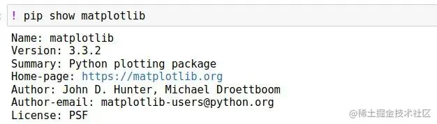
chart 2. stay Jupyter Intermediate inspection Matplotlib Version of
If you want to update Matplotlib Version of , You can use the following code :
pip install matplotlib --upgrade
Before proceeding to the first part , I need to tell you , I have customized Matplotlib Drawing style , For example, using LaTeX Font as default , Change font size and font , change xtick and ytick Direction and size , And in x Axis and y Axis . To put LaTeX The font is used as Matplotlib The default font in , You can use the following code :
plt.rcParams['text.usetex'] = True
If you encounter some errors , You need to read the following articles . I have explained in Matplotlib In dealing with LaTeX The detailed process of Fonts .
towardsdatascience.com/5-powerful-…
To customize other parameters ( font size , Font family and scale parameters ), Just write the following code at the beginning of the code :
plt.rcParams['font.size'] = 15
plt.rcParams['font.family'] = "serif"tdir = 'in'
major = 5.0
minor = 3.0
plt.rcParams['xtick.direction'] = tdir
plt.rcParams['ytick.direction'] = tdirplt.rcParams['xtick.major.size'] = major
plt.rcParams['xtick.minor.size'] = minor
plt.rcParams['ytick.major.size'] = major
plt.rcParams['ytick.minor.size'] = minor
If you need to know more about , You can access the following :
towardsdatascience.com/create-prof…
In this part , There are eight examples of scatter plots . Before you create a scatter chart , You need to use the following code to generate simulation data :
import numpy as np
import matplotlib.pyplot as plt
N = 50
x = np.linspace(0., 10., N)
y = np.sin(x)**2 + np.cos(x)
Variable x It's from 0 To 10 Of 50 An array of data . Variable y yes sin(x) and cos(x) Sum of squares of . You can use the following code to visualize in the form of a scatter chart x Variables on the axis x and y Variables on the axis y :
plt.figure()
plt.scatter(x, y)
The above content is very simple , The result is shown in Fig. 3 Shown :
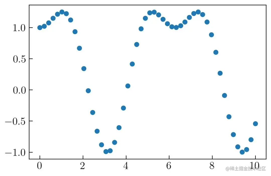
chart 3. Matplotlib Default scatter plot in
To make it more beautiful , You can reduce the size of each data and add the following code to the tag :
plt.scatter(x, y, s = 15, label = r'$y = sin^2(x) + cos(x)$')
To change the color , You need to add... To your code color Parameters :
color = 'r' # r means red
If you want to make the axis scale the same , You can use the following code :
plt.axis('equal')
for x Axis and y Axis create axis labels , You can add the following code :
plt.xlabel(r'$x$ (rad)')
plt.ylabel(r'$y$')
To display the legend , You can use the following code :
plt.legend()
To save a drawing , You can use the following code :
plt.savefig('scatter2.png', dpi = 300, bbox_inches = 'tight', facecolor='w')
The complete code is as follows :
N = 50
x = np.linspace(0., 10., N)
y = np.sin(x)**2 + np.cos(x)
plt.figure()
plt.scatter(x, y, s = 15, label = r'$ y  = sin^2(x) + cos(x)$', color = 'r')
plt.axis('equal')
plt.legend()
plt.xlabel(r'$x$ (rad)')
plt.ylabel(r'$y$')
plt.savefig('scatter2.png', dpi = 300, bbox_inches = 'tight', facecolor='w')
The scatter chart created is shown as chart 4 Shown :
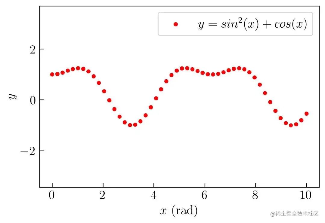
chart 4. Revised scatter chart
You can see the inside of the shaft x Axis and y The scale direction of the shaft , And the font used is LaTeX Format . If you want to change the drawing size , Can be in plt.figure() Add drawing size parameter in
plt.figure(figsize=(7, 4.5))
Change Tag style
To change the tag style , for example , To change from point to cross , Can be in plt.scatter Add this parameter to :
marker = 'x'
chart 5 Is the result of changing to cross :
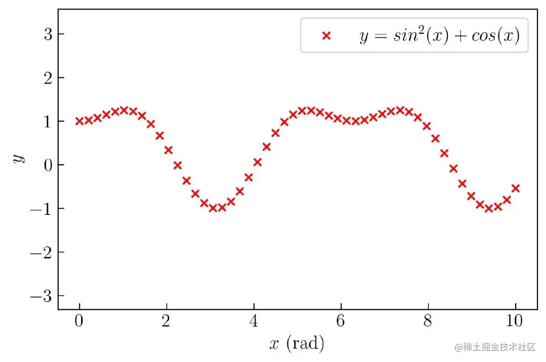
chart 5. Scatter chart with modified style
Matplotlib There are various styles in , You can learn about it through the following links :
matplotlib.org/api/markers…
If you have read the above documents , You can realize that you can use letters as a marker style . An example of using letters as markers is shown below , Such as chart 6 Shown :
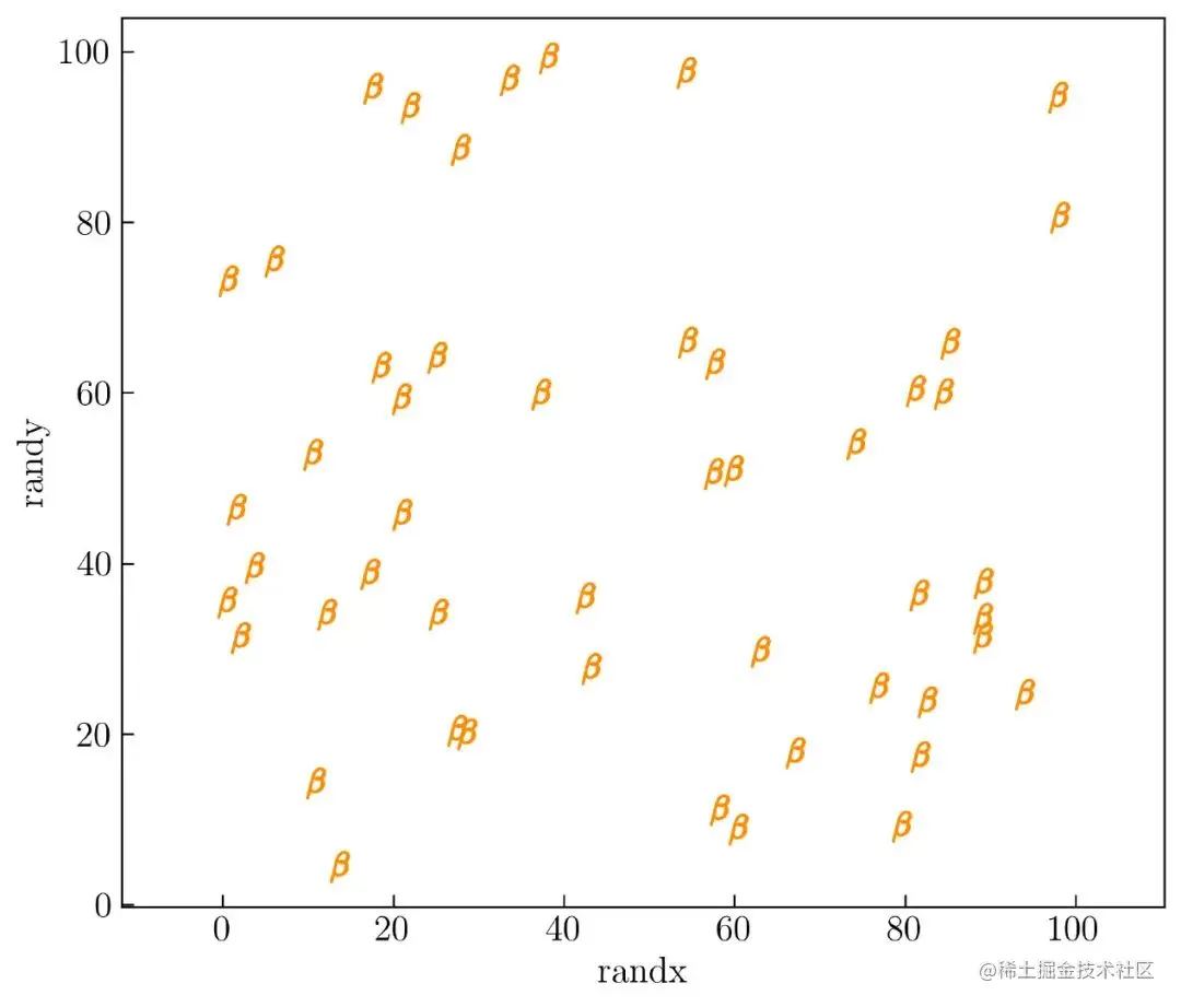
chart 6. Matplotlib Use letters as marker styles in
In order to generate chart 6, Here for x Axis and y The axis parameter creates a different function . Here is the code that generates it :
np.random.seed(100)
N = 50
randx = np.random.random(N) * 100
randy = np.random.random(N) * 100
To visualize variables randx and randy , You can run the following code :
plt.figure(figsize=(7, 6))
plt.scatter(randx, randy, marker=r'$\beta$', s = 150, color = 'darkorange')
plt.axis('equal')
plt.xlabel('randx')
plt.ylabel('randy')
plt.tight_layout()
The Greek symbol is used here beta As a marker style . You can also use other letters to change it , for example a,B,C,d or ** 1、2、3** etc. .
Customize the size of each data
Here's how to create a scatter chart of different sizes for each data , Such as chart 7 Shown .
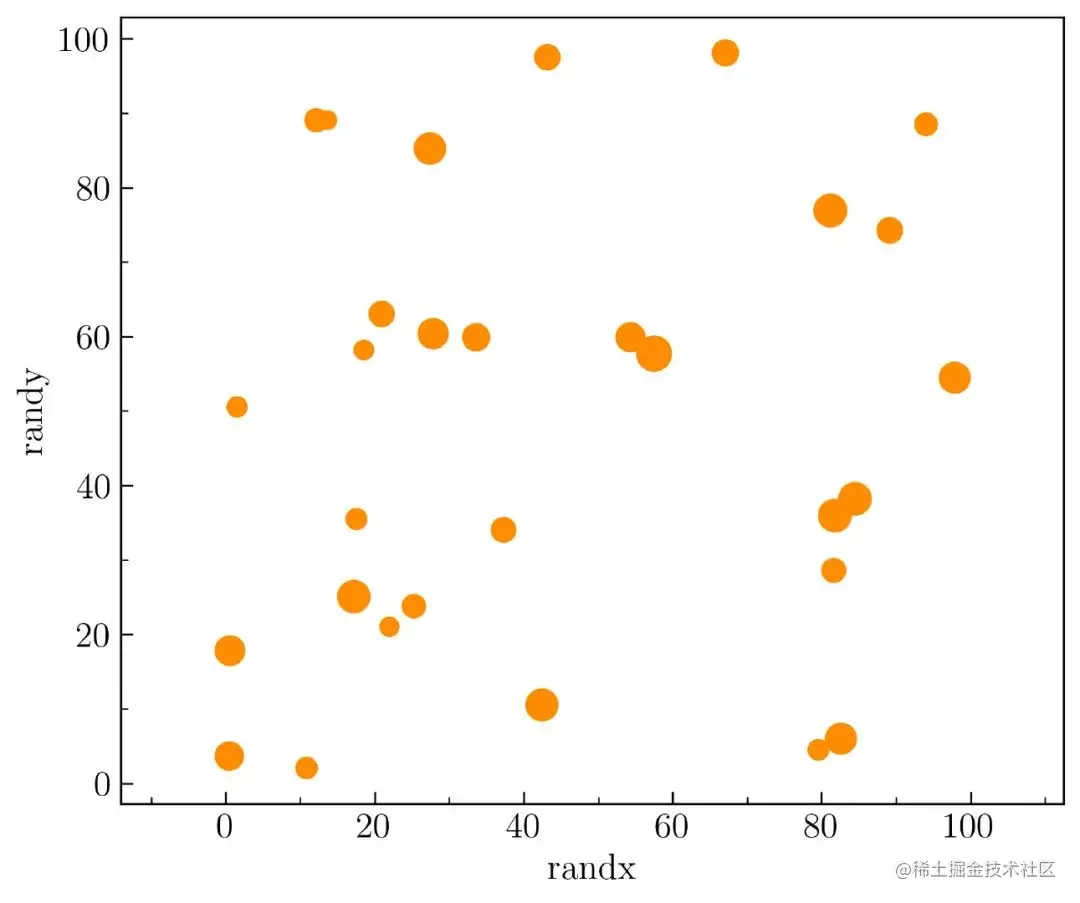
chart 7. Customize the size of data points in the scatter chart
To create it , Use the following code as a variable randx and randy Generated a random data , from 0 To 100
np.random.seed(100)
N = 30
randx = np.random.random(N) * 100
randy = np.random.random(N) * 100
after , Use the following code to 50 To 200 Each data between generates a random integer .
size = np.random.randint(50, 200, size=N)
Visualizing , Just add the following parameters :
plt.scatter(randx, randy, s = size, color = 'darkorange')
establish chart 7 Need to be x Axis and y Insert a minor scale on the shaft . To insert it , You need to use the following code to import the submodule MultipleLocator :
from matplotlib.ticker import MultipleLocator
after , You can add the following code , To insert the auxiliary shaft :
ax = plt.gca()ax.xaxis.set_minor_locator(MultipleLocator(10))
ax.yaxis.set_minor_locator(MultipleLocator(10))
Here is the generation chart 7 Complete code for :
np.random.seed(100)
N = 30
plt.figure(figsize=(7, 6))
randx = np.random.random(N) * 100
randy = np.random.random(N) * 100
size = np.random.randint(50, 200, size=N)
plt.scatter(randx, randy, s = size, color = 'darkorange')
plt.axis('equal')
ax = plt.gca()
ax.xaxis.set_minor_locator(MultipleLocator(10))
ax.yaxis.set_minor_locator(MultipleLocator(10))
plt.xlabel('randx')
plt.ylabel('randy')
plt.savefig('scatter5.png', dpi = 300, bbox_inches = 'tight', facecolor='w')
Color coded scatter plot
You can use the color map to change the color , This means that data of different sizes will be color coded in different colors . You can do this in plt.scatter() Add color parameter in :
c = size
To embed a color bar , You can use the following code :
plt.colorbar()
The results obtained are as follows chart 8 Shown :
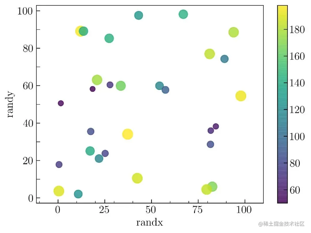
chart 8. Scatter diagram marked with different colors
Here's how to create chart 8 Complete code :
np.random.seed(100)
N = 30
randx = np.random.random(N) * 100
randy = np.random.random(N) * 100
ranking = np.random.random(N) * 200
size = np.random.randint(50, 200, size=N)
plt.figure(figsize=(7, 5))
plt.scatter(randx, randy, s = size, c = size, alpha = .8)
plt.axis('equal')
ax = plt.gca()
ax.xaxis.set_minor_locator(MultipleLocator(10))
ax.yaxis.set_minor_locator(MultipleLocator(10))
plt.xlabel('randx')
plt.ylabel('randy')
plt.colorbar()
plt.savefig('scatter6.png', dpi = 300, bbox_inches = 'tight', facecolor='w')
Custom color map
You can change the color map using the following parameters :
cmap = 'inferno'
Matplotlib The official documents explain the color map in detail , You can access... Through the following link :
matplotlib.org/3.3.2/tutor…
In this paper , Create your own color map by combining blue and orange color maps , Such as chart 9 Shown :
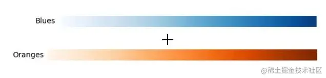
chart 9. Custom color map
Use the following code , You can combine the two colors :
from matplotlib import cm
from matplotlib.colors import ListedColormap, LinearSegmentedColormap
top = cm.get_cmap('Oranges_r', 128)
bottom = cm.get_cmap('Blues', 128)
newcolors = np.vstack((top(np.linspace(0, 1, 128)),
                       bottom(np.linspace(0, 1, 128))))
orange_blue = ListedColormap(newcolors, name='OrangeBlue')
I created my own color map , be known as orange_blue . To learn how to Matplotlib Create and customize your own color map , You can visit the following links :
towardsdatascience.com/creating-co…
To apply it , Just change the color parameters c = orange_blue , Can be in chart 11 The results of the in-process inspection :
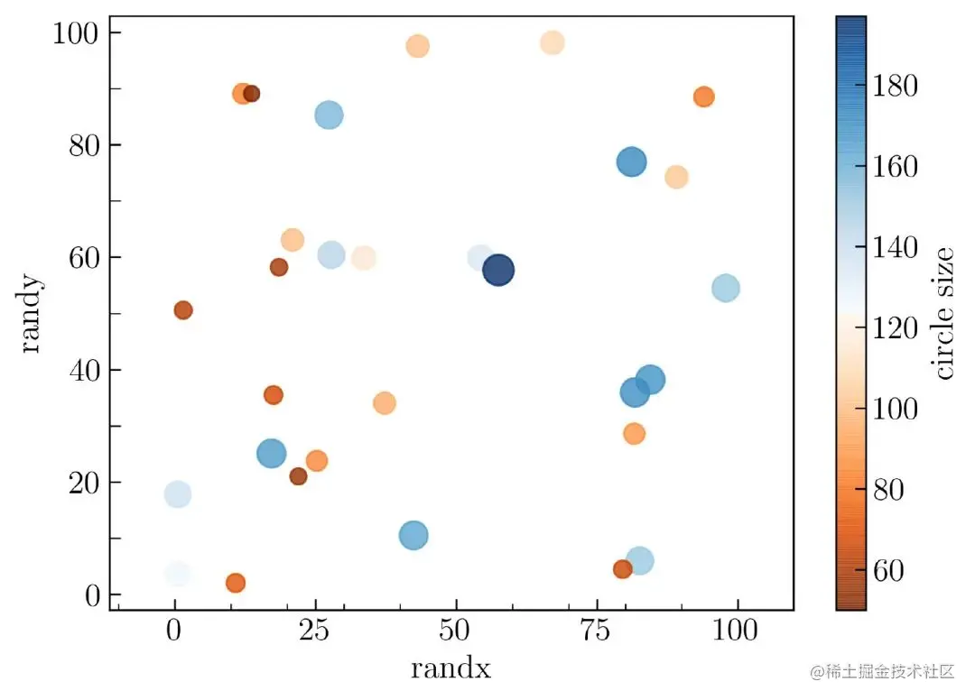
chart 11. Custom color
Here's how to create chart 11 Complete code for :
from matplotlib import cm
from matplotlib.colors import ListedColormap, LinearSegmentedColormap
top = cm.get_cmap('Oranges_r', 128)
bottom = cm.get_cmap('Blues', 128)
newcolors = np.vstack((top(np.linspace(0, 1, 128)),
                       bottom(np.linspace(0, 1, 128))))
orange_blue = ListedColormap(newcolors, name='OrangeBlue')
np.random.seed(100)
N = 30
randx = np.random.random(N) * 100
randy = np.random.random(N) * 100
size = np.random.randint(50, 200, size=N)
plt.figure(figsize=(7, 5))
plt.scatter(randx, randy, s = size, c = size, alpha = .8, cmap = orange_blue)
plt.axis('equal')
ax = plt.gca()
ax.xaxis.set_minor_locator(MultipleLocator(10))
ax.yaxis.set_minor_locator(MultipleLocator(10))
plt.xlabel('randx')
plt.ylabel('randy')
plt.colorbar(label = 'circle size')
plt.savefig('scatter7.png', dpi = 300, bbox_inches = 'tight', facecolor='w')
In order to be in Matplotlib Draw a line graph in , Simulation data will be generated using the following code :
N = 50
x = np.linspace(0., 10., N)
y = np.sin(x)**2 + np.cos(x)
To visualize variables as a line graph x and y , You need to use the following code :
plt.plot(x, y)
The above code will generate a graph , Such as chart 12 Shown :
chart 12. Matplotlib Default line graph in
Custom line styles
You can use the following parameters in Matplotlib Change the line style of the line chart in :
linestyle = '-'
The above parameters should be in plt.plot() Insert . In this article, we will show four different line styles . They are
['-', '--', '-.', ':']
To generate it automatically , Using loops will make it easier , Here is the complete code :
N = 50
x = np.linspace(0., 10., N)
y = np.sin(x)**2 + np.cos(x)
rows = 2
columns = 2
grid = plt.GridSpec(rows, columns, wspace = .25, hspace = .25)
linestyles = ['-', '--', '-.', ':']
plt.figure(figsize=(15, 10))
for i in range(len(linestyles)):
    plt.subplot(grid[i])
    plt.plot(x, y, linestyle = linestyles[i], label = r'$ y  = sin^2(x) + cos(x)$')
    plt.axis('equal')
    plt.xlabel('$x$ (rad)')
    plt.legend()
    plt.annotate("linestyle '" + str(linestyles[i]) + "'", xy = (0.5, -2.5), va = 'center', ha = 'left')

plt.savefig('line2.png', dpi = 300, bbox_inches = 'tight', facecolor='w')
Here we will assign... In a graph 4 There are different linetypes , This means that you need to create... In a diagram 4 Axes . stay Matplotlib in , By using GridSpec() ,subplot() and add_subplot() Define the subgraph to generate it . In this paper , Use GridSpec() , Created 4 Axes ( 2 That's ok 2 Column ), The width and height spacing are equal to 0.25.
As mentioned at the beginning of the article , This article will focus only on custom graphs . If in Matplotlib You need more explanation when defining subgraphs in , You can visit the following link :
towardsdatascience.com/customizing…
The result of running the above code is as follows chart 13 Shown :
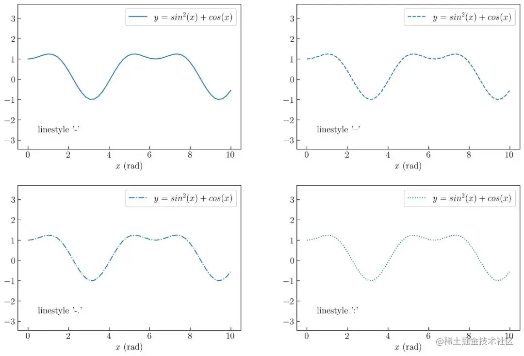
chart 13. Custom line styles
This code will simply generate 4 There are different linetypes , And add labels and notes for each linetype .Matplotlib There are many available linetypes , You can choose your favorite line style through the following link :
matplotlib.org/2.1.2/api/_…
Custom line width
Custom line width , You can use the following code :
lw = 2.0
Line drawings of four different widths , Such as chart 14 Shown :
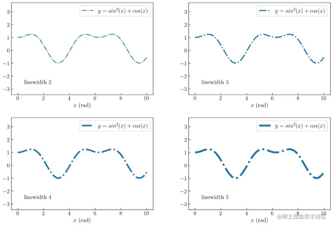
chart 14. Custom line width
establish chart 14 The complete code is as follows :
N = 50
rows = 2
columns = 2
x = np.linspace(0., 10., N)
y = np.sin(x)**2 + np.cos(x)
grid = plt.GridSpec(rows, columns, wspace = .25, hspace = .25)
linewidth = [2, 3, 4, 5]
plt.figure(figsize=(15, 10))
for i in range(len(linestyles)):
    plt.subplot(grid[i])
    plt.plot(x, y, linestyle = '-.', lw = linewidth[i], label = r'$ y  = sin^2(x) + cos(x)$')
    plt.axis('equal')
    plt.xlabel('$x$ (rad)')
    plt.legend()
    plt.annotate("linewidth " + str(linewidth[i]), xy = (0.5, -2.5), va = 'center', ha = 'left')

plt.savefig('line3.png', dpi = 300, bbox_inches = 'tight', facecolor='w')
Create an interval marker
Here you will create an interval marker (mark every). To understand it , The results will be displayed first , Such as chart 15 Shown :
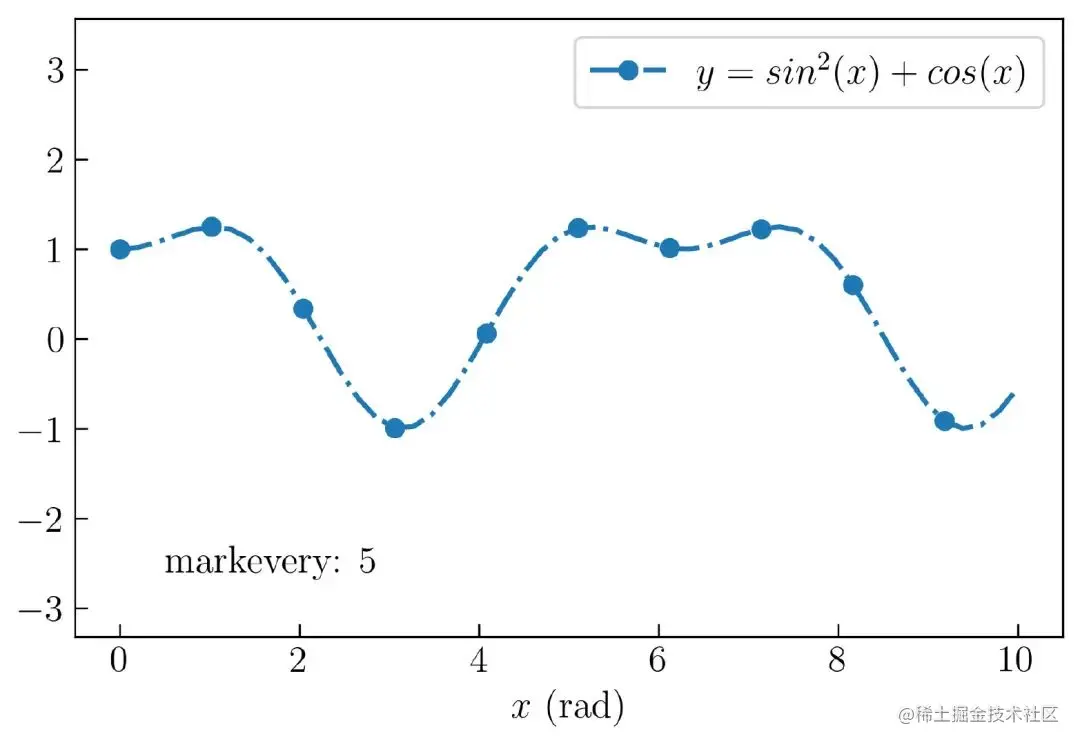
chart 15. Matplotlib Create interval markers in
stay chart 15 in , For each 5 Data to create a circle marker . You can create... Using the following parameters :
'o'            # shape for each 5 data
markevery = 5  # mark every
ms = 7         # size of the circle in mark every
Here is the complete code :
N = 50
x = np.linspace(0., 10., N)
y = np.sin(x)**2 + np.cos(x)
plt.figure(figsize=(7, 4.5))
plt.plot(x, y, 'o', ls = '-.', lw = 2, ms = 7, markevery = 5, label = r'$ y  = sin^2(x) + cos(x)$')
plt.axis('equal')
plt.xlabel('$x$ (rad)')
plt.legend()
plt.annotate("markevery: 5", xy = (0.5, -2.5), va = 'center', ha = 'left')
plt.savefig('line4.png', dpi = 300, bbox_inches = 'tight', facecolor='w')
Here, you need to set the parameter "o" On the third parameter position .
Change line color
Change line color , You can use the following code :
color = 'royalblue'
The following shows how to use loop generation 4 Two different colors and 4 There are different marks , Such as chart 16 Shown :
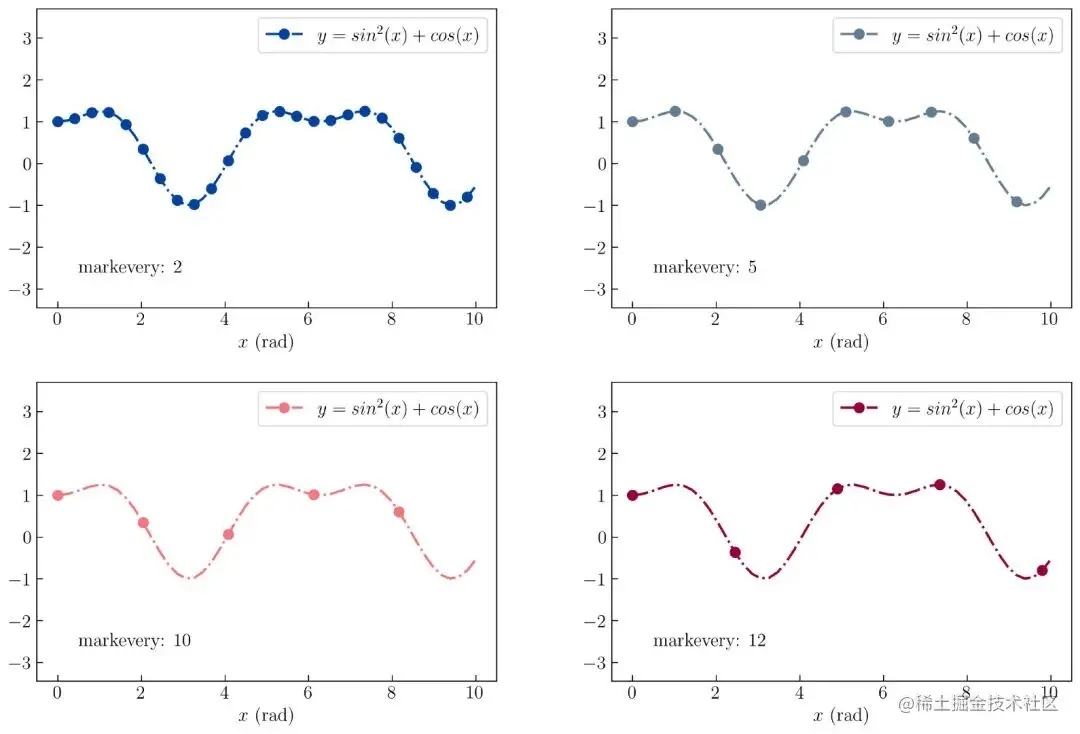
chart 16. Custom line color
establish chart 16 The code for is as follows :
N = 50
x = np.linspace(0., 10., N)
y = np.sin(x)**2 + np.cos(x)
rows = 2
columns = 2
grid = plt.GridSpec(rows, columns, wspace = .25, hspace = .25)
mark = [2, 5, 10, 12]
color = ['#00429d', '#627c94', '#f4777f', '#93003a']
plt.figure(figsize=(15, 10))
for i in range(len(linestyles)):
    plt.subplot(grid[i])
    plt.plot(x, y, 'o', ls='-.', lw = 2, ms = 8, markevery=mark[i], color = color[i], label = r'$ y  = sin^2(x) + cos(x)$')
    plt.axis('equal')
    plt.annotate("markevery: " + str(mark[i]), xy = (0.5, -2.5), va = 'center', ha = 'left')
    plt.xlabel('$x$ (rad)')
    plt.legend()
plt.savefig('line5.png', dpi = 300, bbox_inches = 'tight', facecolor='w')
Add an error to the line diagram
To demonstrate error bars in line charts , You need to use the following code to generate errors :
np.random.seed(100)
noise_x = np.random.random(N) * .2 + .1
noise_y = np.random.random(N) * .7 + .4
The code will be noise_x Generated from 0.1 To 0.3 The random number , by noise_y Generated from 0.3 To 0.7 The random number . for y Axis insertion error line , You can use the following code :
plt.errorbar(x, y, yerr = noise_y)
Line drawings with errors , Such as chart 17 Shown :
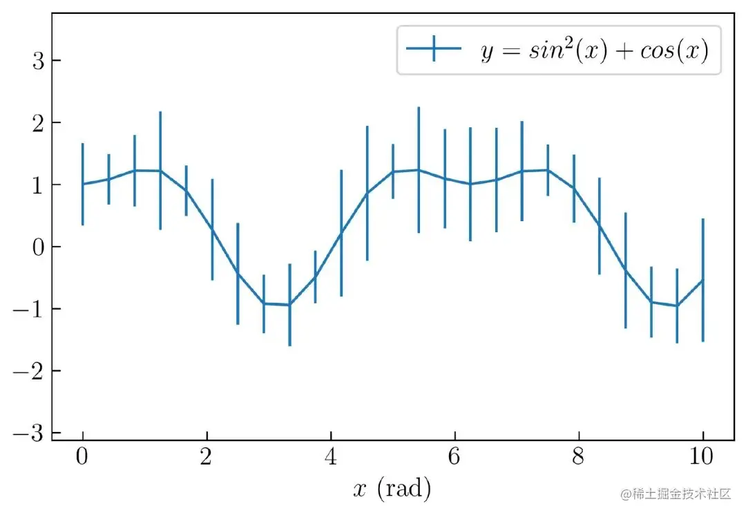
chart 17. Create a line graph to add errors
establish chart 17 The complete code is as follows :
N = 25
x = np.linspace(0., 10., N)
y = np.sin(x)**2 + np.cos(x)
np.random.seed(100)
noise_x = np.random.random(N) * .2 + .1
noise_y = np.random.random(N) * .7 + .4
plt.figure(figsize=(7, 4.5))
plt.errorbar(x, y, yerr = noise_y, xerr = noise_x, label = r'$ y  = sin^2(x) + cos(x)$')
plt.axis('equal')
plt.legend()
plt.xlabel('$x$ (rad)')
plt.savefig('line7.png', dpi = 300, bbox_inches = 'tight', facecolor='w')
stay x Axis add error , You can use the following parameters :
xerr = noise_x
You can see in the chart 18 Of x and y Example of inserting error bars on an axis :
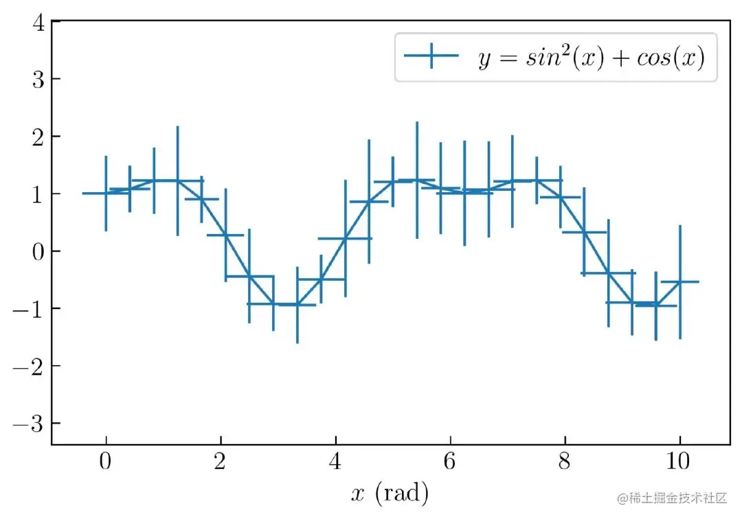
chart 18. Create a line chart with error bars
establish chart 18 The complete code is as follows :
N = 25
x = np.linspace(0., 10., N)
y = np.sin(x)**2 + np.cos(x)
np.random.seed(100)
noise_x = np.random.random(N) * .2 + .1
noise_y = np.random.random(N) * .7 + .4
plt.figure(figsize=(7, 4.5))
plt.errorbar(x, y, yerr = noise_y, xerr = noise_x, label = r'$ y  = sin^2(x) + cos(x)$')
plt.axis('equal')
plt.legend()
plt.xlabel('$x$ (rad)')
plt.savefig('line7.png', dpi = 300, bbox_inches = 'tight', facecolor='w')
If you only want to display the data without displaying the line graph , Only error bars are displayed , The following parameters can be used :
fmt = 'o'    # shape of the data point
color = 'r'  # color of the data point
ecolor ='k'   # color of the error bar
The complete code is as follows :
N = 25
x = np.linspace(0., 10., N)
y = np.sin(x)**2 + np.cos(x)
np.random.seed(100)
noise_x = np.random.random(N) * .2 + .1
noise_y = np.random.random(N) * .7 + .4
plt.figure(figsize=(7, 4.5))
plt.errorbar(x, y, xerr = noise_x, yerr = noise_y, label = r'$ y  = sin^2(x) + cos(x)$', color = 'r', fmt = 'o', ecolor='k', )
plt.axis('equal')
plt.legend()
plt.xlabel('$x$ (rad)')
plt.savefig('line8.png', dpi = 300, bbox_inches = 'tight', facecolor='w')
The effect is like chart 19 Shown :
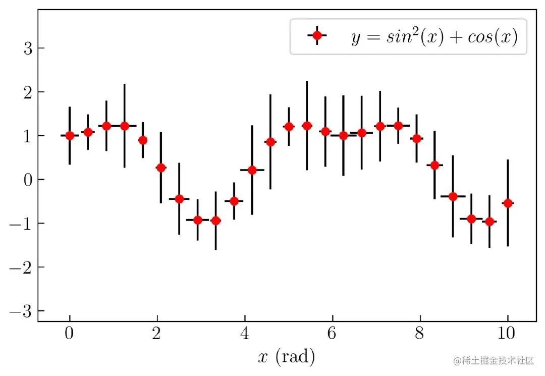
chart 19. Custom create error bars
Fill the error area
If the error range area needs to be filled , You can use the following code :
plt.fill_between(x, y + noise, y - noise, alpha = .5)
fill_between Parameter is x Axis of the data , The upper and lower limits of the filled area . In the code above , use y + noise and y-noise Express . Besides , You also need to reduce the transparency of the filled area . Here is the complete code :
N = 25
x = np.linspace(0., 10., N)
y = np.sin(x)**2 + np.cos(x)
np.random.seed(100)
noise = np.random.random(N) * .7 + .4
plt.figure(figsize=(7, 4.5))
plt.plot(x, y, ls='-', label = r'$ y  = sin^2(x) + cos(x)$')
plt.fill_between(x, y + noise, y - noise, alpha = .5)
plt.axis('equal')
plt.legend()
plt.xlabel('$x$ (rad)')
plt.savefig('line9.png', dpi = 300, bbox_inches = 'tight', facecolor='w')
After the above code runs , The result is as follows chart 20 Shown :
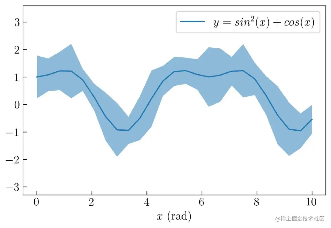
chart 20. Create filled areas
Insert horizontal and vertical lines
You can use the following code to insert horizontal and vertical lines :
plt.hlines(0, xmin = 0, xmax = 10)
plt.vlines(2, ymin = -3, ymax = 3)
You need to define the horizontal line in the first parameter , Including the start and end of the horizontal line . For vertical lines , It has similar parameters .
chart 21 Is an example of adding horizontal and vertical lines :
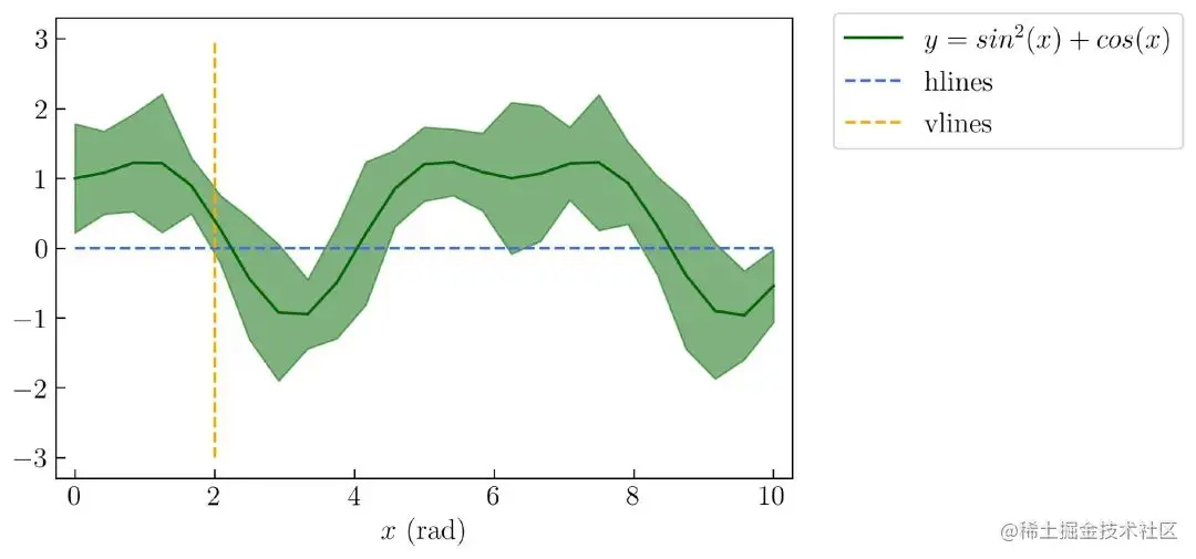
chart 21. Horizontal and vertical lines
establish chart 21 The complete code is as follows :
N = 25
x = np.linspace(0., 10., N)
y = np.sin(x)**2 + np.cos(x)
np.random.seed(100)
noise = np.random.random(N) * .7 + .4
plt.figure(figsize=(7, 4.5))
plt.plot(x, y, ls = '-', label = r'$ y  = sin^2(x) + cos(x)$', color = 'darkgreen')
plt.fill_between(x, y + noise, y - noise, color = 'darkgreen', alpha = .5)
plt.axis('equal')
plt.hlines(0, xmin = 0, xmax = 10, ls = '--', color = 'royalblue', label = 'hlines')
plt.vlines(2, ymin = -3, ymax = 3, ls = '--', color = 'orange', label = 'vlines')
plt.legend(bbox_to_anchor=(1.55, 1.04)) # position of the legend
plt.xlabel('$x$ (rad)')
plt.savefig('line10.png', dpi = 300, bbox_inches = 'tight', facecolor='w')
Vertical fill
Next, a filled area will be drawn between two vertical lines , Such as chart 22 Shown :
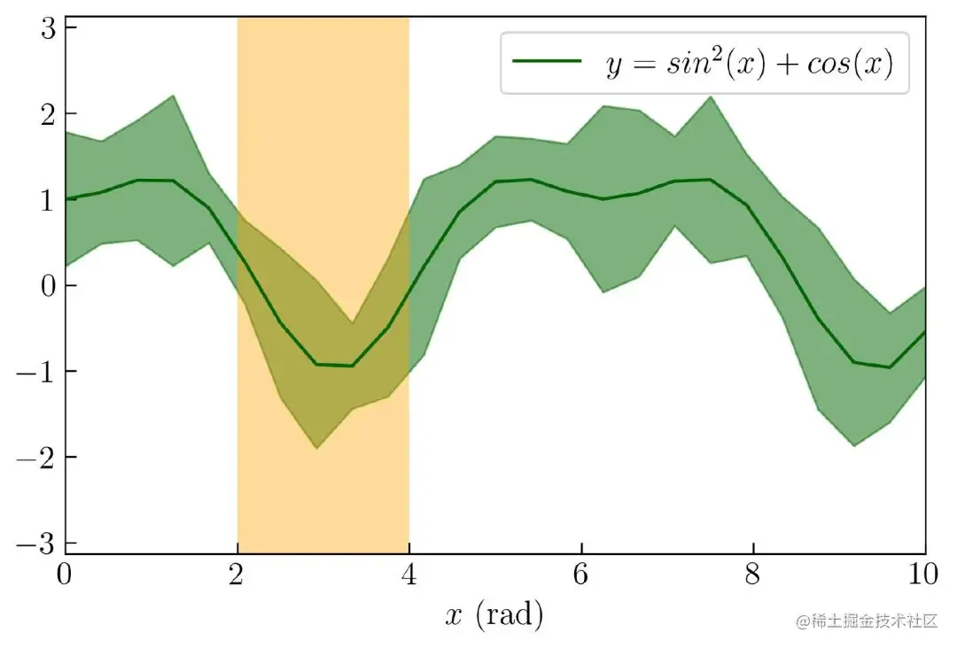
establish chart 22 The complete code is as follows :
N = 25
x = np.linspace(0., 10., N)
y = np.sin(x)**2 + np.cos(x)
np.random.seed(100)
noise = np.random.random(N) * .7 + .4
plt.figure(figsize=(7, 4.5))
plt.plot(x, y, ls='-', label = r'$ y  = sin^2(x) + cos(x)$', color = 'darkgreen')
plt.fill_between(x, y + noise, y - noise, color = 'darkgreen', alpha = .5)
plt.axis('equal')
plt.fill_between((2,4), -3.2, 3.2, facecolor='orange', alpha = 0.4)
plt.xlim(0, 10)
plt.ylim(-3, 3)
plt.legend()
plt.xlabel('$x$ (rad)')
plt.savefig('line11.png', dpi = 300, bbox_inches = 'tight', facecolor='w')
The following will explain how to 1D and 2D Make histogram in . First , One dimensional histograms will be introduced . Before visualizing a one-dimensional histogram , You will use the following code to make an analog data , Normal distribution random number .
N = 1000
np.random.seed(10021)
x = np.random.randn(N) * 2 + 15
By default ,Numpy A normal distribution random number will be generated , The average is / Median (mu) be equal to 0 , variance (sigma) be equal to 1 . In the code above , take mu Change to 15, take sigma Change to 2 . To visualize variables in a one-dimensional histogram x , You can use the following code :
plt.hist(x)
The result is as follows chart 23 Shown :

chart 23. Matplotlib Default one-dimensional histogram in
stay Matplotlib in , One dimensional histogram bins The default value is 10, If you want to change bins The default value of , You can modify the following parameters :
bins = 40
take bins Set to 40 after , The result is as follows chart 24 Shown :
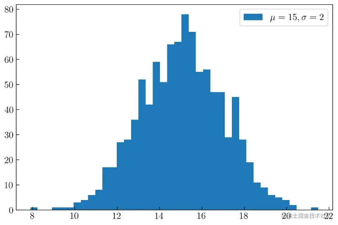
chart 24. Modified one-dimensional histogram
Here's how to create chart 24 Complete code for :
N = 1000
np.random.seed(10021)
x = np.random.randn(N) * 2 + 15
plt.figure(figsize=(9, 6))
plt.hist(x, bins = 40, label = r'$\mu = 15, \sigma = 2$')
plt.legend()
You can also use the following parameters to limit the range of the histogram :
range = (12, 18)
This parameter will make the histogram display only 12 To 18 Data between , Such as chart 25 Shown :
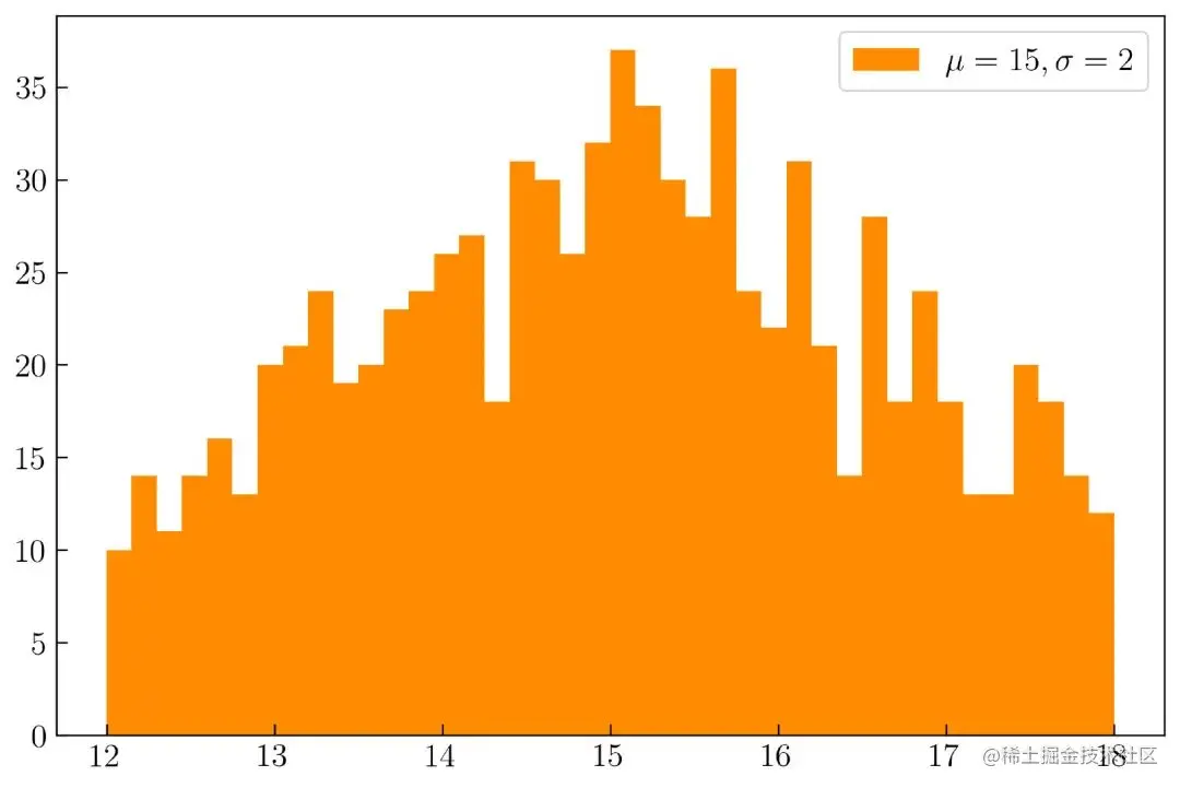
chart 25. One dimensional histogram with limited range
establish chart 25 The complete code is as follows :
N = 1000
np.random.seed(10021)
x = np.random.randn(N) * 2 + 15
plt.figure(figsize=(9, 6))
plt.hist(x, bins = 40, range = (12, 18), color = 'darkorange', label = r'$\mu = 15, \sigma = 2$')
plt.legend()
plt.savefig('hist3.png', dpi = 300, bbox_inches = 'tight', facecolor='w')
We also use color Parameter to change the color of the histogram .
Horizontal histogram
You can create a horizontal histogram , Such as chart 26 Shown :
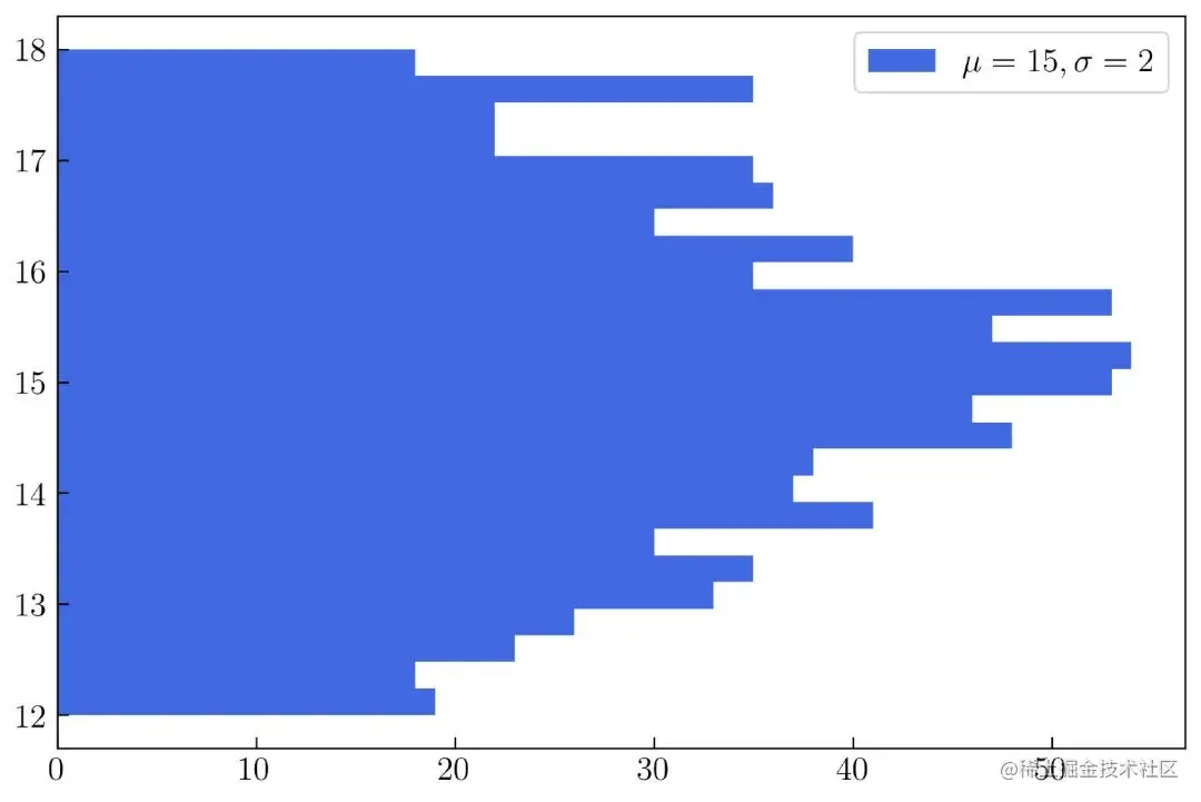
chart 25. Horizontal histogram
Use the following parameters to create a horizontal histogram :
orientation = 'horizontal'
establish chart 25 The complete code is as follows :
N = 1000
np.random.seed(10021)
x = np.random.randn(N) * 2 + 15
plt.figure(figsize=(9, 6))
plt.hist(x, bins = 25, range = (12, 18), color = 'royalblue', orientation='horizontal', label = r'$\mu = 15, \sigma = 2$')
plt.legend()
plt.savefig('hist4.png', dpi = 300, bbox_inches = 'tight', facecolor='w')
If you want to display the border of each histogram , You can use the following parameters .
edgecolor = 'k'
Set the histogram border to black , Such as chart 26 Shown :
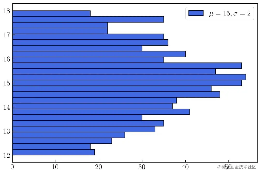
chart 26. Customize the border of the histogram
establish chart 26 The complete code is as follows :
N = 1000
np.random.seed(10021)
x = np.random.randn(N) * 2 + 15
plt.figure(figsize=(9, 6))
plt.hist(x, bins = 25, range = (12, 18), color = 'royalblue', orientation='horizontal',  edgecolor='k', label = r'$\mu = 15, \sigma = 2$')
plt.legend()
plt.savefig('hist5.png', dpi = 300, bbox_inches = 'tight', facecolor='w')
Overlapping histograms
You can display many histograms in one graph , Such as chart 27 Shown :
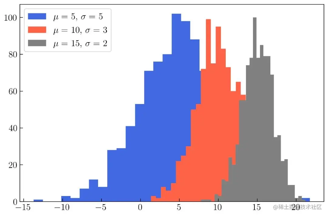
chart 27. Create overlapping histograms
stay chart 27 in , Three normal distributions are generated , Have different mu and sigma , The code is as follows :
N = 1000
mu1 = 5
mu2 = 10
mu3 = 15
sigma1 = 5
sigma2 = 3
sigma3 = 2
x1 = np.random.randn(N) * sigma1 + mu1
x2 = np.random.randn(N) * sigma2 + mu2
x3 = np.random.randn(N) * sigma3 + mu3
plt.figure(figsize=(9, 6))
plt.hist(x1, bins = 30, color = 'royalblue', label = r'$\mu = $ ' + str(mu1) + ', $\sigma = $ ' + str(sigma1))
plt.hist(x2, bins = 30, color = 'tomato', label = r'$\mu = $ ' + str(mu2) + ', $\sigma = $ ' + str(sigma2))
plt.hist(x3, bins = 30, color = 'gray', label = r'$\mu = $ ' + str(mu3) + ', $\sigma = $ ' + str(sigma3))
plt.legend()
plt.savefig('hist6.png', dpi = 300, bbox_inches = 'tight', facecolor='w')
You can make the histogram more beautiful by changing its transparency , Such as chart 28 Shown :
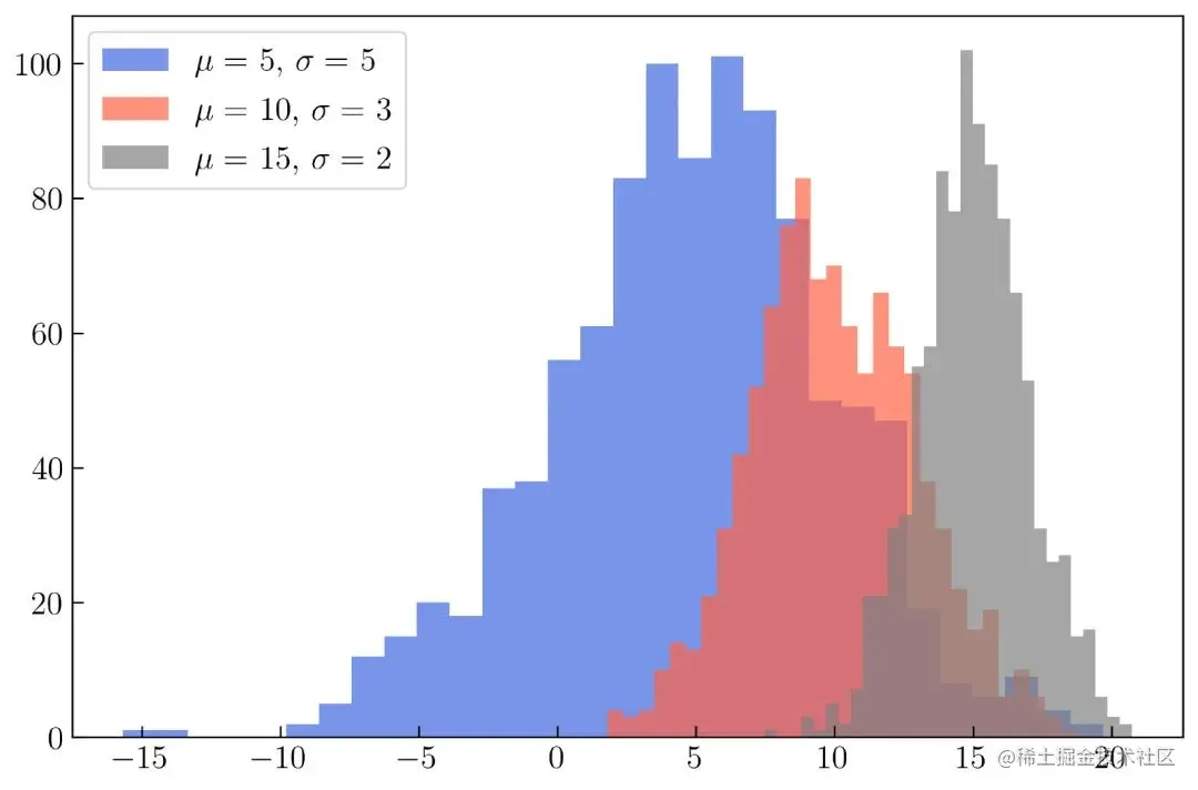
chart 28. Change the transparency of the histogram
establish chart 28 The complete code is as follows , The difference from the previous code , Is to add alpha Parameters :
N = 1000
mu1 = 5
mu2 = 10
mu3 = 15
sigma1 = 5
sigma2 = 3
sigma3 = 2
x1 = np.random.randn(N) * sigma1 + mu1
x2 = np.random.randn(N) * sigma2 + mu2
x3 = np.random.randn(N) * sigma3 + mu3
plt.figure(figsize=(9, 6))
plt.hist(x1, bins = 30, color = 'royalblue', label = r'$\mu = $ ' + str(mu1) + ', $\sigma = $ ' + str(sigma1), alpha = .7)
plt.hist(x2, bins = 30, color = 'tomato', label = r'$\mu = $ ' + str(mu2) + ', $\sigma = $ ' + str(sigma2), alpha = .7)
plt.hist(x3, bins = 30, color = 'gray', label = r'$\mu = $ ' + str(mu3) + ', $\sigma = $ ' + str(sigma3), alpha = .7)
plt.legend()
plt.savefig('hist7.png', dpi = 300, bbox_inches = 'tight', facecolor='w')
You can also use loop generation chart 28, As the code shows :
N = 1000
mu1 = 5
mu2 = 10
mu3 = 15
sigma1 = 5
sigma2 = 3
sigma3 = 2
x1 = np.random.randn(N) * sigma1 + mu1
x2 = np.random.randn(N) * sigma2 + mu2
x3 = np.random.randn(N) * sigma3 + mu3
mu = np.array([mu1, mu2, mu3])
sigma = np.array([sigma1, sigma2, sigma3])
x = np.array([x1, x2, x3])
colors = ['royalblue', 'tomato', 'gray']
plt.figure(figsize=(9, 6))
for i in range(len(x)):
    plt.hist(x[i], bins = 30, color = colors[i],
             label = r'$\mu = $ ' + str(mu[i]) +
             ', $\sigma = $ ' + str(sigma[i]), alpha = .7)
plt.legend()
After reading the code above , Maybe you want to try , Create many histograms in a single graph ( exceed 3 individual ). The following one is created and visualized in a single graph 10 Histogram code :
N_func = 10
N_data = 1000
np.random.seed(1000)
mu = np.random.randint(low = -5, high = 5, size = N_func)
sigma = np.random.randint(low = 1, high = 5, size = N_func)
x = []
for i in range(len(mu)):
    xi = np.random.randn(N_data) * sigma[i] + mu[i]
    x.append(xi)
colors = ['#00429d', '#7f40a2', '#a653a1', '#c76a9f', '#e4849c', '#d0e848',
          '#b6cf54', '#a9b356', '#b2914b', '#ff0001']

plt.figure(figsize=(9, 6))
for i in range(len(mu)):
    plt.hist(x[i], bins = 30, color = colors[i], label = r'$\mu = $ ' + str(mu[i]) + ', $\sigma = $ ' + str(sigma[i]), alpha = .7)
plt.legend(bbox_to_anchor=(1.33, 1.03))
After running the code , The result is as follows chart 29 Shown :
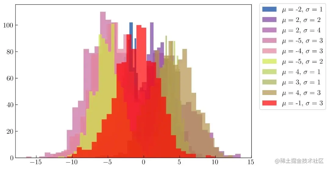
chart 29. Create multiple histograms
For color selection, please refer to the following links :gka.github.io/palettes/
For the detailed process of generating palette, please refer to the following :towardsdatascience.com/create-prof…
two-dimensional histogram
have access to Matplotlib Generate 2D Histogram , Such as chart 30 Shown .
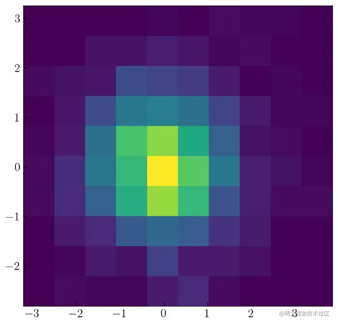
chart 30. two-dimensional histogram
To create a chart 30, You need to use the following code to generate 2 It's a normal distribution .
N = 1_000
np.random.seed(100)
x = np.random.randn(N)
y = np.random.randn(N)
To be in 2D Visualize variables in the histogram x and y , You can use the following code :
plt.hist2d(x, y)
Same as one-dimensional histogram ,Matplotlib in bins The default value is 10 . To change it , The same parameters as in the one-dimensional histogram can be applied , This is shown in the following code :
bins = (25, 25)
Can be in chart 31 See the modification effect of two-dimensional histogram in :
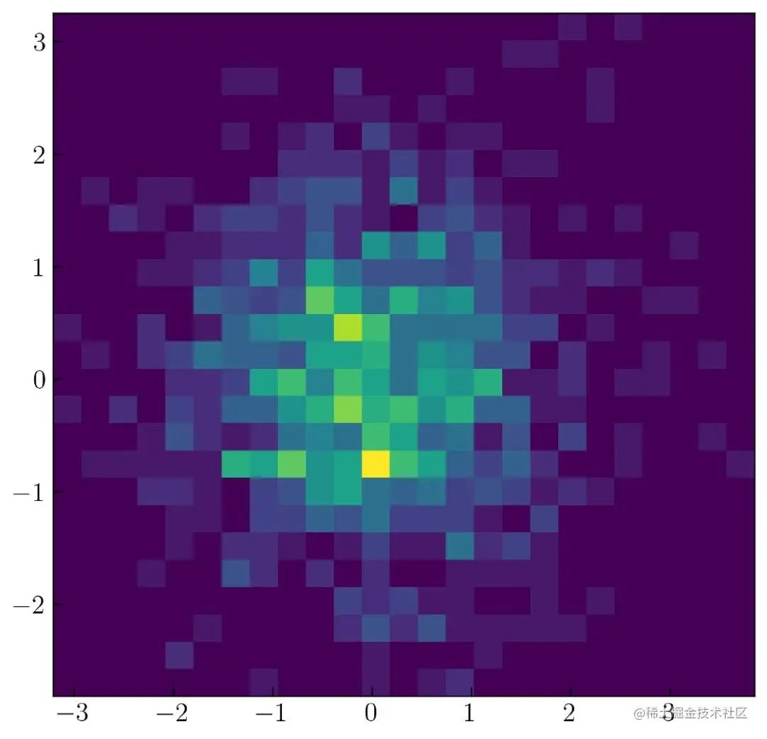
chart 31. Modify the two-dimensional histogram bins value
You can also use the following parameters to change the color map of the two-dimensional histogram :
cmap = orange_blue
I want to Viridis Color map of ( Matplotlib Default color map in ) Change your name to orange_blue Color map of . I have explained above how to create my own color map .
The following is the complete code after modifying the color map :
from matplotlib import cm
from matplotlib.colors import ListedColormap, LinearSegmentedColormap
top = cm.get_cmap('Oranges_r', 128)
bottom = cm.get_cmap('Blues', 128)
newcolors = np.vstack((top(np.linspace(0, 1, 128)),
                       bottom(np.linspace(0, 1, 128))))
orange_blue = ListedColormap(newcolors, name='OrangeBlue')
N = 10_000
np.random.seed(100)
x = np.random.randn(N)
y = np.random.randn(N)
plt.figure(figsize=(8.5, 7))
plt.hist2d(x, y, bins=(75, 75), cmap = orange_blue)
cb = plt.colorbar()
cb.set_label('counts each bin', labelpad = 10)
plt.savefig('hist12.png', dpi = 300, bbox_inches = 'tight', facecolor='w')
Run the above code , The result is as follows chart 32 Shown :
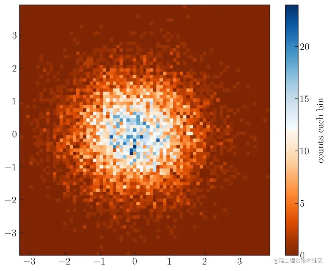
chart 32. Modify the color of 2D histogram
alike , Can be applied to by setting parameters plt.hist2d() To limit the range of each count ( Change the limit of the color bar ).
cmin = 5, cmax = 25
Here is the complete code :
N = 10_000
np.random.seed(100)
x = np.random.randn(N)
y = np.random.randn(N)
plt.figure(figsize=(8.5, 7))
plt.hist2d(x, y, bins=(75, 75), cmap = 'jet', cmin = 5, cmax = 25)
cb = plt.colorbar()
cb.set_label('counts each bin', labelpad = 10)
Use here “jet” Color map , The lower limit of the color bar is equal to 5 , Cap of 25 . The result is as follows chart 33 Shown :
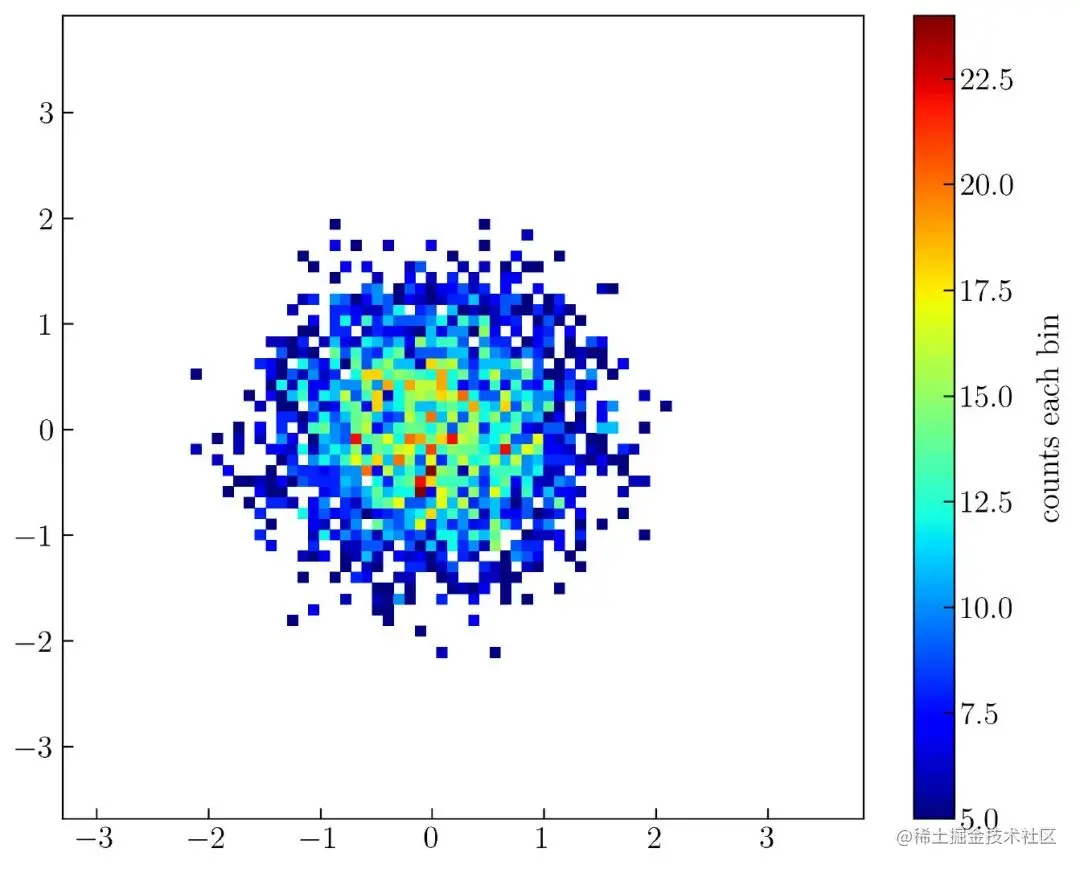
chart 33. Set the limit range in the histogram
You can also try using the following code to count the generated random number from 10000 Change to 100000 .
N = 100_000
np.random.seed(100)
x = np.random.randn(N)
y = np.random.randn(N)
plt.figure(figsize=(8.5, 7))
plt.hist2d(x, y, bins=(75, 75), cmap = 'Spectral')
cb = plt.colorbar()
cb.set_label('counts each bin', labelpad = 10)
The result is as follows chart 34 Shown :
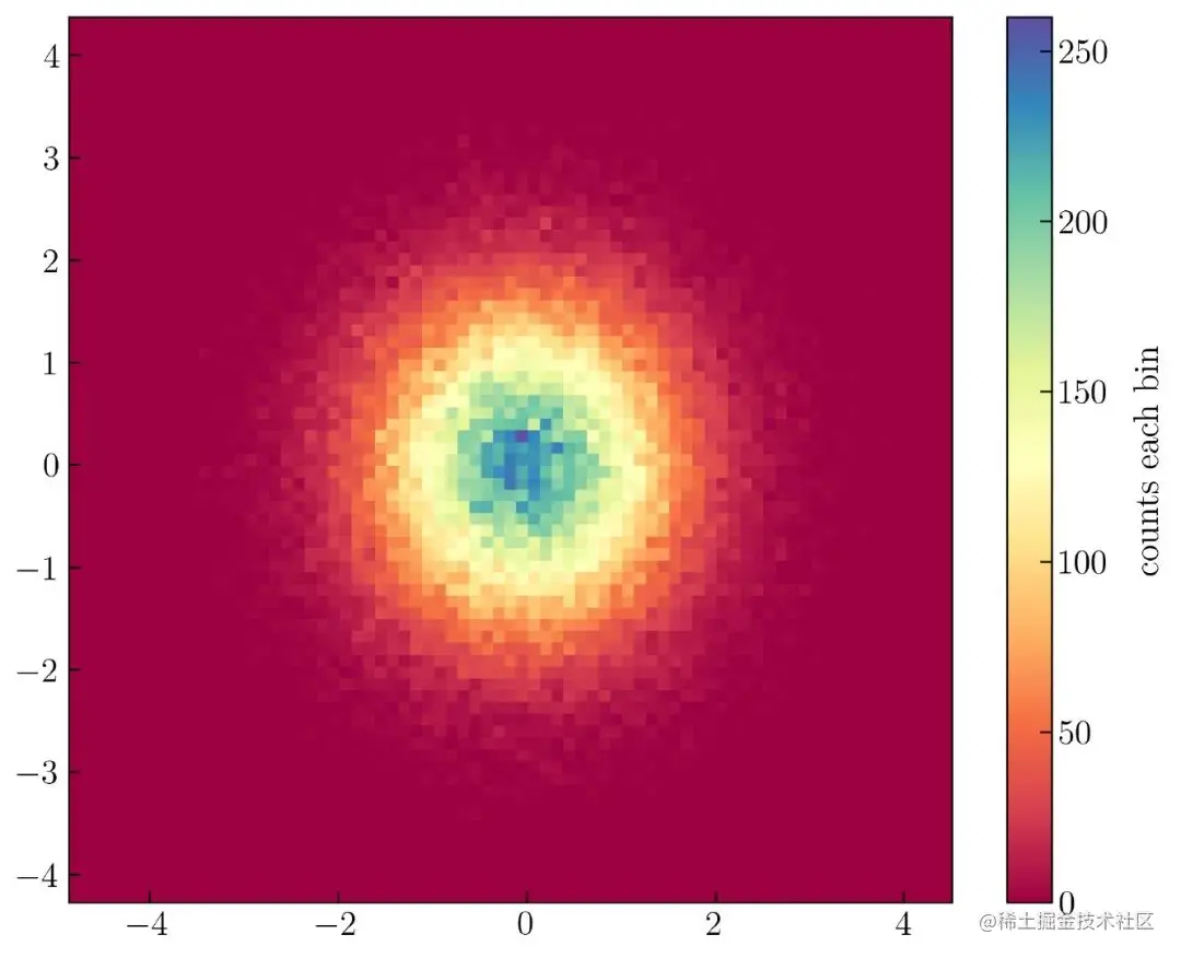
chart 34. Use Matplotlib Visualize the normal distribution in the two-dimensional histogram
chart 34 stay 0 It's peaking at , stay -1 To 1 Location distribution , Because there is no change mu and sigma Value .
Marginal graph (Marginal plot)
「Python The way of data 」 notes : Marginal graph (Marginal plot), In some places, it also becomes Joint distribution (Joint plot).
Here's how to create a marginal distribution , Such as chart 35 Shown :
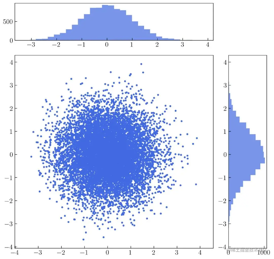
chart 35. The marginal graph of scatter and histogram
chart 35 From the scatter diagram and 2 Histogram construction . To create it , You need to know how to define subgraphs or axes in a single drawing . chart 35 from 25 Axes ( 5 Column 5 That's ok ) constitute . The details are as follows chart 36 Shown .
You can use the following code to create chart 36 :
You may need to read the following , In order to better understand :towardsdatascience.com/customizing…
rows = 5
columns = 5
grid = plt.GridSpec(rows, columns, wspace = .4, hspace = .4)
plt.figure(figsize=(10, 10))
for i in range(rows * columns):
    plt.subplot(grid[i])
    plt.annotate('grid '+ str(i), xy = (.5, .5), ha = 'center',
                 va = 'center')
for i in range(rows):
    exec (f"plt.subplot(grid[{i}, 0])")
    plt.ylabel('rows ' + str(i), labelpad = 15)
for i in range(columns):
    exec (f"plt.subplot(grid[-1, {i}])")
    plt.xlabel('column ' + str(i), labelpad = 15)
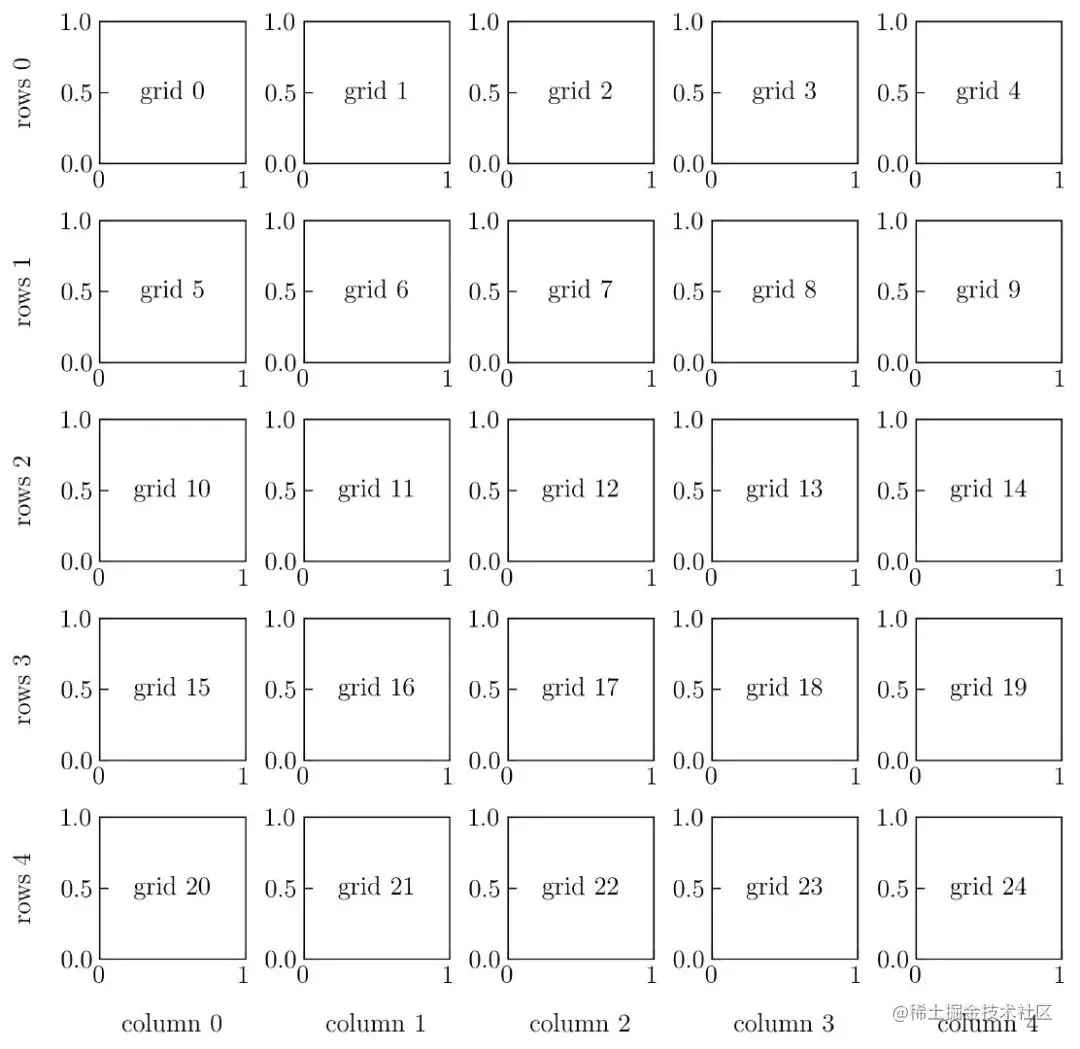
chart 36. Many pictures
chart 35 Shows chart 36 Transformation . There will be chart 36 Some of the meshes in are merged into only 3 A larger grid . The first grid will be the grid 0 Merge to grid 3( That's ok 1 , Column 0 To column ). I'll fill the first grid with histograms . The second mesh merges from the 1 Go to the first place 4 Line and from 0 Column to the first 3 Column 16 Grid (s) . The last mesh is by merging the mesh 9、14、19 and 24( That's ok 1、2、3、4 And column 4) Built .
To create the first mesh , You can use the following code :
rows = 5
columns = 5
grid = plt.GridSpec(rows, columns, wspace = .4, hspace = .4)
plt.figure(figsize=(10, 10))
plt.subplot(grid[0, 0:-1])
after , Add the following code to insert a one-dimensional histogram :
plt.hist(x, bins = 30, color = 'royalblue', alpha = .7)
To create a second mesh , You can add the following code to the above code :
plt.subplot(grid[1:rows+1, 0:-1])
Add the following code to generate a scatter plot in the second grid :
plt.scatter(x, y, color = 'royalblue', s = 10)
plt.axis('equal')
Here is the code to generate the third grid and its histogram , You need to insert the following code into the first grid code :
plt.subplot(grid[1:rows+1, -1])
plt.hist(y, bins = 30, orientation='horizontal',
         color = 'royalblue', alpha = .7)
Merge the above code , The complete code is as follows :
N = 10_000
np.random.seed(100)
x = np.random.randn(N)
y = np.random.randn(N)
rows = 5
columns = 5
grid = plt.GridSpec(rows, columns, wspace = .4, hspace = .4)
plt.figure(figsize=(10, 10))
plt.subplot(grid[0, 0:-1])
plt.hist(x, bins = 30, color = 'royalblue', alpha = .7)
plt.subplot(grid[1:rows+1, 0:-1])
plt.scatter(x, y, color = 'royalblue', s = 10)
plt.axis('equal')
plt.subplot(grid[1:rows+1, -1])
plt.hist(y, bins = 30, orientation='horizontal', color = 'royalblue', alpha = .7)
Next , The scatter plot in the second grid will be changed using a two-dimensional histogram , Such as chart 37 Shown :
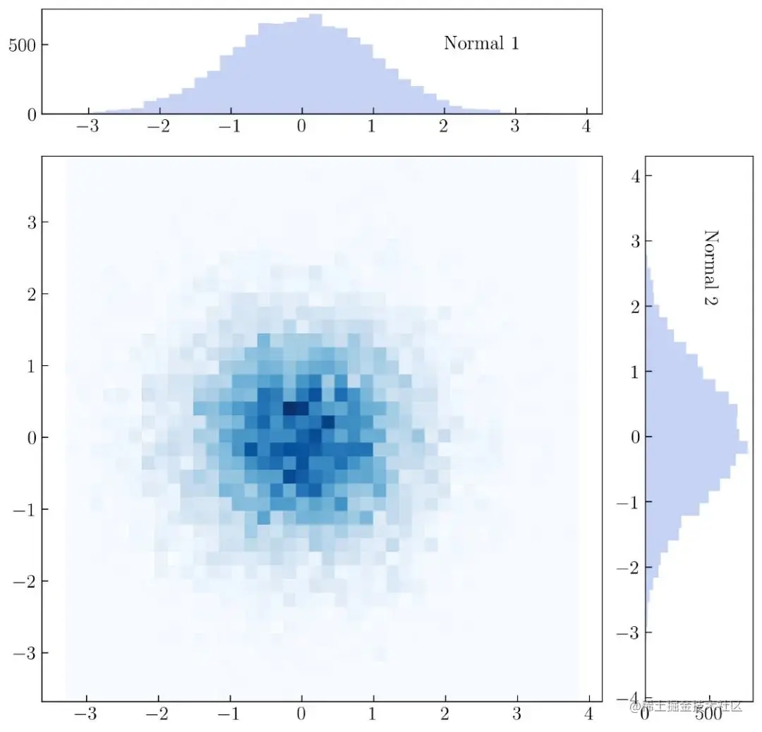
chart 37. Marginal graph
establish chart 37 The complete code is as follows :
N = 10_000
np.random.seed(100)
x = np.random.randn(N)
y = np.random.randn(N)
rows = 5
columns = 5
grid = plt.GridSpec(rows, columns, wspace = .4, hspace = .4)
plt.figure(figsize=(10, 10))
plt.subplot(grid[0, 0:-1])
plt.hist(x, bins = 40, color = 'royalblue', alpha = .3)
plt.annotate('Normal 1', xy = (2, 500), va = 'center', ha = 'left')
plt.subplot(grid[1:rows+1, 0:-1])
plt.hist2d(x, y, cmap = 'Blues', bins = (40, 40))
plt.axis('equal')
plt.subplot(grid[1:rows+1, -1])
plt.hist(y, bins = 40, orientation='horizontal', color = 'royalblue', alpha = .3)
plt.annotate('Normal 2', xy = (500, 2), va = 'bottom', ha = 'center', rotation = -90)
「Python The way of data 」 notes : Use Matplotlib To create a marginal graph , Relatively speaking, it is more complicated , It is recommended that seaborn To create Joint distribution (Joint plot), The effect is similar .
Refer to the following article :
- Easy to use Seaborn Data visualization
If you want to visualize data with a bar graph , stay Matplotlib Before creating a bar chart in , First create the simulation data to be displayed . For example, the data of six people is created in the math test scores , To create it , Use the following code .
name = ['Adam', 'Barry', 'Corbin', 'Doe', 'Evans', 'Frans']
np.random.seed(100)
N = len(name)
math = np.random.randint(60, 100, N)
The generated math test scores range from 60 To 100 , The code is as follows :
plt.bar(name, math, alpha = .7)
After adding some information , A bar graph is generated , Such as chart 38 Shown :
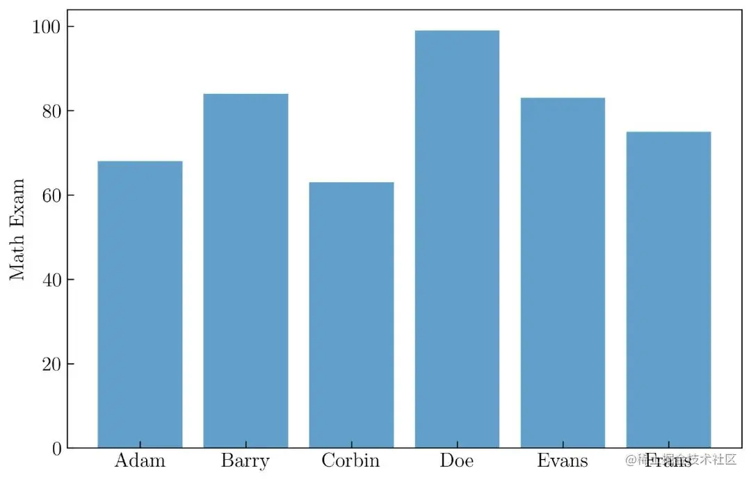
chart 38. Create a bar chart
establish chart 38 The complete code is as follows :
name = ['Adam', 'Barry', 'Corbin', 'Doe', 'Evans', 'Frans']
np.random.seed(100)
N = len(name)
math = np.random.randint(60, 100, N)
plt.figure(figsize=(9, 6))
plt.bar(name, math, alpha = .7)
plt.ylabel('Math Exam')
after , Use the following code for physical 、 Biology and chemistry test scores create more simulation data .
np.random.seed(100)
N = len(name)
math = np.random.randint(60, 100, N)
physics = np.random.randint(60, 100, N)
biology = np.random.randint(60, 100, N)
chemistry = np.random.randint(60, 100, N)
You can also use Pandas Create a table ( stay Python in , We call it DataFrame ). Created from simulated data DataFrame Such as chart 39 Shown :
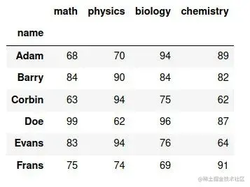
chart 39. Pandas Medium DataFrame data
By default , How to create... Is not shown here DataFrame Code for .
then , Visualize it , Such as chart 40 Shown :
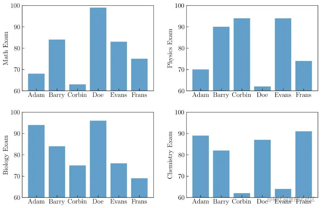
chart 40. Create multiple bar charts
establish chart 40 The code for is as follows :
name = ['Adam', 'Barry', 'Corbin', 'Doe', 'Evans', 'Frans']
np.random.seed(100)
N = len(name)
math = np.random.randint(60, 100, N)
physics = np.random.randint(60, 100, N)
biology = np.random.randint(60, 100, N)
chemistry = np.random.randint(60, 100, N)
rows = 2
columns = 2
plt.figure(figsize=(12, 8))
grid = plt.GridSpec(rows, columns, wspace = .25, hspace = .25)
plt.subplot(grid[0])
plt.bar(name, math, alpha = .7)
plt.ylabel('Math Exam')
plt.ylim(60, 100)
plt.subplot(grid[1])
plt.bar(name, physics, alpha = .7)
plt.ylabel('Physics Exam')
plt.ylim(60, 100)
plt.subplot(grid[2])
plt.bar(name, biology, alpha = .7)
plt.ylabel('Biology Exam')
plt.ylim(60, 100)
plt.subplot(grid[3])
plt.bar(name, chemistry, alpha = .7)
plt.ylabel('Chemistry Exam')
plt.ylim(60, 100)
Or use the following code ( If you want to use a loop ):
name = ['Adam', 'Barry', 'Corbin', 'Doe', 'Evans', 'Frans']
course_name = ['Math', 'Physics', 'Biology', 'Chemistry']
N = len(name)
rows = 2
columns = 2
plt.figure(figsize=(12, 8))
grid = plt.GridSpec(rows, columns, wspace = .25, hspace = .25)
for i in range(len(course_name)):
    np.random.seed(100)
    course = np.random.randint(60, 100, N)
    plt.subplot(grid[i])
    plt.bar(name, course, alpha = .7)
    plt.ylabel(course_name[i] + ' Exam')
    plt.ylim(60, 100)
Horizontal Bar Graph
You can use the following code to create a horizontal bar chart .
Want to present in a horizontal bar chart and various colors chart 40, Here is the complete code to generate it :
name = ['Adam', 'Barry', 'Corbin', 'Doe', 'Evans', 'Frans']
course_name = ['Math', 'Physics', 'Biology', 'Chemistry']
colors = ['#00429d', '#7f40a2', '#a653a1', '#c76a9f',
          '#e4849c', '#d0e848']
N = len(name)
rows = 2
columns = 2
plt.figure(figsize=(12, 8))
grid = plt.GridSpec(rows, columns, wspace = .25, hspace = .25)
for i in range(len(course_name)):
    np.random.seed(100)
    course = np.random.randint(60, 100, N)
    plt.subplot(grid[i])
    plt.barh(name, course, color = colors)
    plt.xlabel(course_name[i] + ' Exam')
    plt.xlim(60, 100)
    plt.gca().invert_yaxis()
After running the code above , Will get results , Such as chart 41 Shown :
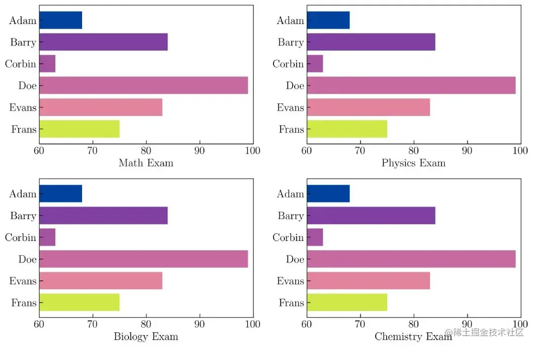
chart 41. Horizontal Bar Graph
You can use the following parameters to insert error bars in a horizontal bar chart :
N = len(name)
noise = np.random.randint(1, 3, N)
plt.barh(name, course, xerr = noise)
Use here 1 To 3 An integer random number between creates an error , Such as variable noise Described in . After adding some elements to the horizontal bar chart , Show it , Such as chart 42 Shown :
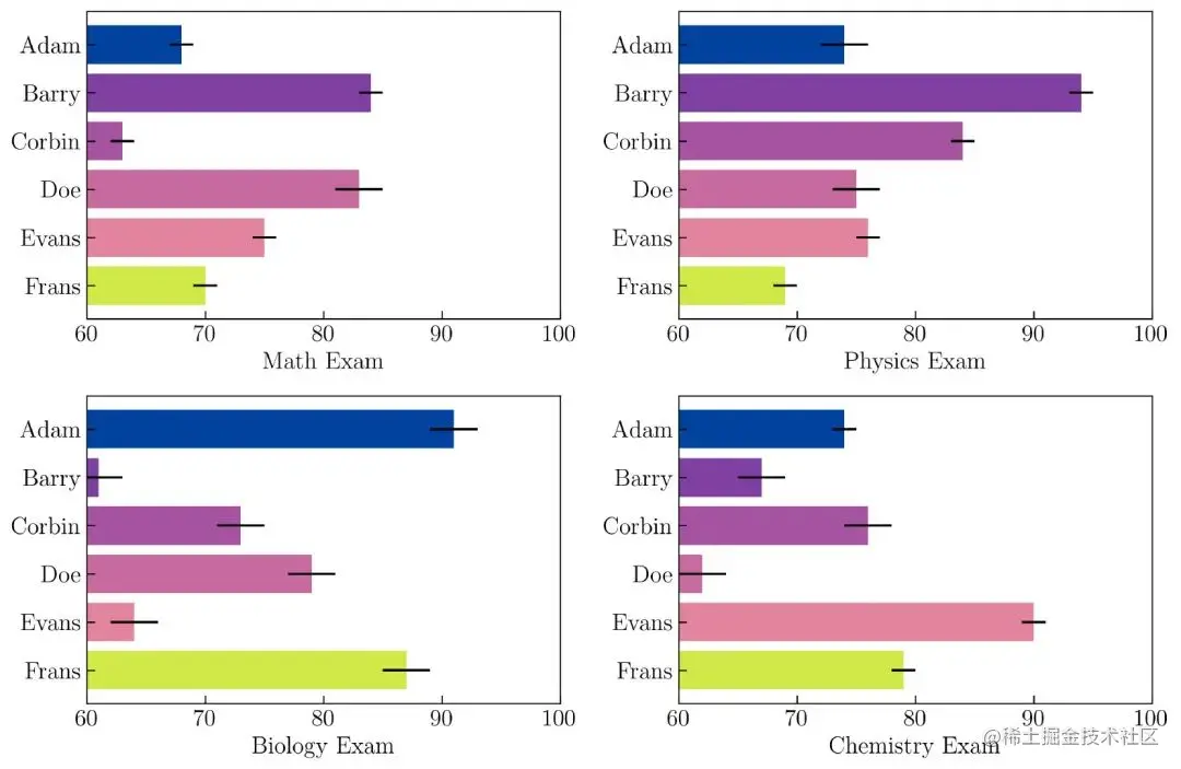
chart 42. Horizontal bar chart with error added
establish chart 42 The code for is as follows :
name = ['Adam', 'Barry', 'Corbin', 'Doe', 'Evans', 'Frans']
course_name = ['Math', 'Physics', 'Biology', 'Chemistry']
N = len(name)
rows = 2
columns = 2
plt.figure(figsize=(12, 8))
grid = plt.GridSpec(rows, columns, wspace = .25, hspace = .25)
np.random.seed(100)
for i in range(len(course_name)):
    course = np.random.randint(60, 95, N)
    noise = np.random.randint(1, 3, N)
    plt.subplot(grid[i])
    plt.barh(name, course, color = colors, xerr = noise,
             ecolor = 'k')
    plt.xlabel(course_name[i] + ' Exam')
    plt.xlim(60, 100)
    plt.gca().invert_yaxis()
You may have realized that the simulated data is not real , however , I think this is still understood Matplotlib A good example of a bar chart in .
This article is about Matplotlib The third part of the visual introduction 1 part . This article only covers Matplotlib Introduce 11 Of the four parts 4 Parts of , Including scatter plot , Broken line diagram , Histogram and bar chart . In the following content , I'll show you how to create a box diagram , Violin chart , The pie chart , Polar diagram , Geographic projection ,3D Diagram and outline diagram tutorial .
The source of the original :
towardsdatascience.com/visualizati…