The first 5 Chapter Button control (Button)
5.1 Introduction to button control
The button is a standard tkinter Control . Text or pictures can be displayed on the button as prompt information . Only one font and color can be used for text . The main function of the button is to click , You can call the specified callback function , Complete specific functions . such as , close window 、 To execute an order, etc .
import tkinter as tk
root=tk.Tk()
root.geometry('300x240')
b1 = tk.Button(root,text="Quit",command=root.destroy)
b1.pack()
root.mainloop()
result :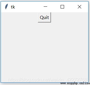
This applet shows the basic functions of the button control . After clicking the button , Callback the set function . The function of this program is to exit the application , And close the window .
5.2 Button properties
The properties of the button control are as follows :
5.2.1 activebackground and activeforeground
Define the button in ACTIVE In the state of , Background color and text color . These two properties can be used to highlight text , Or some special effect .
Code
import tkinter as tk
root=tk.Tk()
root.geometry(‘300x240’)
b1 = tk.Button(root,text=“Quit”,activebackground=‘blue’,
activeforeground=‘yellow’,command=root.destroy)
b1.pack()
root.mainloop()
result :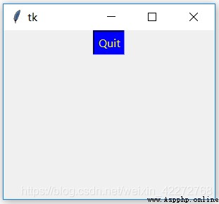
5.2.2 anchor
anchor How to control the display of text . See 3.3.4 section . Look below anchor=tk.SW Example .
import tkinter as tk
root=tk.Tk()
root.geometry('300x240')
b1=tk.Button(root,text='Quit',anchor=tk.SW,
height=5,width=20,command=root.destroy)
b1.pack()
root.mainloop()
result :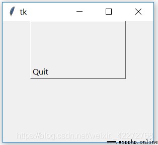
The text on the button , Not the usual centered display , It is displayed in the lower left corner . This is it. anchor The role of .
5.2.3 background(bg)
Set the background color of the button .bg Is an abbreviation .
import tkinter as tk
root=tk.Tk()
root.geometry('300x240')
b1=tk.Button(root,text='Quit',height=3,width=20,
bg='yellow',command=root.destroy)
b1.pack()
root.mainloop()
result :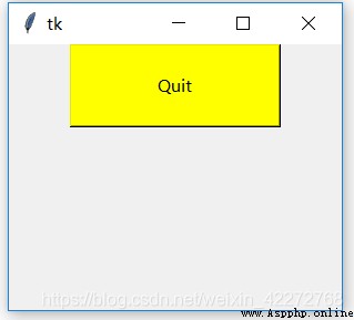
explain : The background color is set to yellow .
5.2.4 bitmap
Show pictures on buttons . This bitmap No windows Commonly used in the system bitmap. Not recommended bitmap. If you want to use pictures , have access to image Property to set , Support gif、png And so on .
import tkinter as tk
root=tk.Tk()
root.geometry('300x240')
b1=tk.Button(root,bitmap='@x.xbm',
bg='yellow', command=root.destroy)
b1.pack()
root.mainloop()
result :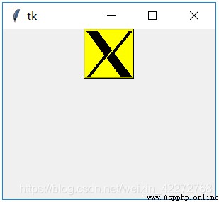
5.2.5 borderwidth(bd)
Define the border width of the button .bd Is an abbreviation .
import tkinter as tk
root=tk.Tk()
root.geometry('300x240')
b1=tk.Button(root,text=' sign out ',height=3,width=20,
bd=10,bg='yellow',command=root.destroy)
b1.pack()
root.mainloop()
result :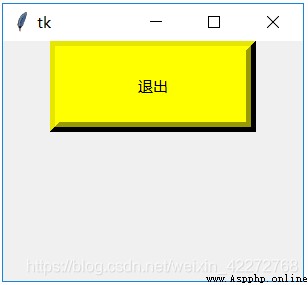
5.2.6 command
command Is used to set the callback function , That is to say, after pressing the button , Call specific functions to realize certain functions . The previous example simply called the system destroy() function , In real use , It must call more complex functions .
One of the key problems is that parameters are passed . stay command in , There are no parentheses , You cannot explicitly pass parameters to a callback function . The important reason for this is , When the button is instantiated , It doesn't make sense to just pass parameters to the callback function . The parameters of the callback function should be dynamically confirmed in the program , Instead of simply confirming at the time of instantiation .
So how to pass parameters to the callback function ? A simple way is to use global variables . But this method is not the best . There are more global variables , The maintainability of the program is a kind of destruction , It also brings potential bug.
The second method is to use classes . Define the callback function and corresponding parameters in the class , Use internal variables of the class , Can reduce the impact on other programs . This method is the most common .
Another way is to use anonymous functions lambda Methods .lambda Developers can define simple functions without naming them . such as :
a=lambda x,y,z:xyz
print(a(1,2,3))
And what you get is 123=6. In the callback function of the button , You can also define similar anonymous callback functions , So as to meet the function of transferring parameters .
import tkinter as tk
root=tk.Tk()
root.geometry('300x240')
b2=tk.Label(root,text=' Test text ')
b2.pack()
b3 = tk.Entry(root,width=20)
b3.pack()
def change_b2(label,text):
label['text']=text.get()
b1=tk.Button(root,text=' Change label text ',height=3,
width=20,bg='yellow',
command=lambda :change_b2(b2,b3))
b1.pack()
root.mainloop()
result :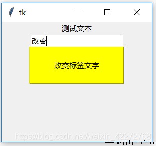
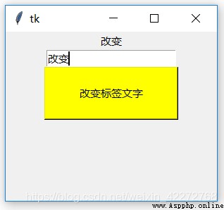
You can see , Use lambda You can pass parameters directly to the callback function . In fact, the implementation mechanism is that the button is to lambda As a callback function , But when actually called , Replace with the handler we expect .
5.2.7 compound
See Chapter 4 on compound Instructions for usage .
5.2.8 cursor
When the mouse passes the button , The cursor displayed . Cursor shape description 3.3.6 section .
5.2.9 default
The value is ACTIVE,NORMAL and DISABLED.
5.2.10 disabledforeground
When the button is disabled , The color of the text on the button .
import tkinter as tk
root=tk.Tk()
root.geometry('300x240')
b1=tk.Button(root,text=' Do not use buttons ',
height=3,width=20,state=tk.DISABLED,
disabledforeground='blue',
command=root.destroy)
b1.pack()
root.mainloop()
result :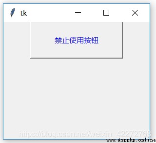
5.2.11 font
Set the font of the text on the button , See 3.3.3 Section .
5.2.12 foreground and fg
Set the color of the text on the button . This is the text color when the button status is normal .
import tkinter as tk
root=tk.Tk()
root.geometry('300x240')
b1=tk.Button(root,text=' Normal button ',
height=3,width=20,
fg='yellow',
command=root.destroy)
b1.pack()
root.mainloop()
result :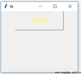
5.2.13 highlightbackground,highlightcolor and highlightthickness
The color of the border when the corresponding button does not get focus (highlightbackground)、 The color of the border when the button gets focus (highlightcolor) And the width of the border (highlightthickness). But for button controls , These three parameters do not work .
5.2.14 image
Show pictures on buttons . When using image Attribute ,text And bitmap Properties are masked .
import tkinter as tk
root=tk.Tk()
root.geometry('300x240')
p = tk.PhotoImage(file="a.gif")
b1=tk.Button(root,height=80,width=100,
image=p,command=root.destroy)
b1.pack()
root.mainloop()
result :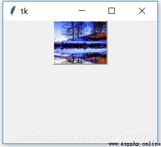
5.2.15 justify
The alignment of multiple lines of text displayed on the button . See Chapter IV for specific instructions .
5.2.16 overrelief
Set the... When the mouse passes the button 3D effect . Value and relief equally . When the mouse pointer is in the button area , The corresponding... Will be displayed according to the settings 3D effect
import tkinter as tk
root=tk.Tk()
root.geometry('300x240')
b1=tk.Button(root,height=4,width=10,text=' sign out ',
bd=10,command=root.destroy,
overrelief='sunken')
b1.pack()
root.mainloop()
result :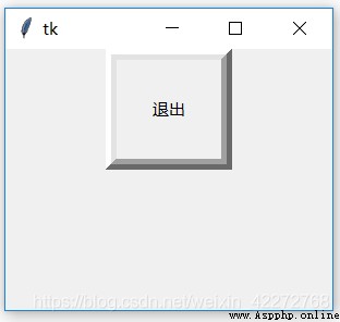
When the mouse moves over the button , Will change 3D appearance .
5.2.17 padx and pady
The inner margin between the text or image and the button border .
import tkinter as tk
root=tk.Tk()
root.geometry('300x240')
b1=tk.Button(root,text=' sign out ',
padx=10,pady=10,command=root.destroy)
b1.pack()
b2=tk.Button(root,text=' sign out ',
command=root.destroy)
b2.pack()
root.mainloop()
result :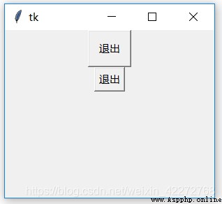
The first button is set padx and pady The effect of . The second button is not set padx and pady. You can find that the text of the first button is farther from the border than that of the second . This is it. padx and pady The role of .
5.2.18 relief
Button on the 3D effect . In general , When the button is pressed sunken effect , When released raised effect . You can change the effect of button release by setting this property , But it does not affect the effect when pressing .
import tkinter as tk
root=tk.Tk()
root.geometry('300x240')
b1=tk.Button(root,text=' sign out ',bd=10,
command=root.destroy,relief='solid')
b1.pack()
root.mainloop()
result :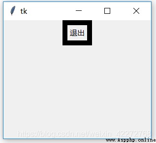
5.2.19 state
Set the state of the button . There are three states :NORMAL,ACTIVE and DISABLED.NORMAL and ACTIVE It's the same thing , All buttons can be used normally . and DISABLED Will prohibit the use of buttons , The button will be grayed out , And cannot press . See for specific usage 5.2.10 Examples in .
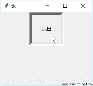
5.2.20 takefocus
Set whether you can use Tab To select the button .True To be able to use Tab Key selected ,False For not . The following code is an example that can be selected . By Tab Selected button , A virtual box will appear on the button . Now press the space bar , You can activate the function of this button . Without this imaginary frame , You can only use the mouse click to activate the function of the button .
import tkinter as tk
root=tk.Tk()
root.geometry('300x240')
b1=tk.Button(root,text=' sign out ',bd=5,
command=root.destroy,takefocus=True)
b1.pack()
root.mainloop()
result :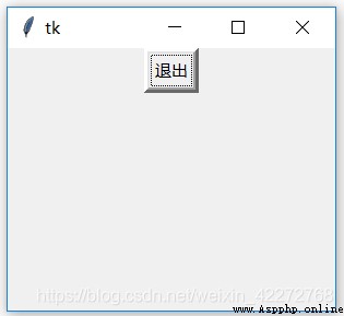
5.2.21 text
Used to set the text on the button . Many previous chapters have used examples , I won't repeat it here .
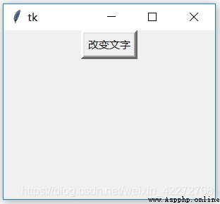
5.2.22 textvariable
Used to change the text on the button .
import tkinter as tk
root=tk.Tk()
root.geometry('300x240')
btn_text=tk.StringVar()
def btn_change():
btn_text.set(' Change the text ')
btn_text.set(' sign out ')
b1=tk.Button(root,bd=5, command=btn_change,
textvariable=btn_text)
b1.pack()
root.mainloop()
result :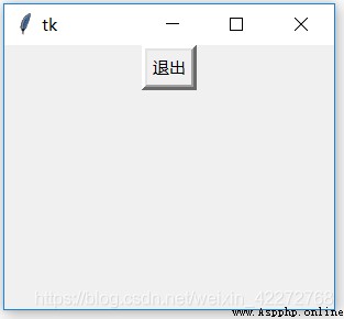
5.2.23 underline
The logo is underlined under that letter . It is also valid for Chinese .
import tkinter as tk
root=tk.Tk()
root.geometry('300x240')
b1=tk.Button(root,bd=5, command=root.destroy,
text=' sign out ',underline=1)
b1.pack()
root.mainloop()
result :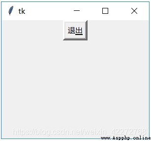
5.2.24 width and height
Set the width of the button . For text, the width of the text , For the image, it is in pixels . For specific usage, see the examples in the previous chapters .
5.2.25 wraplength
And in Chapter 4 wraplength In the same way , Referable .