The main knowledge points are as follows :
Matplotlib-Axes.twinx() Method to add a secondary axis
ggplot2-sec.axis() Draw biaxial
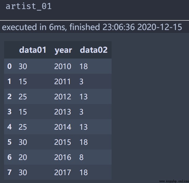
Here we directly give the code for data preview and visual design , Some of the codes in the figure will be explained in detail , The data preview is as follows :
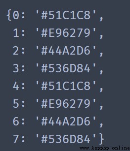
Custom color Dictionary year_color The construction code is as follows :
color = ("#51C1C8", "#E96279", "#44A2D6", "#536D84",
         "#51C1C8", "#E96279", "#44A2D6", "#536D84")
year = artist_01.index.to_list()
year_color = dict(zip(year,color))
year_color
The visualization code is as follows :
plt.style.use('fivethirtyeight')
fig,ax = plt.subplots(figsize=(8,4),dpi=200,fac