Preface
One 、 Broken line diagram
Effect display :
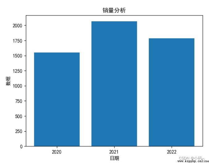
Two 、 Histogram
1、 Standard histogram codes are as follows ( Example )
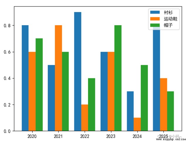
2、 The code of the parallel bar graph is as follows ( Example )
3、 The stack bar code is as follows ( Example )
4、 The horizontal histogram code is as follows ( Example )
5、 The positive and negative histogram codes are as follows ( Example )
summary
Because visualization is used more and more widely , Use python Drawing has become an important trend , This article summarizes various graphic paintings , And put forward some tips and methods .
Tips : The following is the main body of this article , The following cases can be used for reference
As a common and relatively simple line graph, it is deeply loved by users . The following is a simple example . If you have any questions, you can point them out in the comment area .
import matplotlib.pyplot as plt # Import drawing library
import pandas as pd
df = pd.read_csv(r'C:\XXX\aaa.csv',encoding='gbk') # open csv file
plt.rcParams['font.sans-serif'] = 'SimHei' # Set the font to plain black (SimHei)
plt.rcParams['font.sans-serif'] = 'FangSong' # Set the font to imitation song (FangSong)
# The above two lines can make Chinese display normally
a=df['X Axis '] # Read all data under the column name
b=df['Y Axis '] # Read all data under the column name
plt.xlabel(" date ", loc='center') # add to x Axis title
plt.ylabel(" data ", loc='center') # add to y Axis title , If y Axis title requires special characters , Recommended latex Format , for example " Volume /"+r'$cm^3$'
plt.plot(a, b, 'b:o', label=' Time data ')# Draw a line ,b Representing blue ,o Data representing each point is displayed in circles ,: It's the dotted line ,- Represents a solid line
#plt.plot(a, X, 'y', label=' Time data 2') # If you need to draw more than one broken line on a drawing , Add a few more lines of this statement
plt.legend() # Show Legend
plt.savefig(r'C:\xxx\XXX.png') # Save the picture
plt.show() # Show pictures 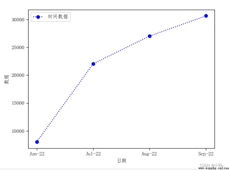
1、 Standard histogram codes are as follows ( Example ):
import csv
import matplotlib.pyplot as plt
f = csv.reader(open(r'C:\XXX\aaa.csv', 'r')) # open csv file
plt.rcParams['font.sans-serif'] = 'SimHei' # Set the font to plain black (SimHei)
plt.rcParams["axes.unicode_minus"] = False # Display the sign correctly
# The above two lines can make Chinese display normally
data = list(f) # csv Data is converted to a list
# drawing ,plt.bar() You can draw a histogram
for i in range(1,len(data)):
print(data[1])
for j in range(len(data[1])):
data[1][j]=int(data[1][j]) # take y The axis data is converted to integer
plt.bar(data[0], data[1])
plt.xlabel(" date ", loc='center') # add to x Axis title
plt.ylabel(" data ", loc='center') # add to y Axis title , If y Axis title requires special characters , Recommended latex Format , for example " Volume /"+r'$cm^3$'
plt.title(" Sales analysis ")
plt.savefig(r'C:\xxx\XXX.png') # Save the picture
plt.show() # Show pictures
2、 The code of the parallel bar graph is as follows ( Example ):
import matplotlib.pyplot as plt
import numpy as np
import pandas as pd
df = pd.read_csv(r'C:\XXX\xxx.csv',encoding='gbk')
plt.rcParams['font.sans-serif'] = 'SimHei' # Set the font to plain black (SimHei)
plt.rcParams["axes.unicode_minus"] = False # Display the sign correctly
a = df[' shirt ']
b = df[' Sports shoes ']
c = df[' hat ']
x = df['x Axis ']
# There are three types of data ,n Set to 3
total_width, n = 0.8, 3
# The width of each type of histogram
width = total_width / n
# To reset x Axis coordinates
x = x - (total_width - width) / 2 # Center it
# Draw a histogram
plt.bar(x, a, width=width, label=" shirt ")
plt.bar(x + width, b, width=width, label=" Sports shoes ")
plt.bar(x + 2*width, c, width=width, label=" hat ")
# Show Legend
plt.legend(loc="upper right")
# Show histogram
plt.show()
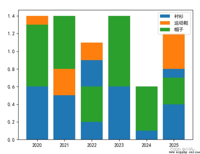
3、 The stack bar code is as follows ( Example ):
import matplotlib.pyplot as plt
import pandas as pd
df = pd.read_csv(r'C:\XXX\XX.csv',encoding='gbk')
plt.rcParams['font.sans-serif'] = 'SimHei' # Set the font to plain black (SimHei)
plt.rcParams["axes.unicode_minus"] = False # Display the sign correctly
a = df[' shirt ']
b = df[' Sports shoes ']
c = df[' hat ']
x = df['x Axis ']
# Draw a histogram
plt.bar(x, a, label=" shirt ")
plt.bar(x, b,bottom=a, label=" Sports shoes ")
plt.bar(x, c, bottom=b,label=" hat ")
# Show Legend
plt.legend(loc="upper right")
# Show histogram
plt.show()
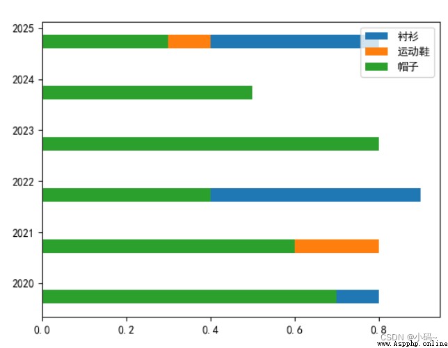
4、 The horizontal histogram code is as follows ( Example ):
import matplotlib.pyplot as plt
import pandas as pd
df = pd.read_csv(r'C:\XXX\XX.csv',encoding='gbk')
plt.rcParams['font.sans-serif'] = 'SimHei' # Set the font to plain black (SimHei)
plt.rcParams["axes.unicode_minus"] = False # Display the sign correctly
a = df[' shirt ']
b = df[' Sports shoes ']
c = df[' hat ']
x = df['x Axis ']
# There are three types of data ,n Set to 3
total_width, n = 0.8, 3
# The width of each type of histogram
width = total_width / n
# To reset x Axis coordinates
x = x - (total_width - width) / 2 # Center it
# Draw a histogram
plt.barh(x, a, label=" shirt ",height=width)
plt.barh(x, b, label=" Sports shoes ",height=width)
plt.barh(x, c, label=" hat ",height=width)
# Show Legend
plt.legend(loc="upper right")
# Show histogram
plt.show()
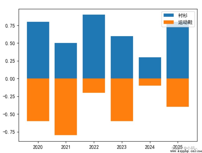
5、 The positive and negative histogram codes are as follows ( Example ):
import matplotlib.pyplot as plt
import pandas as pd
df = pd.read_csv(r'C:\XXX\XX.csv',encoding='gbk')
plt.rcParams['font.sans-serif'] = 'SimHei' # Set the font to plain black (SimHei)
plt.rcParams["axes.unicode_minus"] = False # Display the sign correctly
a = df[' shirt ']
b = df[' Sports shoes ']
# c = df[' hat ']
x = df['x Axis ']
# Draw a histogram
plt.bar(x, a, label=" shirt ")
plt.bar(x, -b, label=" Sports shoes ")
# plt.bar(x, c, label=" hat ")
# Show Legend
plt.legend(loc="upper right")
# Show histogram
plt.show()
That's what we're going to talk about today , This paper introduces python The use of drawing various pictures , and pandas Provides a large number of functions and methods that enable us to process data quickly and conveniently .