1、 Now we have 2015 To 2017 year 25 Ten thousand 911 Emergency call data , Please count the number of different types of emergencies in these data , If we also want to count the changes in the number of different types of emergency calls in different months , What should be done ?
Data sources :https://www.kaggle.com/mchirico/montcoalert/data
01、 Please count the number of different types of emergencies in these data :
import numpy as np
from matplotlib import pyplot as plt
import pandas as pd
# Because there is an ellipsis, it cannot display all , This method removes the ellipsis , All show
pd.set_option(‘display.max_rows’, None)# Show all rows
pd.set_option(‘display.max_columns’, None)# Show all columns
# Modify the configuration dictionary at the beginning of the program rcParams, matplotlib The font used in the default configuration file of does not display Chinese correctly . In order to make the chart display Chinese correctly , There are several solutions .
from pylab import *
mpl.rcParams[‘font.sans-serif’] = [‘SimHei’] # Specify default font
mpl.rcParams[‘axes.unicode_minus’] = False # Resolve save image is negative ’-' Questions displayed as squares
file_path= r’D:\whole_development_of_the_stack_study\RS_Algorithm_Course\ For its 1 Year of CV Course \03 machine learning - Data Science Database \14100_ machine learning - Data Science Database (HM)\ Data analysis data \day06\code\911.csv’
df= pd.read_csv(file_path)
#print(df.head(10))
#print(df.info())
# Get the classification
#print(df[“title”].str.split(’:’))
temp_list = df[“title”].str.split(’:’).tolist()
print(temp_list[:10:])
cate_list = list(set([i[0] for i in temp_list]))
print(cate_list)
# The structure is all 0 Array of
zeros_df = pd.DataFrame(np.zeros((df.shape[0],len(cate_list))),columns=cate_list)
# Assignment method 1, High feed rate , Only three .
for cate in cate_list:
zeros_df[cate][df[“title”].str.contains(cate)] = 1
#print(zeros_df)
# Assignment method 2, Low efficiency , Traverse 25 m .
#for i in range(df.shape[0]):
#zeros_df.loc[i,temp_list[i][0]] = 1
#print(zeros_df)
# Sum up
sum_ret = zeros_df.sum(axis=0)
print(sum_ret)
02、 If we also want to count the changes in the number of different types of emergency calls in different months :
import numpy as np
from matplotlib import pyplot as plt
import pandas as pd
# Because there is an ellipsis, it cannot display all , This method removes the ellipsis , All show
pd.set_option(‘display.max_rows’, None)# Show all rows
pd.set_option(‘display.max_columns’, None)# Show all columns
# Modify the configuration dictionary at the beginning of the program rcParams, matplotlib The font used in the default configuration file of does not display Chinese correctly . In order to make the chart display Chinese correctly , There are several solutions .
from pylab import *
mpl.rcParams[‘font.sans-serif’] = [‘SimHei’] # Specify default font
mpl.rcParams[‘axes.unicode_minus’] = False # Resolve save image is negative ’-' Questions displayed as squares
file_path= r’D:\whole_development_of_the_stack_study\RS_Algorithm_Course\ For its 1 Year of CV Course \03 machine learning - Data Science Database \14100_ machine learning - Data Science Database (HM)\ Data analysis data \day06\code\911.csv’
df= pd.read_csv(file_path)
# Get the classification
#print(df[“title”].str.split(’:’))
temp_list = df[“title”].str.split(’:’).tolist()
#print(temp_list[:10:])
cate_list = [i[0] for i in temp_list]
# Extracted type list
#print(cate_list)
# Go to df Add a column
df[‘cate’] = pd.DataFrame(np.array(cate_list).reshape((df.shape[0],1)),columns=[“cate”])
#print(df.head(5))
print(df.groupby(by=“cate”).count()[“title”])
No matter what industry you are in , Time series is a very important data form , A lot of statistical data and the law of data are also closely related to time series .
and stay pandas Processing time series in is very simple
pd.date_range(start=None, end=None, periods=None, freq=‘D’)
start and end as well as freq Coordination can produce start and end In the range of frequency freq A set of time indexes .
start and periods as well as freq Coordination can be generated from start The starting frequency is freq Of periods A time index .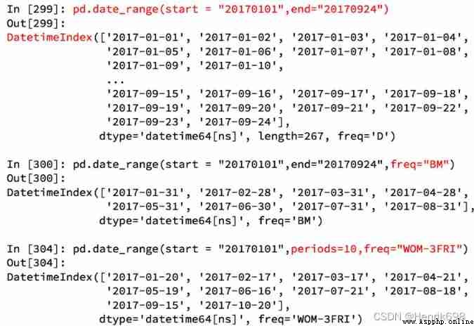
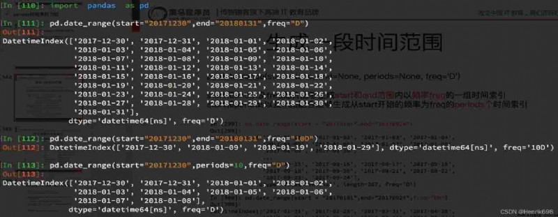
index=pd.date_range(“20170101”,periods=10)
df = pd.DataFrame(np.random.rand(10),index=index)
Go back to the beginning 911 In the case of data , We can use pandas The method provided converts a time string into a time series
df[“timeStamp”] = pd.to_datetime(df[“timeStamp”],format="")
format In most cases, parameters can be left blank , But for pandas Unformatted time string , We can use this parameter , For example, include Chinese
So here comes the question :
Now we need to count the number of times in each month or quarter. What should we do ?
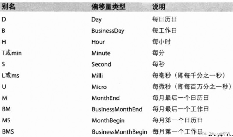
Resampling : It refers to the process of converting time series from one frequency to another , Convert high frequency data into low frequency data Downsampling , Low frequency is converted to high frequency L sampling .
pandas Provides a resample To help us achieve frequency conversion 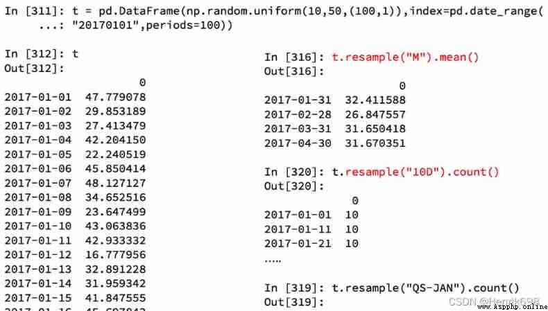
1、 According to the statistics 911 Changes in the number of calls in different months in the data :
import pandas as pd
# Because there is an ellipsis, it cannot display all , This method removes the ellipsis , All show
pd.set_option(‘display.max_rows’, None)# Show all rows
pd.set_option(‘display.max_columns’, None)# Show all columns
# Modify the configuration dictionary at the beginning of the program rcParams, matplotlib The font used in the default configuration file of does not display Chinese correctly . In order to make the chart display Chinese correctly , There are several solutions .
from pylab import *
mpl.rcParams[‘font.sans-serif’] = [‘SimHei’] # Specify default font
mpl.rcParams[‘axes.unicode_minus’] = False # Resolve save image is negative ’-' Questions displayed as squares
file_path= r’D:\whole_development_of_the_stack_study\RS_Algorithm_Course\ For its 1 Year of CV Course \03 machine learning - Data Science Database \14100_ machine learning - Data Science Database (HM)\ Data analysis data \day06\code\911.csv’
df= pd.read_csv(file_path)
df[“timeStamp”] = pd.to_datetime(df[“timeStamp”])
df.set_index(“timeStamp”,inplace=True)
#print(df.head(5))
# According to the statistics 911 Changes in the number of calls in different months in the data
count_by_month = df.resample(“M”).count()[“title”]
print(count_by_month.head())
# drawing
_x = count_by_month.index
_y = count_by_month.values
# View all methods
#for i in _x:
#print(dir(i))
#break
_x = [i.strftime("%Y%m%d") for i in _x]
plt.figure(figsize=(20,8),dpi=80)
plt.plot(range(len(_x)),_y)
plt.xticks(range(len(_x)),_x,rotation=45)
plt.show()
2、 According to the statistics 911 Changes in the number of different types of calls in different months in the data
import numpy as np
from matplotlib import pyplot as plt
import pandas as pd
# Because there is an ellipsis, it cannot display all , This method removes the ellipsis , All show
pd.set_option(‘display.max_rows’, None)# Show all rows
pd.set_option(‘display.max_columns’, None)# Show all columns
# Modify the configuration dictionary at the beginning of the program rcParams, matplotlib The font used in the default configuration file of does not display Chinese correctly . In order to make the chart display Chinese correctly , There are several solutions .
from pylab import *
mpl.rcParams[‘font.sans-serif’] = [‘SimHei’] # Specify default font
mpl.rcParams[‘axes.unicode_minus’] = False # Resolve save image is negative ’-' Questions displayed as squares
file_path= r’D:\whole_development_of_the_stack_study\RS_Algorithm_Course\ For its 1 Year of CV Course \03 machine learning - Data Science Database \14100_ machine learning - Data Science Database (HM)\ Data analysis data \day06\code\911.csv’
df= pd.read_csv(file_path)
# Convert time string to time type , And set it to index
df[“timeStamp”] = pd.to_datetime(df[“timeStamp”])
# Get the classification
#print(df[“title”].str.split(’:’))
temp_list = df[“title”].str.split(’:’).tolist()
#print(temp_list[:10:])
cate_list = [i[0] for i in temp_list]
# Go to df Add a column , Representation grouping
df[‘cate’] = pd.DataFrame(np.array(cate_list).reshape((df.shape[0],1)),columns=[“cate”])
# important : You need to ensure that the merged data indexes are consistent , To merge , So here again after the merger of index To reset .
df.set_index(“timeStamp”,inplace=True)
print(df.head())
plt.figure(figsize=(20, 8), dpi=80)
# grouping
# Repeat drawing in one picture
for group_name,group_data in df.groupby(by=‘cate’):
# Draw different categories
# According to the statistics 911 Changes in the number of calls in different months in the data
count_by_month = group_data.resample(“M”).count()[“title”]
# drawing
_x = count_by_month.index
_y = count_by_month.values
_x = [i.strftime("%Y%m%d") for i in _x]
plt.plot(range(len(_x)), _y, label=group_name)
plt.xticks(range(len(_x)), _x, rotation=45)
plt.legend(loc=“best”)
plt.show()
What I learned before DatetimeIndex It can be understood as a time stamp ;
So now we have to learn PeriodIndex It can be understood as time period ;
periods = pd.PeriodIndex(year=data[“year”],month=data[“month”],day=data[“day”],hour=data[“hour”],freq=“H”)
So what if you downsampling this time period ?
data = df.set_index(periods).resample(“10D”).mean()
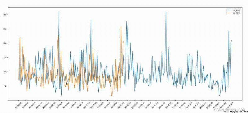
Now we have Beijing, Shanghai and Guangzhou 、 Shenzhen 、 And Shenyang 5 Urban air quality data , Please draw 5 City PM2.5 Changes over time
Observe the time structure in this set of data , It's not a string , What should we do at this time ?
Data sources : https://www.kaggle.com/uciml/pm25-data-for-five-chinese-cities
Please draw 5 City PM2.5 Changes over time :
import numpy as np
from matplotlib import pyplot as plt
import pandas as pd
# Because there is an ellipsis, it cannot display all , This method removes the ellipsis , All show
pd.set_option(‘display.max_rows’, None) # Show all rows
pd.set_option(‘display.max_columns’, None) # Show all columns
# Modify the configuration dictionary at the beginning of the program rcParams, matplotlib The font used in the default configuration file of does not display Chinese correctly . In order to make the chart display Chinese correctly , There are several solutions .
from pylab import *
mpl.rcParams[‘font.sans-serif’] = [‘SimHei’] # Specify default font
mpl.rcParams[‘axes.unicode_minus’] = False # Resolve save image is negative ’-' Questions displayed as squares
file_path = r’D:\whole_development_of_the_stack_study\RS_Algorithm_Course\ For its 1 Year of CV Course \03 machine learning - Data Science Database \14100_ machine learning - Data Science Database (HM)\ Data analysis data \day06\code\PM2.5\BeijingPM20100101_20151231.csv’
df = pd.read_csv(file_path)
#print(df.head())
#print(df.info())
# Pass the separated time string through PeriodIndex The method is transformed into pandas The type of time
period = pd.PeriodIndex(year=df[“year”],month=df[“month”],day=df[“day”],hour=df[“hour”],freq=“H”)
#print(periods)
#print(type(periods))
df[“datetime”] = period
#print(df.head(10))
# hold datetime Set as index
df.set_index(“datetime”,inplace=True)
# Down sampling
# encounter nan when , Sampling from will not nan Count it in
df = df.resample(‘7D’).mean()
print(df.shape)
# Processing missing data , Delete missing data
#print(df[“PM_US Post”])
#print(df[“PM_Dongsi”].tail(20))
#print(’*’*100)
#print(df[“PM_US Post”].tail(20))
data = df[“PM_US Post”].dropna()
data_china = df[“PM_Dongsi”].dropna()
# drawing
_x = data.index
_x = [i.strftime(’%Y%m%d’) for i in _x]
_x_china = [i.strftime(’%Y%m%d’) for i in data_china.index]
_y = data.values
_y_china = data_china.values
plt.figure(figsize=(20,8),dpi = 80)
plt.plot(range(len(_x)),_y,label=“US_POST”)
plt.plot(range(len(_x_china)),_y_china,label=“CN_POST”)
plt.xticks(range(0,len(_x),10),list(_x)[::10],rotation=45)
plt.legend(loc=“best”)
plt.show()