The previous article focused on both variables Numerical variable The situation of , When a variable is a categorical variable , We need other types of graphs to show the analysis data . stay seaborn There are many types of graphics in and they are very easy to use .
import numpy as np
import pandas as pd
import matplotlib.pyplot as plt
import seaborn as sns
%matplotlib inline
sns.set(,font_scale=1.4,context="paper")
# Set style 、 scale
import warnings
warnings.filterwarnings('ignore')
# No warning
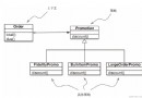
seaborn in , The classification diagram is mainly divided into three parts :
The above three series represent data of different granularity levels . Of course , In the course of practical use , There is no need to remember so much , because seaborn The classification series in has a unified graphical interface catplot(), Just this one function , Access to all classified image types .
seaborn.stripplot(x=None, y=None, hue=None, data=None, order=None, hue_order=None, jitter=True, dodge=False, orient=None, color=None, palette=None, size=5, edgecolor=‘gray’, linewidth=0, ax=None, **kwargs)
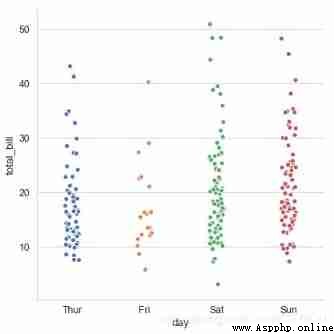
# 1、catplot() By default ,kind='strip'
# Plot the distribution scatter diagram of the sample data according to different categories
tips = sns.load_dataset("tips")
print(tips.head())
# Load data
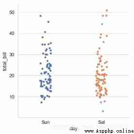
sns.catplot(x="day", # x → Set the grouping statistics field
y="total_bill", # y → Data distribution statistics field
# here xy Data exchange , This will make the scatter plot horizontally distributed
data=tips, # data → Corresponding data
jitter = True, height=6,
# When the point data overlaps more ,jitter You can control point jitter , You can also set the spacing as :jitter = 0.1
s = 6, edgecolor = 'w',linewidth=1,marker = 'o' ,
# Set point size 、 Stroke color or width 、 Point style
)
 total_bill tip sex smoker day time size
0 16.99 1.01 Female No Sun Dinner 2
1 10.34 1.66 Male No Sun Dinner 3
2 21.01 3.50 Male No Sun Dinner 3
3 23.68 3.31 Male No Sun Dinner 2
4 24.59 3.61 Female No Sun Dinner 4
# 1、stripplot()
# adopt kind='swarm' To adjust the points to prevent coincidence
sns.catplot(x="day", y="total_bill",kind='swarm',
hue='sex',data=tips,height=5,s=5.5)
# Prevent coincidence by distributing points along the axis , This only works with smaller datasets
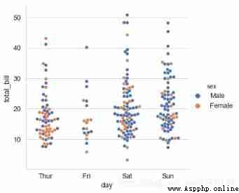
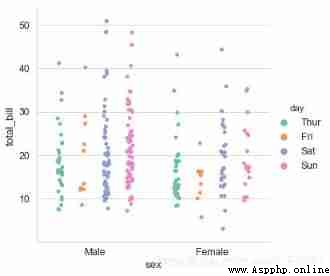
# 1、stripplot()
# Set the color palette
sns.catplot(x="sex", y="total_bill", hue="day",
data=tips, jitter=True,
palette="Set2", # Set the color palette
dodge=True, # Whether to split
)
# Sort
print(tips['day'].value_counts())
# see day The unique value of the field
sns.catplot(x="day", y="total_bill", data=tips,
order = ['Sun','Sat'])
# order → Filter categories , Control sorting
Sat 87
Sun 76
Thur 62
Fri 19
Name: day, dtype: int64
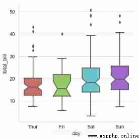
seaborn.boxplot(x=None, y=None, hue=None, data=None, order=None, hue_order=None, orient=None, color=None, palette=None, saturation=0.75, width=0.8, dodge=True, fliersize=5, linewidth=None, whis=1.5, notch=False, ax=None, **kwargs)
# boxplot catplot(kind='box')
sns.catplot(x='day', y='total_bill', data=tips,
kind='box',linewidth=2, # Line width
width=0.6, # The space ratio between boxes
fliersize=5, # Outlier size
palette='hls', # palette
whis=1.5, # Set up IQR
notch=True, # Set whether to make grooves with median
order=['Thur', 'Fri', 'Sat', 'Sun'], # Filter categories
)
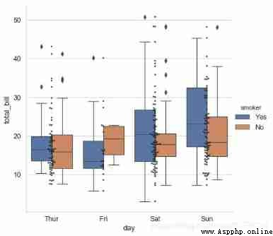
# adopt hue Parameter reclassification
# Multiple types of graphs are mixed
# Draw a box diagram
sns.catplot(x="day", y="total_bill", data=tips,
kind='box',hue = 'smoker',height=6)
# Draw a scatter plot
sns.swarmplot(x="day", y="total_bill", data=tips,
color ='k',s= 3,alpha = 0.8)
# Add classified scatter chart , To add a scatter plot here, use the respective functions swarmplot()
# No more advanced ports catplot() Otherwise, there are two figures
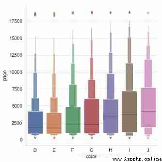
For datasets with a large amount of data , The scatter chart will be very crowded , Now we can use boxenplot(), This kind of chart is similar to the box chart , It can not only display the distribution of data, but also display the statistical information of data as a box diagram
diamonds = sns.load_dataset("diamonds")
print(diamonds.head(3))
sns.catplot(x='color',y='price',kind='boxen',
data=diamonds.sort_values("color"),
height=6)
 carat cut color clarity depth table price x y z
0 0.23 Ideal E SI2 61.5 55.0 326 3.95 3.98 2.43
1 0.21 Premium E SI1 59.8 61.0 326 3.89 3.84 2.31
2 0.23 Good E VS1 56.9 65.0 327 4.05 4.07 2.31
Violin diagram combines kernel density estimation with box diagram
seaborn.violinplot(x=None, y=None, hue=None, data=None, order=None, hue_order=None, bw=‘scott’, cut=2, scale=‘area’, scale_hue=True, gridsize=100, width=0.8, inner=‘box’, split=False, dodge=True, orient=None, linewidth=None, color=None, palette=None, saturation=0.75, ax=None, **kwargs)
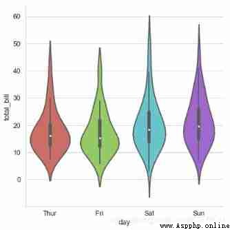
# 2、violinplot()
# Violin chart
sns.catplot(x="day", y="total_bill", data=tips,
kind='violin',linewidth = 2, # Line width
width = 0.8, # The space ratio between boxes
height=6,palette = 'hls', # Set up the palette
order = ['Thur','Fri','Sat','Sun'], # Filter categories
scale = 'area',
# Measure the width of a violin graph :
# area- The same area ,count- Determine the width according to the number of samples ,width- The width is the same
gridsize = 30, # Set the smoothness of the violin graph edges , The higher, the smoother
inner = 'box',
bw = .5 # Control the degree of fit , Generally, it is not necessary to set
)
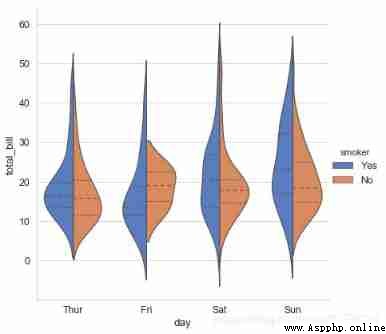
# 2、violinplot()
# adopt hue Parameter reclassification
sns.catplot(x="day", y="total_bill", data=tips,
kind='violin',hue = 'smoker',
palette="muted", split=True, # Set whether to split the violin diagram
inner="quartile",height=6)
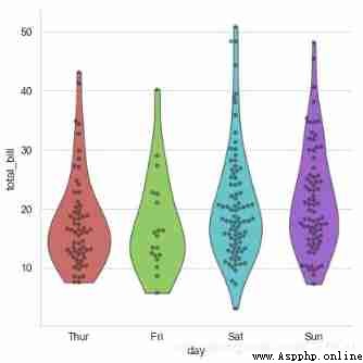
# 2、violinplot()
# Combined with scatter diagram
sns.catplot(x="day", y="total_bill", data=tips,
kind='violin',palette = 'hls',
inner = None,height=6,
cut=0 # Set to 0, Limit the graph to the observed data .
)
# Insert scatter plot
sns.swarmplot(x="day", y="total_bill", data=tips,
color="k", alpha=.5)
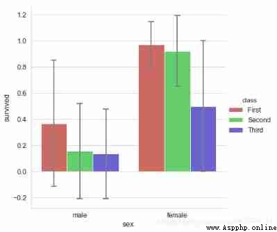
seaborn.barplot(x=None, y=None, hue=None, data=None, order=None, hue_order=None, estimator=<function mean>, ci=95, n_boot=1000, units=None, orient=None, color=None, palette=None, saturation=0.75, errcolor=’.26’, errwidth=None, capsize=None, dodge=True, ax=None, **kwargs)
# 1、barplot()
# confidence interval : Sample mean + Sampling error
titanic = sns.load_dataset("titanic")
# print(titanic.head())
# Load data
sns.catplot(x="sex", y="survived", data=titanic,
kind='bar',palette = 'hls', hue="class",
order = ['male','female'], # Filter categories
capsize = 0.05, # Horizontal extension width of error line
saturation=.8, # Color saturation
errcolor = 'gray',errwidth = 2, # Error bar color , Width
height=6,ci = 'sd'
# Confidence interval error → 0-100 Internal value 、'sd'、None
)
print(titanic.groupby(['sex','class']).mean()['survived'])
print(titanic.groupby(['sex','class']).std()['survived'])
# Calculate the data
sex class
female First 0.968085
Second 0.921053
Third 0.500000
male First 0.368852
Second 0.157407
Third 0.135447
Name: survived, dtype: float64
sex class
female First 0.176716
Second 0.271448
Third 0.501745
male First 0.484484
Second 0.365882
Third 0.342694
Name: survived, dtype: float64
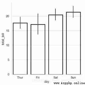
# 1、barplot()
# Histogram - Confidence interval estimate
# You can change your style like this
sns.catplot(x="day", y="total_bill", data=tips,
linewidth=2.5,facecolor=(1,1,1,0),
kind='bar',edgecolor = 'k',)
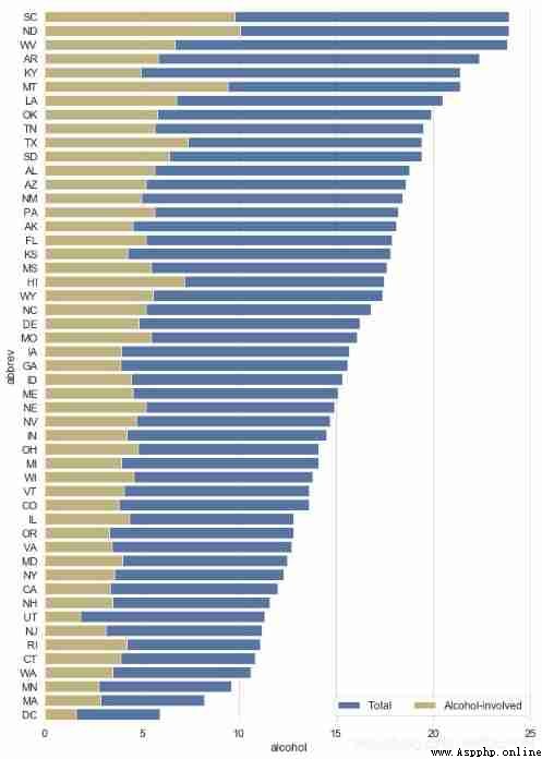
# 1、barplot()
crashes = sns.load_dataset("car_crashes").sort_values("total", ascending=False)
print(crashes.head())
# Load data
f, ax = plt.subplots(figsize=(10, 15))
# Create a chart
# sns.set_color_codes("pastel")
sns.barplot(x="total", y="abbrev", data=crashes,
label="Total", color="b",edgecolor = 'w')
# Set the first histogram
# sns.set_color_codes("muted")
sns.barplot(x="alcohol", y="abbrev", data=crashes,
label="Alcohol-involved", color="y",edgecolor = 'w')
# Set the second histogram
ax.legend(ncol=2, loc="lower right")
sns.despine(left=True, bottom=True)
 total speeding alcohol not_distracted no_previous ins_premium \
40 23.9 9.082 9.799 22.944 19.359 858.97
34 23.9 5.497 10.038 23.661 20.554 688.75
48 23.8 8.092 6.664 23.086 20.706 992.61
3 22.4 4.032 5.824 21.056 21.280 827.34
17 21.4 4.066 4.922 16.692 16.264 872.51
ins_losses abbrev
40 116.29 SC
34 109.72 ND
48 152.56 WV
3 142.39 AR
17 137.13 KY
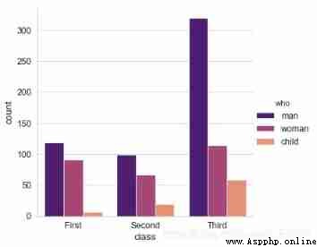
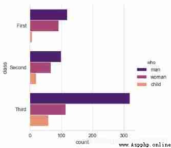
# 2、countplot()
# Counting histogram
sns.catplot(x="class", hue="who", data=titanic,
kind='count',palette = 'magma')
sns.catplot(y="class", hue="who", data=titanic,
kind='count',palette = 'magma')
# x/y → With x perhaps y Axis drawing ( The transverse , vertical )
# Usage and barplot be similar
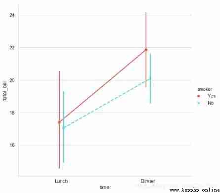
# 3、pointplot()
sns.catplot(x="time", y="total_bill", hue = 'smoker',data=tips,
kind='point',palette = 'hls',height=7,
dodge = True, # Whether the set points are separated
join = True, # Whether to connect
markers=["o", "x"], linestyles=["-", "--"], # Set point style 、 Linetype
)
# Calculate the data
# # Usage and barplot be similar