author | Huang Weini
source | The beauty of data analysis and statistics
today , A friend asked a question in the group .
The general meaning is shown in the figure :

It is proposed to use vba, But I have to say , I haven't learned vba Friend, , Will feel vba It's hard to use . It's not easy , Go straight up Python, No problem is Python It can't be solved .
ha-ha , That's a bit of an exaggeration . But the above problem , use Python The solution is absolutely no problem .
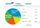
Let's take a look at this data first , What does it look like ?
One Excel Yes 3 individual sheet surface , Every sheet There is a data in the table . We want to take advantage of this 3 Data , Draw a line chart .
My idea is roughly like this , The whole process is as follows :
Create a new Excel form ;
Read the Test data , And read each sheet The values in the table ;
Read the above data , Write new Excel In the table ;
Draw graphics ;
With the above ideas , Let's go straight to the code , The code gives you detailed comments .
# Import related libraries
from openpyxl import load_workbook,Workbook
from openpyxl.chart import LineChart, Reference
# newly build Excel form
wb = Workbook()
ws = wb.active
ws.cell(row=1,column=1).value = " sales "
# Read the data in the test table , And write to the new Excel In the table
wb1 = load_workbook(" test .xlsx")
for index,value in enumerate(wb1.sheetnames):
ws1 = wb1[value]
ws.cell(row=index+2,column=1).value = ws1.cell(row=1,column=1).value
# Draw graphics
chart = LineChart()
data = Reference(ws,min_row=1,max_row=4,min_col=1, max_col=1)
chart.add_data(data,titles_from_data=True)
chart.title = " Sales in different months "
chart.y_axis.scaling.min = 9
chart.y_axis.scaling.max = 14
ws.add_chart(chart,"D1")
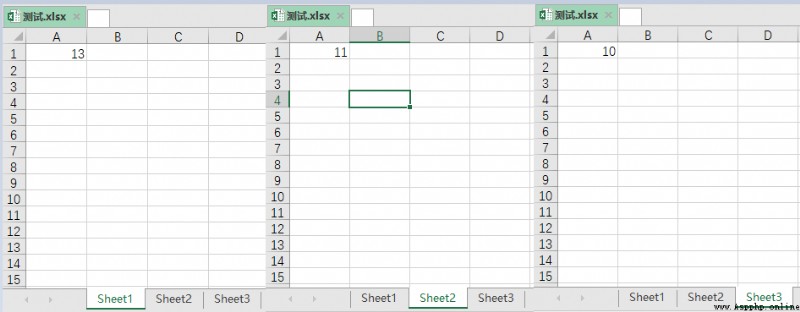
wb.save(" newest .xlsx")The final effect is as shown in the figure :

Looking back
Matplotlib Two methods of drawing torus !
13 individual python Necessary knowledge , Recommended collection !
Artifact , Easy visualization Python Calling process !
Low code out of half a lifetime , Come back or " cancer "!
 Share
Point collection
A little bit of praise
Click to see