前面一篇文章 Python 繪制直方圖 Matplotlib Pyplot figure bar legend gca text 有介紹如何用 Python 繪制直方圖,但現實應用中需要在直方圖的基礎上再繪制折線圖。比如測試報告中,就可以用圖形反映測試用例的運行情況,直方圖可以反映測試用例 pass 了多少,失敗了多少,如果想反映 pass rate 趨勢,就可以用折線圖,本文介紹如何繪制多個圖,以及最後應用在同一圖上繪制直方圖和折線圖並存。
內容提要:
plt.figure 的作用是定義一個大的圖紙,可以設置圖紙的大小、分辨率等。
例如:
初始化一張畫布
fig = plt.figure(figsize=(7,10),dpi=100)
直接在當前活躍的的 axes 上面作圖,注意是當前活躍的
plt.plot() 或 plt.bar()
那麼現在來看 subplot 和 subplots ,兩者的區別在於 suplots 繪制多少圖已經指定了,所以 ax 提前已經准備好了,而 subplot 函數調用一次就繪制一次,沒有指定。
subplot 函數是添加一個指定位置的子圖到當前畫板中。
matplotlib.pyplot.subplot(*args, **kwargs)
函數簽名:
subplot(nrows, ncols, index, **kwargs) 括號裡的數值依次表示行數、列數、第幾個
subplot(pos, **kwargs)subplot(ax)這個我沒用應用成功
如果需要自定義畫板大小,使用 subplot 這個函數時需要先定義一個自定義大小的畫板,因為 subplot 函數無法更改畫板的大小和分辨率等信息;所以必須通過 fig = plt.figure(figsize=(12, 4), dpi=200) 來定義畫板相關設置;不然就按默認畫板的大小; 同時,後續對於這個函數便捷的操作就是直接用 plt,獲取當前活躍的圖層。
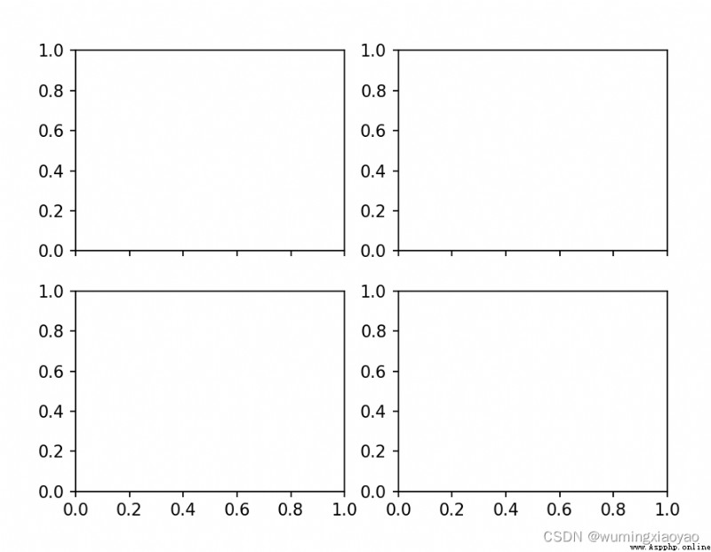
例如:添加 4 個子圖
沒有自定義畫板,所以是在默認大小的畫板上添加子圖的。
plt.subplot(221) 中的 221 表示子圖區域劃分為 2 行 2 列,取其第一個子圖區域。子區編號從左上角為 1 開始,序號依次向右遞增。
import matplotlib.pyplot as plt
# equivalent but more general than plt.subplot(221)
ax1 = plt.subplot(2, 2, 1)
# add a subplot with no frame
ax2 = plt.subplot(222, frameon=False)
# add a polar subplot
plt.subplot(223, projection='polar')
# add a red subplot that shares the x-axis with ax1
plt.subplot(224, sharex=ax1, facecolor='red')
plt.show()
效果: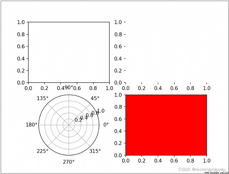
subplots 函數主要是創建一個畫板和一系列子圖。
matplotlib.pyplot.subplots(nrows=1, ncols=1, sharex=False, sharey=False, squeeze=True, subplot_kw=None, gridspec_kw=None, **fig_kw)
該函數返回兩個變量,一個是 Figure 實例,另一個 AxesSubplot 實例 。Figure 代表整個圖像也就是畫板整個容器,AxesSubplot 代表坐標軸和畫的子圖,通過下標獲取需要的子區域。
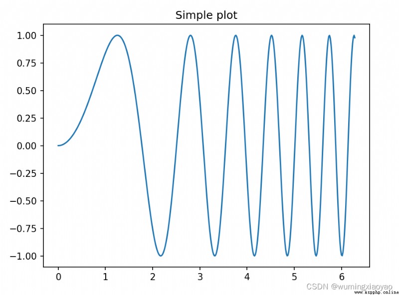
例 1:一個畫板中只有 1 個子圖
plt.subplots() 默認 1 行 1 列
 import numpy as np
import matplotlib.pyplot as plt
# First create some toy data:
x = np.linspace(0, 2*np.pi, 400)
y = np.sin(x**2)
# Creates just a figure and only one subplot
fig, ax = plt.subplots()
ax.plot(x, y)
ax.set_title('Simple plot')
plt.show()
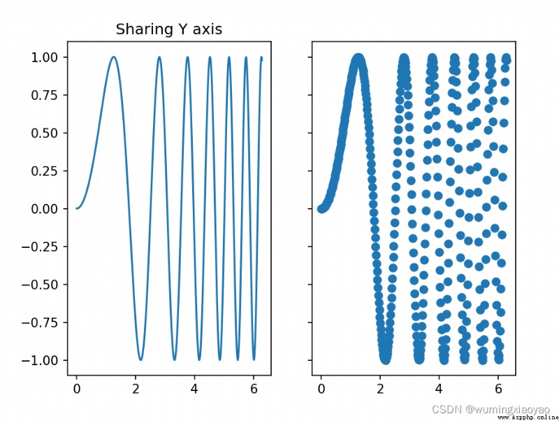
例 2:一個畫板中只有 2 個子圖
plt.subplots(1, 2)1 行 2 列
 import numpy as np
import matplotlib.pyplot as plt
# First create some toy data:
x = np.linspace(0, 2*np.pi, 400)
y = np.sin(x**2)
# Creates two subplots and unpacks the output array immediately
f, (ax1, ax2) = plt.subplots(1, 2, sharey=True)
ax1.plot(x, y)
ax1.set_title('Sharing Y axis')
ax2.scatter(x, y)
plt.show()
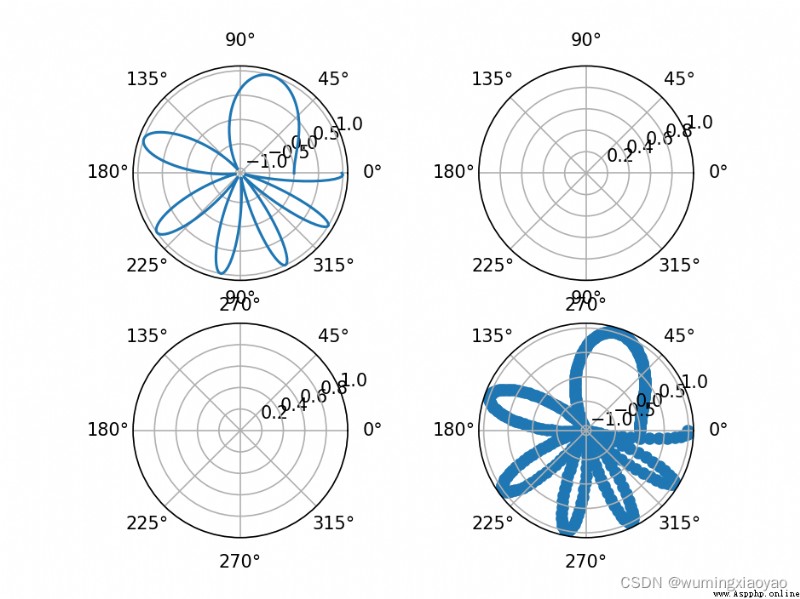
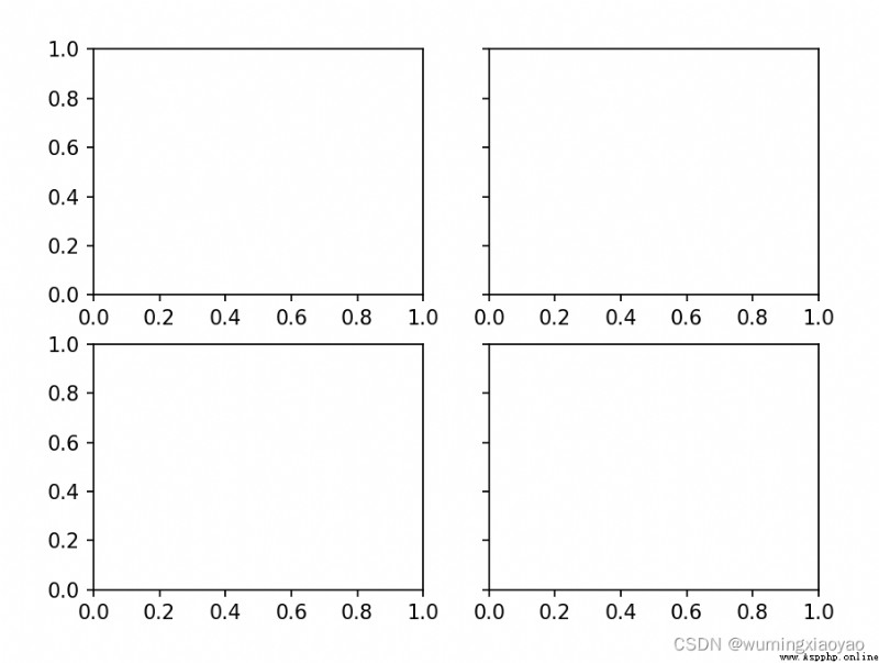
例 3:一個畫板中只有 4 個子圖
plt.subplots(2, 2)2 行 2 列
通過索引來訪問子圖:
axes[0, 0] 第一個圖位置
axes[0, 1] 第二個圖位置
axes[1, 0] 第三個圖位置
axes[1, 1] 第四個圖位置
 import numpy as np
import matplotlib.pyplot as plt
# First create some toy data:
x = np.linspace(0, 2*np.pi, 400)
y = np.sin(x**2)
# Creates four polar axes, and accesses them through the returned array
fig, axes = plt.subplots(2, 2, subplot_kw=dict(polar=True))
axes[0, 0].plot(x, y)
axes[1, 1].scatter(x, y)
plt.show()
例 4:子圖共享 X 軸
sharex=‘col’
 import numpy as np
import matplotlib.pyplot as plt
# Share a X axis with each column of subplots
plt.subplots(2, 2, sharex='col')
plt.show()
例 5:子圖共享 Y 軸
sharey=‘row’
 import numpy as np
import matplotlib.pyplot as plt
# Share a X axis with each column of subplots
plt.subplots(2, 2, sharey='row')
plt.show()
例 6:子圖共享 X 和 Y 軸
sharex=‘all’, sharey=‘all’
 import numpy as np
import matplotlib.pyplot as plt
# Share a X axis with each column of subplots
plt.subplots(2, 2, sharex='all', sharey='all')
# Note that this is the same as
# plt.subplots(2, 2, sharex=True, sharey=True)
plt.show()
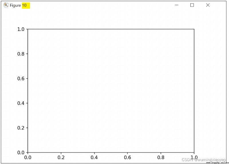
例 7:創建制定編號的畫圖
編號為 10 的畫板,如果該編號已經存在,則刪除編號。
 import numpy as np
import matplotlib.pyplot as plt
# Creates figure number 10 with a single subplot
# and clears it if it already exists.
fig, ax=plt.subplots(num=10, clear=True)
plt.show()
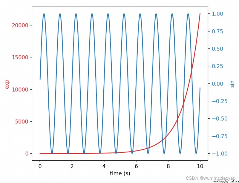
了解了 subplots 函數,對 twinx 函數的理解就容易多了。
twinx 返回一個新的子圖並共用當前子圖的 X 軸。新的子圖會覆蓋 X 軸(如果新子圖 X 軸是 None 就會用當前子圖的 X 軸數據),其 Y 軸會在右側。同理 twiny 函數是共享 Y 軸的。
例:我們先畫了一個紅色線子圖,再畫一個藍色線子圖,藍色線子圖是共用紅色線子圖的 X 軸的,那麼就可以實樣實現:
fig, ax1 = plt.subplots() 生成一個畫板 fig,並默認第一個子圖 ax1.
ax1.plot(t, data1, color=color) ax1 第一子圖區域畫折線圖
ax2 = ax1.twinx() 生成一個新的子圖 ax2 ,並共享 ax1 第一子圖的 X 軸
ax2.plot(t, data2, color=color) 在新的子圖 ax2 區域畫折線圖
效果圖:
代碼:
 import numpy as np
import matplotlib.pyplot as plt
# Create some mock data
t = np.arange(0.01, 10.0, 0.01)
data1 = np.exp(t)
data2 = np.sin(2 * np.pi * t)
fig, ax1 = plt.subplots()
color = 'tab:red'
ax1.set_xlabel('time (s)')
ax1.set_ylabel('exp', color=color)
ax1.plot(t, data1, color=color)
ax1.tick_params(axis='y', labelcolor=color)
ax2 = ax1.twinx() # instantiate a second axes that shares the same x-axis
color = 'tab:blue'
ax2.set_ylabel('sin', color=color) # we already handled the x-label with ax1
ax2.plot(t, data2, color=color)
ax2.tick_params(axis='y', labelcolor=color)
fig.tight_layout() # otherwise the right y-label is slightly clipped
plt.show()
有了前面的基礎,我們來畫一個直方圖和折線圖並存。基於前面一篇文章 Python 繪制直方圖 Matplotlib Pyplot figure bar legend gca text 直方圖的例子基礎上再畫折線圖。
應用場景是測試用例運行結果圖,直方圖描述 Smoke 和 Regressin 用例pass 和 fail 數量,折線圖描述總的用例 Pass Rate。把 Mock 的數字換一下就可以直接應用了,具體代碼細節就不詳細介紹了,可以參考 文章 Python 繪制直方圖 Matplotlib Pyplot figure bar legend gca text 。
效果圖: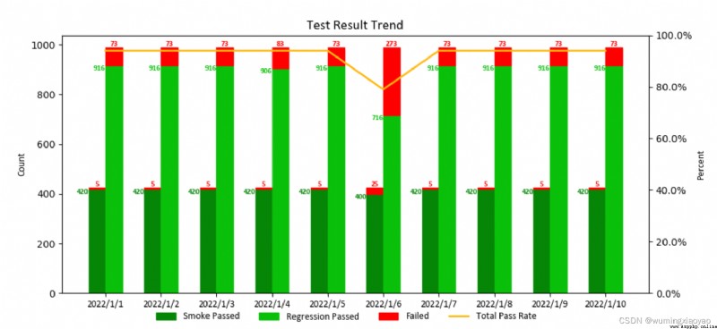
代碼:
import matplotlib.pyplot as plt
import matplotlib.font_manager as font_manager
import numpy as np
from matplotlib.ticker import FuncFormatter
def to_percent(num, position):
return str(num) + '%'
def draw_trend_image_test(reg_total_count_pass, reg_total_count_fail, smoke_total_count_pass, smoke_total_count_fail, date_list, image_file_name = 'test_result_trend.png'):
# attributes
bar_width = 0.3
regression_pass_color = '#0ac00a'
smoke_pass_color = '#068606'
font_name = 'Calibri'
label_size = 10
text_size = 8
title_size = 14
# set the color for failure
smoke_fail_color = []
for item in smoke_total_count_fail:
if item > 0:
smoke_fail_color.append("red")
else:
smoke_fail_color.append(smoke_pass_color)
reg_fail_color = []
for item in reg_total_count_fail:
if item > 0:
reg_fail_color.append("red")
else:
reg_fail_color.append(regression_pass_color)
total_pass_rate = [round((s_p+r_p)/(s_p+r_p+s_f+r_f), 2)*100 for s_p, r_p, s_f, r_f in zip(
smoke_total_count_pass, reg_total_count_pass, smoke_total_count_fail, reg_total_count_fail)]
if len(date_list) > 5:
fig, ax1 = plt.subplots(figsize=(10.8, 4.8))
else:
fig, ax1 = plt.subplots()
# draw bar
x = np.arange(len(date_list))
ax1.bar(x - bar_width/2, smoke_total_count_pass, color=smoke_pass_color, edgecolor=smoke_pass_color, width= bar_width, label="Smoke Passed")
ax1.bar(x - bar_width/2, smoke_total_count_fail, color="red", edgecolor=smoke_fail_color, width= bar_width, bottom=smoke_total_count_pass)
ax1.bar(x + bar_width/2, reg_total_count_pass, color=regression_pass_color, edgecolor=regression_pass_color, width= bar_width, label="Regression Passed")
ax1.bar(x + bar_width/2, reg_total_count_fail, color="red", edgecolor=reg_fail_color, width= bar_width, label="Failed", bottom=reg_total_count_pass)
# set title, labels
ax1.set_title("Test Result Trend", fontsize=title_size, fontname=font_name)
ax1.set_xticks(x, date_list,fontsize=label_size, fontname=font_name)
ax1.set_ylabel("Count",fontsize=label_size, fontname=font_name)
# set bar text
for i in x:
if smoke_total_count_fail[i] > 0:
ax1.text(i-bar_width/2, smoke_total_count_fail[i] + smoke_total_count_pass[i], smoke_total_count_fail[i],horizontalalignment = 'center', verticalalignment='bottom',fontsize=text_size,family=font_name,color='red',weight='bold')
ax1.text(i-bar_width, smoke_total_count_pass[i], smoke_total_count_pass[i],horizontalalignment = 'right', verticalalignment='top',fontsize=text_size,family=font_name,color=smoke_pass_color,weight='bold')
ax1.text(i, reg_total_count_pass[i], reg_total_count_pass[i], horizontalalignment = 'right', verticalalignment='top',fontsize=text_size,family=font_name,color=regression_pass_color,weight='bold')
if reg_total_count_fail[i] > 0:
ax1.text(i+ bar_width/2, reg_total_count_fail[i] + reg_total_count_pass[i], reg_total_count_fail[i],horizontalalignment = 'center', verticalalignment='bottom',fontsize=text_size,family=font_name,color='red',weight='bold')
# draw plot
ax2 = ax1.twinx()
ax2.plot(x, total_pass_rate, label='Total Pass Rate',
linewidth=2, color='#FFB90F')
ax2.yaxis.set_major_formatter(FuncFormatter(to_percent))
ax2.set_ylim(0, 100)
ax2.set_ylabel("Percent",fontsize=label_size, fontname=font_name)
# plt.show() # should comment it if save the pic as a file, or the saved pic is blank
# dpi: image resolution, better resolution, bigger image size
legend_font = font_manager.FontProperties(family=font_name, weight='normal',style='normal', size=label_size)
fig.legend(loc="lower center", ncol=4, frameon=False, prop=legend_font)
fig.savefig(image_file_name,dpi = 100)
if __name__ == '__main__':
reg_total_count_pass = [916,916,916,906,916,716,916,916,916,916]
reg_total_count_fail = [73,73,73,83,73,273,73,73,73,73]
smoke_total_count_pass = [420, 420, 420,420, 420, 400,420, 420, 420,420]
smoke_total_count_fail = [5,5,5,5,5,25,5,5,5,5]
date_list = ['2022/1/1', '2022/1/2', '2022/1/3','2022/1/4','2022/1/5', '2022/1/6', '2022/1/7','2022/1/8', '2022/1/9', '2022/1/10']
draw_trend_image_test(reg_total_count_pass, reg_total_count_fail, smoke_total_count_pass, smoke_total_count_fail, date_list)