一、基本介紹
(1) Matplotlib 是 Python 最著名的繪圖庫,它提供了一整套和 matlab 相似的命令 API,適合交互式地進行制圖.We can also use it as a charting control,嵌入 GUI 應用程序中. (2) Matplotlib The document is complete,並且 Gallery 頁面中有上百幅縮略圖,Open after all active programs.If we need to draw some type of figure,只需要在這個頁面中浏覽/復制/粘貼一下,基本上都能搞定.
- 官方網站:https://matplotlib.org/stable/gallery/index.html
二、基本用法
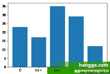
1,柱狀圖
(1)The following is one of the most simple columnar design example:
import matplotlib.pyplot as plt
#准備數據
langs = ['C', 'C++', 'Java', 'Python', 'PHP']
students = [23,17,35,29,12]
#繪制柱狀圖
plt.bar(langs,students)
plt.show()
(2)通過調整柱狀圖的寬度,可以實現在同一 x 軸位置繪制多個柱狀圖.We can also set them into different color,And set the legend,從而使它們更容易區分.
import matplotlib.pyplot as plt
import numpy as np
#准備數據
men = (20, 35, 30, 35, 27)
women = (25, 32, 34, 20, 25)
left = np.arange(5) # Column of the level of start position
width = 0.35
#繪制柱狀圖
p1 = plt.bar(left, men, width, color='b')
p2 = plt.bar(left+ width, women, width, color='r')
#設置坐標軸
countries = ['USA', 'India', 'China', 'Russia', 'Germany']
plt.xticks(left, countries)
#繪制圖例
plt.legend((p1[0], p2[0]), ('Men', 'Women')) #圖例
plt.show()
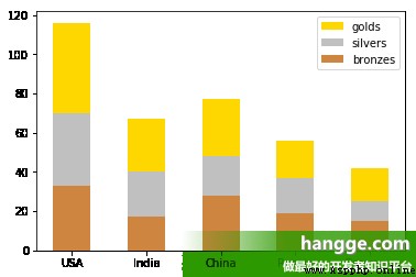
(3) bar() 函數提供了一個可選參數 bottom,該參數可以指定柱狀圖開始堆疊的起始值,一般從底部柱狀圖的最大值開始,依次類推.We can use this feature to create a stacked bar chart:
import matplotlib.pyplot as plt
import numpy as np
#准備數據
bronzes = np.array([33, 17, 28, 19, 15])
silvers = np.array([37, 23, 20, 18, 10])
golds = np.array([46, 27, 29, 19, 17])
left = np.arange(5) # Column of the level of start position
#繪制堆疊圖
p1 = plt.bar(left, golds, width=0.5, label='golds', color='gold', bottom=silvers+bronzes)
p2 = plt.bar(left, silvers, width=0.5, label='silvers', color='silver', bottom=bronzes)
p3 = plt.bar(left, bronzes, width=0.5, label='bronzes', color='#CD853F')
#設置坐標軸
countries = ['USA', 'India', 'China', 'Russia', 'Germany']
plt.xticks(left, countries)
#繪制圖例
plt.legend(loc="upper right")
plt.show()
2,折線圖
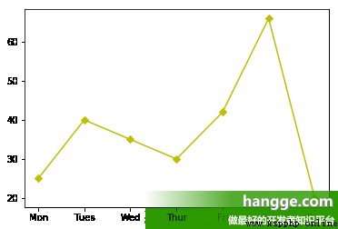
(1)Here is drawing a single line of the sample:
import matplotlib.pyplot as plt
#准備數據
x = ["Mon", "Tues", "Wed", "Thur", "Fri","Sat","Sun"]
y = [25, 40, 35, 30, 42, 66, 20]
#繪制折線("y"表示黃色,marksize用來設置'D'菱形的大小)
plt.plot(x, y, "y", marker='D', markersize=5, label="周活")
plt.show()
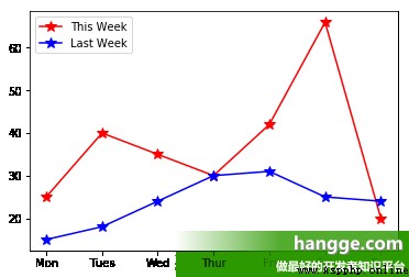
(2)If you want to draw a number line chart,只要准備好繪制多條折線圖的數據即可.If you don't set line color, matplotlib Will be automatically as line add different colors
import matplotlib.pyplot as plt
#准備數據
x = ["Mon", "Tues", "Wed", "Thur", "Fri","Sat","Sun"]
y1 = [25, 40, 35, 30, 42, 66, 20]
y2 = [15, 18, 24, 30, 31, 25, 24]
#繪制折線("y"表示黃色,marksize用來設置'*'五角星的大小)
plt.plot(x, y1, 'r',marker='*', markersize=10)
plt.plot(x, y2, 'b', marker='*',markersize=10)
#繪制圖例
plt.legend(['This Week', 'Last Week'])
plt.show()
3,餅圖
Here's a cake design example,其中 autopct 參數設置為 %1.2f%,To the sum of the percentage of display in the corresponding fan zone.
import matplotlib.pyplot as plt
#准備數據
langs = ['C', 'C++', 'Java', 'Python', 'PHP']
students = [23,17,35,29,12]
#使得X/Y軸的間距相等
plt.axis('equal')
#繪制餅狀圖
plt.pie(students, labels = langs,autopct='%1.2f%%')
plt.show()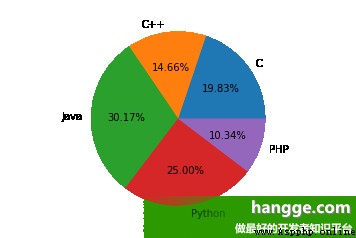
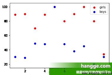
4,散點圖
(1)散點圖用於在水平軸和垂直軸上繪制數據點,它表示了因變量隨自變量變化的趨勢.通俗地講,它反映的是一個變量受另一個變量的影響程度.
import matplotlib.pyplot as plt
#准備數據
girls = [89, 90, 70, 89, 100, 80, 90, 100, 80, 34]
boys = [30, 29, 49, 48, 100, 48, 38, 45, 20, 30]
x = [1, 2, 3, 4, 5, 6, 7, 8, 9, 10]
#繪制散點
plt.scatter(x, girls, color='r',label="girls")
plt.scatter(x, boys, color='b',label="boys")
#添加圖例
plt.legend()
plt.show()
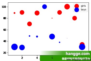
(2)We are also free to set the size and color of each point:
import matplotlib.pyplot as plt
import numpy as np
#准備數據
girls = [89, 90, 70, 89, 100, 80, 90, 100, 80, 34]
boys = [30, 29, 49, 48, 100, 48, 38, 45, 20, 30]
girls_area = np.pi * (15 * np.random.rand(50))**2 # 半徑0 to 15
boys_area = np.pi * (15 * np.random.rand(50))**2 # 半徑0 to 15
x = [1, 2, 3, 4, 5, 6, 7, 8, 9, 10]
#繪制散點
plt.scatter(x, girls, s=girls_area, color='r',label="girls")
plt.scatter(x, boys, s=boys_area, color='b',label="boys")
#添加圖例
plt.legend()
plt.show()
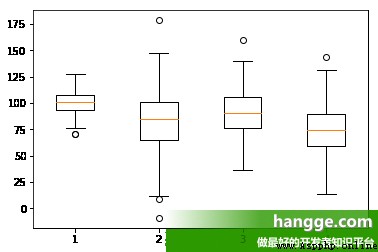
5,箱型圖
(1)箱型圖(也稱為盒須圖)它能顯示出一組數據的最大值、最小值、中位數、及上下四分位數.箱型圖結構如下所示:

(2)Here is a box design example,這裡我們使用 numpy.random.normal() 函數來創建一組基於正態分布的隨機數據,該函數有三個參數,分別是正態分布的平均值、標准差以及期望值的數量.
import matplotlib.pyplot as plt
#准備數據
collectn_1 = np.random.normal(100, 10, 200)
collectn_2 = np.random.normal(80, 30, 200)
collectn_3 = np.random.normal(90, 20, 200)
collectn_4 = np.random.normal(70, 25, 200)
data_to_plot=[collectn_1,collectn_2,collectn_3,collectn_4]
#創建箱型圖
plt.boxplot(data_to_plot)
plt.show()